+44 7727 978782
ua
Submit Request

Shopify SEO tips

Shopify SEO tips

Shopify SEO is very important part of your website promotion to get more reach and sales. In our article, we provide you with some most useful tips that help you to reach the Google TOP for your Shopify store.

Step 1: Improve the structure of your Shopify site.

The organization of your material on your page is critical to SEO success.
When customers can discover what they’re searching for quickly and simply, they’re more likely to stay on your site longer and view more pages, which can benefit your search engine rankings.
How can you make your website more user-friendly?
Simplify. Don’t use too many categories or subcategories.
Search engines can explore and rank your products more easily if your site has a simpler structure.
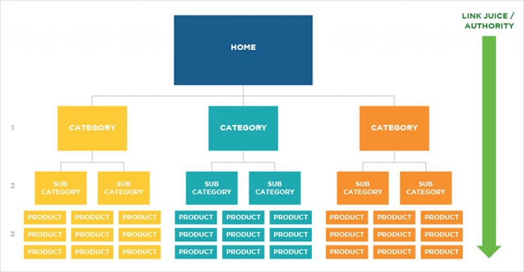
The following is an example of a simple, SEO-friendly site structure:

Your products are only a few clicks away from your homepage, as shown in the diagram, making it easy for customers to find what they’re looking for and for search engines to scan the site.
Using one of these formats, you can easily organize your content using Shopify:
shopify seo
Home » Product Pages » Category Pages
> Category Pages » Sub-Category Pages » Product Pages » Home »
Always keep in mind that your website should be designed with customers in mind.
You’ll need an About page and a Contact page for your site in addition to product and category pages. Don’t skip these pages because they tell shoppers and search engines that you’re credible and trustworthy.
Finally, on your page, provide a search box. Is it going to assist with SEO? Not in a direct way. However, it will assist visitors in finding what they’re looking for, which is a vital component of eCommerce optimization so you can make more money from your existing traffic.

Step 2: Search for keywords.

The success or failure of your SEO campaign is primarily determined by the keywords you choose. Unfortunately, many eCommerce business owners don’t give keyword research a second consideration.
It’s not enough to sprinkle keywords across your website. What matters most is that you use the correct keywords.
How do you come up with the proper keyword mix for your SEO strategy? Simple. Perform a keyword search.

To begin, narrow your focus. Choosing a broad category like “sneakers” isn’t going to cut it. The more specialized the niche, the better. CBD for pets has been shown to be effective.
After you’ve decided on a niche, the following step is to locate the correct keywords to go with it.
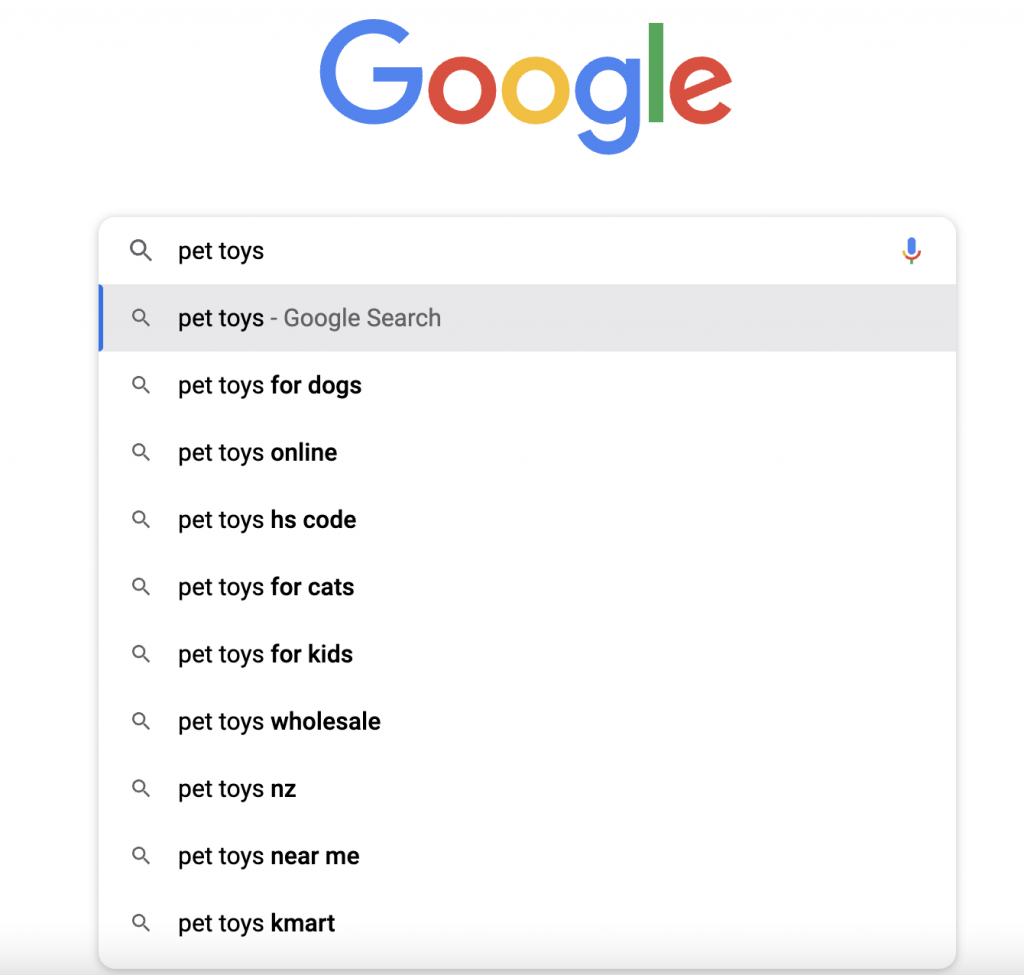
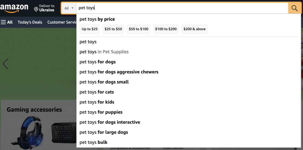
There are a couple of approaches you can take. One option is to use Google or Amazon’s auto-suggest feature. Finding the terms your clients are seeking will help you rank higher in their search results, avoid Amazon suspension due to illegal activity, and appear more trustworthy to potential customers.
Assume you’re in the business of marketing pet toys. Go to Google and search for “pet toys.” The following keywords will appear in your search results.
shopify seo


If you try the same thing with Amazon, you’ll see something like this:
shopify seo

These search keywords will be used by potential customers to locate your store and products. You may either stop here or go a step further by employing specialized SEO tools to go deeper into keyword research.
Let’s take a look at some of the top Shopify keyword tools.

Shopify’s Best Keyword Tools

The auto-suggest functions of Google and Amazon are excellent, but they are limited in scope. They won’t tell you about the search volume or keyword difficulty of these search queries, for example.
Dedicated keyword tools like Google Keyword Planner and Ahref, on the other hand, can help. They can also generate a longer list of similar terms.
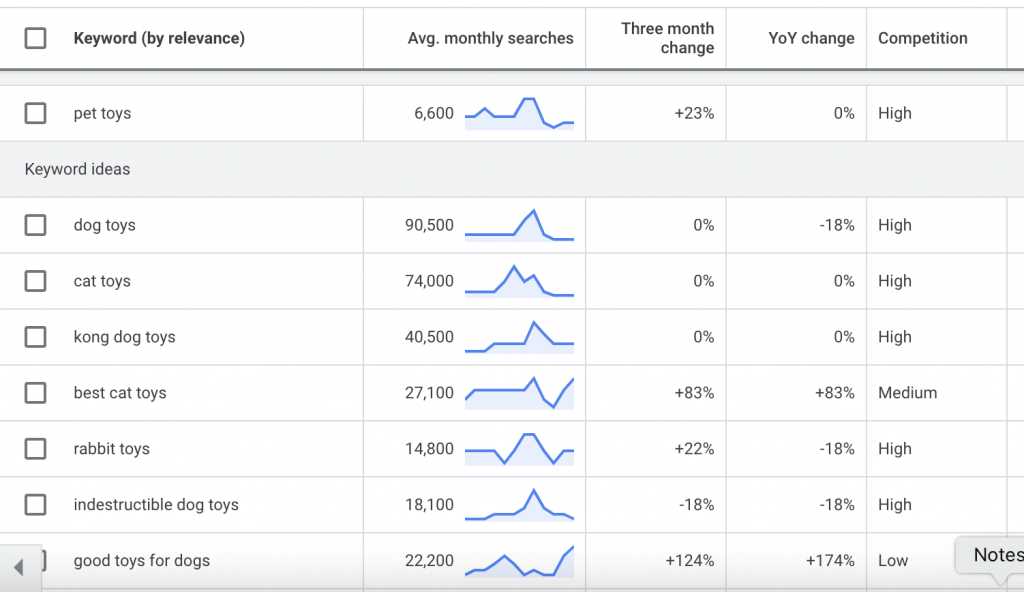
If you plug one of the suggested keywords – say, “pet toys” – into Google Keyword Planner, you’ll see something like this:
shopify seo

Keep an eye on the number of monthly searches and the competitors. You should choose keywords with a large monthly search volume and minimal competition.

Step 3: Incorporate keywords into the content of your page.

You should now have a list of keywords that you want to target. The next step is to make it simple for Google to find your pages by utilizing those keywords.
However, you must first decide the sites to which the keywords will be added. The ideal locations to start are your homepage, product pages, and product category pages.
Where should the keywords be placed on those pages? Ideal locations include the page title, meta description, page body content, and picture Alt texts.
Let’s imagine you want to include the keyword “women sweatpant” in the headline of your product page. I’ll suppose your website is brand new and lacks a product page. This means you’ll have to create one and incorporate your keyword.
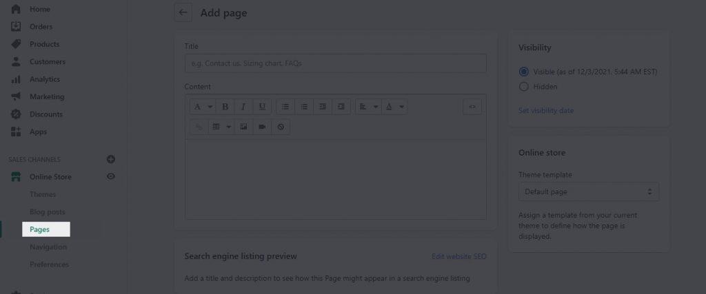
Log into your Shopify account and click the Pages link, as seen below:
shopify seo

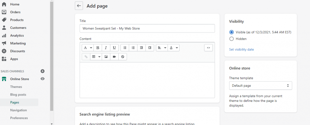
Fill up the page title using the following format:
Name of the store as a keyword
Here’s an illustration:
shopify seo

You’ve just added a target term to the title of your page. You did a fantastic job.
After that, you’ll want to add keywords to the page description. To do so, go to the Edit website SEO link directly below and type in descriptive text that best describes your page in the Description box. Make sure your target keywords are included in the description.

Step 4: Create Links to Your Shop

Search engines utilize backlinks to judge how well your site is regarded by the general public. Consider it SEO’s version of word-of-mouth. It’s an off-page SEO technique that focuses on establishing your credibility and reliability.
What’s the best way to attract links to your store? Here are some pointers:
Links to Suppliers and Manufacturers
If you sell products created or supplied by well-known companies, it’s possible that they have a policy that only authorized sellers are given a link. Send them an email to see if they’ll link to your store.
Voices from the Industry and Influencers
To develop both links and content, reach out to industry leaders and influencers for interviews.
Mentions
It’s possible that you’ve already been referenced in multiple places but haven’t been linked to. You may look for these mentions on mention.com. Then send them an email requesting that they include a link to your site in their mention.
Expired Links
This involves some detective effort to look for broken links for items and services that are similar to yours. Once you’ve found one, contact the owner of the site that contains the broken link and request that they link to your site instead. Because broken links are detrimental to SEO, this is a win-win situation for both parties: they get to fix a broken link, and you gain a backlink.
We also have a comprehensive guide on link building that includes a variety of additional tactics for improving your ranking.

Step 5: Use Content Marketing to Improve Your Rankings

Let’s speak about content marketing now that you’ve got everything else in place.
People visit your website for the content. As the owner of an eCommerce site, you may be tempted to compromise on content or believe that product descriptions are sufficient.
Take the effort to generate fresh material that enhances your overall user experience, and you’ll have a lot more success.
It can be difficult to decide what to write about, but it doesn’t have to be. Make a list of everything your customers ask you or everything you believe they might want to know. Real responses, not product information.
Your content is an opportunity to introduce clients and potential customers to your brand in a non-sales approach. It’s also one of the simplest strategies to gain more backlinks and rank for more keywords.
Are you having trouble coming up with article ideas? Take a look at this list of more than 100 subjects!

Step 7: Don’t Forget to Set Up 301 Redirects for Outdated Product Pages

If a product goes out of supply in Shopify and you want to inform search engines that a page is no longer available and has been permanently transferred to a different page, 301 redirects are the ideal answer.
What is the difference between a 301 redirect and a 302 redirect?
A 301 redirect is a method of automatically redirecting users and search engines from one page to another. It’s an excellent approach to dealing with a URL that doesn’t exist any longer or that you don’t want people to access. You want to make sure that the visitor or search engine is directed to a helpful page rather than a 404 Not Found page, which could end their customer journey with you.
Perhaps you’ve erased pages for goods that you know will never be available again. Because the page ranked in search engines or was linked to another site, there may be some potential consumer loss if a 301 redirect to a new page is not set up.
You want to redirect the visitor to a new page, and the best way to do so is to use the Shopify admin area to set a URL redirect.
1. Select Online Store > Navigation > URL Redirects from the drop-down menu.
2. Select Add URL Redirect from the drop-down menu.
3. In the Redirect from the field, type the old URL and the new URL in the Redirect to the field.
4. Select Add from the drop-down menu.
It’s worth noting that if the URL you’re redirecting from still contains a web page, you’ll have to delete it for the redirect to operate.

When to Use 301 Redirections: When website pages/products are removed/moved to a new place and are no longer available.
Domains that have been relocated indefinitely.
If there are 404 pages with content that has expired.

Step 8: Register your sitemap.xml with Google Search Console.

A sitemap is a file that contains all of your website’s pages and tells Google and other search engine crawlers what to scan and index on a regular basis. Shopify businesses create a sitemap.xml file containing all of the links to your website’s pages, including products, providing a comprehensive overview of your site’s structure.
However, if you want picture-perfect SEO, that’s only part of the task.
You must upload your sitemap to Google Search Console (or Bing Webmaster Tools if you believe Bing could be a valuable source of traffic for you) in order for your site to be scanned and indexed quickly.
The sitemap in Shopify is located in the store’s root directory, for example, example.com/sitemap.xml.

How to Use Google Search Console to submit a Sitemap

1. Go to Google Search Console and log in.
2. Go to your website’s URL.
3. Click on the sitemap on the left side and choose Add/Test Sitemap.

google search console sitemap

It may take a few days for your request to be processed.

Step 9: Integration with Google Analytics

To track and report website traffic, a Google Analytics connection is required. It’s free and packed with tools to help you figure out how visitors behave on your site. Although it is a high learning curve, even a beginner may use it to track their paid and organic traffic counts. Do you want to know how long people spend reading a blog post? Google Analytics is a good place to start.
Pro Hint: Always use the Universal Analytics code, which is Google Analytics’ most recent version.
Go to Admin > Online Store > Preferences in your Shopify store. Then, in the Google Analytics account field, add your tracking ID code snippet.

This is a lot less complicated than some CMS choices. Rest certain that your decision to use Shopify has made your online selling life easier in yet another manner.

Step 10: Be Serious About Blogging

You must create informative content on your blog to improve your store’s visibility on Google.
Thankfully, Shopify includes a blogging option out of the box. It may be found by going to Online Store >> Posts on the blog
Create content around the keywords you want to target for the best results.
If you offer women’s sweatpants, for example, blog entries with the following titles might be effective:
1. The ten best sweatpant outfits
2. How to wear sweatpants to a party in style
There are 15 things you should know about women’s sweatpants.
Google search crawlers can easily figure out what your website is about if you publish blog entries that are relevant to your subject.

You’ll be moving up the search results rankings in no time if you follow each of the 10 stages in our Shopify SEO tutorial. To acquire your findings faster and scale them to other traffic sources, contact our team.

Heatmap Apps to Increase Shopify Store Conversions

Heatmap Apps to Increase Shopify Store Conversions

Shopify is a popular platform to host e-commerce websites. There is not much information available about optimizing Shopify-hosted E-commerce sites from the client side. Sometimes, you might need to understand how visitors navigate your website, what catches their attention, and what draws them away. You’ll find the right tool with a heatmap.

What is a Heatmap?

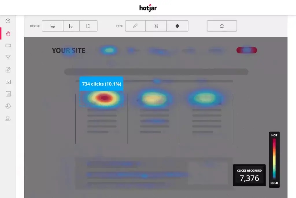
Heatmaps show where most visitors clicked, browsed, and returned to. Scroll heatmaps show how far visitors have traveled before leaving, as well as whether or not they reached your top products or CTAs.

These heatmap tools can help you analyze website issues and make adjustments to improve customer experience and convert more customers. This will help you identify the areas that are most popular with customers in your Shopify store.

Here’s a list of heat map-generators that can help optimize your store. Let’s get started!

Heatmaps have many benefits

Let’s look at how heatmaps can help Shopify shop optimization.

Instant Overview

Heatmaps, despite having other analytics benefits, are able to immediately alert you to any serious issues on your website.

Heatmaps that display clicking habits of your users are available by clicking here. Scroll heatmaps show your pages’ average visibility. Heatmaps of user interaction reveal the areas that are most attractive to visitors. Heatmaps that track mouse movements are used to track them. Geo heatmaps, which show users’ locations in pseudonymous ways, are the final.

Visual Approach

Heatmaps can be as precise as spreadsheets but heatmap visuals have a better performance than Excel’s columns and rows of statistics.

An Excel spreadsheet might reveal which links have the lowest click rates, or which pages have higher bounce rates and spend more time on them than others.

However, the spreadsheet statistics will not reveal Why. The same statistics can be analyzed in a properly designed heatmap. This could indicate that a link is becoming difficult to see or that a high bounce rate can be explained by a low visibility page.

It’s easier to learn

While surveys and questionnaires are useful, we all have biases. Heatmaps on the other hand can be used to show users’ navigational patterns, which may be considered immediate feedback.

Heatmaps and A/B Testing can be used together to improve your knowledge without being intrusive. You are able to evaluate design options before they are released to a wider audience. This will help you avoid offending your users.

Chooses that Improve the Bottom Line

Heatmaps help business managers make better web design decisions to increase sales and engagement. Heatmaps are about increasing revenue. Heatmaps are all about increasing revenue. This is evident by the wide use of heatmap online diagnostic tools.

Top Shopify Apps Heatmaps Apps

Hotjar

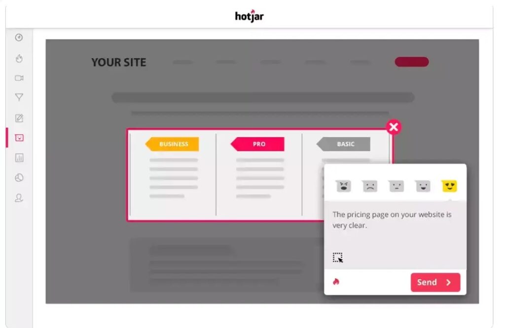
Hotjar is an excellent tool to display your customers’ online activity. Hotjar combines analytics with review features to give you a better understanding of how to make your website more user-friendly and productive.

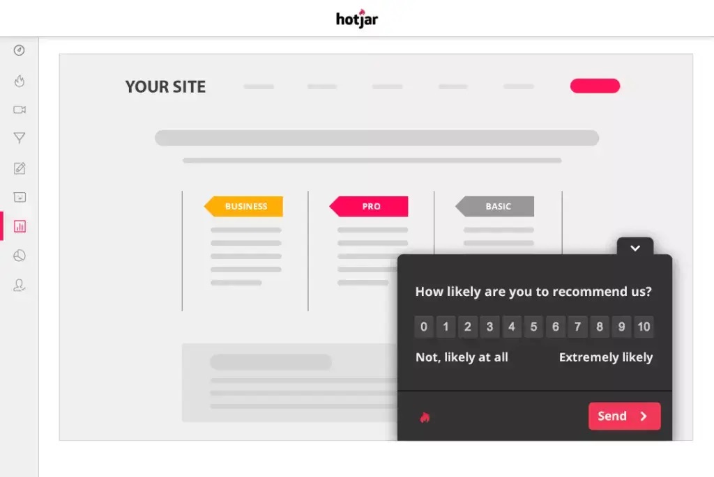
Analytics tools allow you to monitor user activity by allowing you see what visitors do. Evaluation tools let you hear what consumers say (by polling them using surveys).

Hotjar Features

Heatmaps:

hotjar heatmap

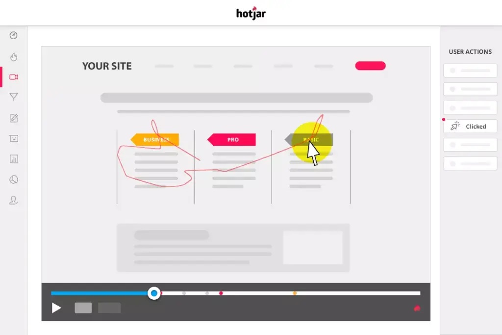
Recording:

hotjar screen recording

Surveys:

hotjar surveys

Feedback:

hotjar feedback

Pros

  • Quick customer insights.
  • It is easy to use.
  • Traffic view with accuracy
  • Software features are constantly improved.
  • Certified GDPR and CCPA
  • Many integrations

Cons

  • There is less flexibility with free features.

Pricing

Free Trial: Free Plan for Life

Prices: $39 per month.

Hotjar can be used to convert Shopify stores. Read our article: How to Increase Shopify Store Conversions. Leverage Hotjar, Google Analytics & Littledata.

Crazy Egg

Crazy Egg makes it easy to create a website without spending a lot of money. With a simple and intuitive interface, Crazy Egg is easy to set up and use. You can quickly modify your website based on your visitors’ usage habits.

Crazy Egg Features

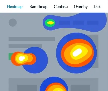
Heatmaps:

crazy egg heatmaps

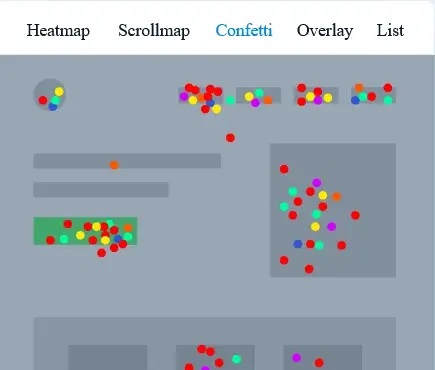
Confetti. Find out where people click and what attracts them there.

crazy egg confetti

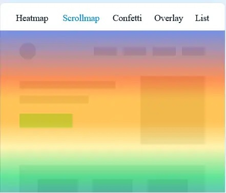
Scroll maps. These show how far users scroll down, so you can see when they leave the site.

crazy egg heatmap

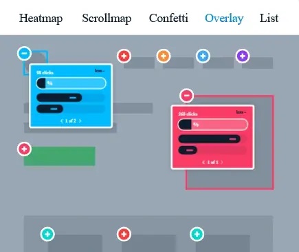
Overlays. Additional information on each element of your website.

crazy egg overlays

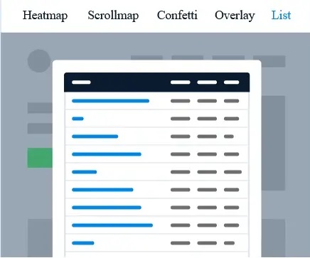
Get a list of reports. You can see only numerical data about the number of clicks on your website elements.

crazy egg reports

Pros

  • Visual representation of user behavior
  • It is clear which elements of your content get the most interaction.
  • Simple implementation on-site
  • The tool has a great UX and UI.

Cons

  • It is necessary to find a better way to organize historical snapshot data.
  • Price increases

Pricing

30-day Free Trial

Prices: $24 per month.

Smartlook

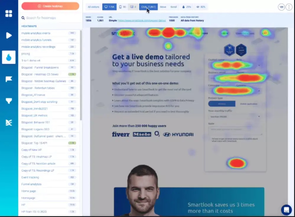
Smartlook heatmaps

Smartlook, a qualitative analytics platform for mobile and website, has helped over 200,000 companies from all sectors and industries to answer the “whys” behind their user behavior. Why are they not using a feature? Why don’t they use a feature? It is now possible to do without guessing.

Smartlook Features

  • Recording.
  • Website and mobile heatmaps
  • Events.
  • Funnels.
  • Analytics and reporting.
  • Retention tables.

Pros

  • Clear insights can be gained by recording visitor behavior.
  • Keep track of the activities and return users.
  • You can distinguish between random browsing and deliberate actions.
  • Analyze funnel conversion statistics.

Cons

  • A variety of small bugs — they are not dangerous but can cause some problems.

Pricing

10-day free trial. You can also get a free plan.

Prices: $31 per month.

Mouseflow

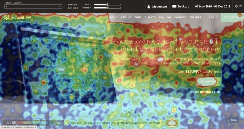
Mouseflow heatmaps

Mouseflow, a behavior analytics tool, helps UX professionals, product managers, digital marketers, startups, small businesses, and corporations increase website engagements in order to increase conversions. It allows you to instantly view the sessions of visitors and create heatmaps for all your pages.

To observe the bounces of your visitors, you can create funnels and use form analytics to increase your lead generation. You can also launch feedback campaigns to learn more about your visitors. Mouseflow is able to help you find answers that other analytics tools cannot.

Mouseflow Features

  • Replays of sessions.
  • Heatmaps.
  • Funnels.
  • Forms.
  • Feedback.

Pros

  • You can easily integrate with any platform.
  • It is easy to use
  • Ability to filter recordings by a variety of variables

Cons

  • The free version may include more features.
  • Optimized for better viewing on mobile devices

Pricing

14-day free trial. You can also get a free plan for life.

Prices: $24 per month.

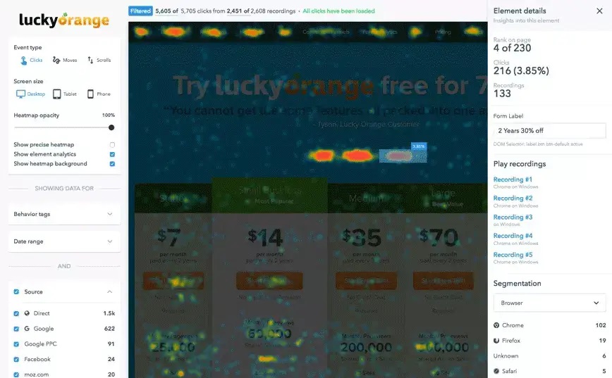
Lucky Orange Heatmaps & Replay

Lucky-Orange-Heatmaps-Replay

Lucky Orange offers a complete conversion optimization package to businesses of all sizes. Lucky Orange also helps website owners identify the reasons why visitors aren’t converting.

With dynamic heatmaps and visitor records, users can see everything a customer does on a website. They can also discover drops in conversion rates using conversion funnels, form analytics and surveys to find out where customers are losing their interest.

Lucky Orange’s conversion funnels enable users to see when customers abandon a process like “making an account” and “checking out” to help them pinpoint the problem areas.

Customers can connect directly with customer service representatives via the website by using fully responsive chat technologies. The chat interface offers a variety of options, including operator transfers, canned replies, typing preview, and co-browsing. It also has a custom data API, which allows users to view information about the person they are chatting with.

All chat widgets can be customized to match the website’s overall design.

Lucky Orange Features

  • Recordings of sessions.
  • Dynamic heatmaps
  • Live Views
  • Visitor Profile
  • Surveys
  • Form Analytics
  • Conversion Funnel.

Pros

  • It’s easy to set up and use, and the product is great.
  • This package includes several analytics tools that developers can use to better understand users’ behaviour.
  • Session recorders are particularly useful.
  • Lucky Orange’s email updates are a great way to keep up with the number of people visiting our site each day.

Cons

  • Sometimes it can be very slow

Pricing

7-day Free Trial

Prices: $10 per month.

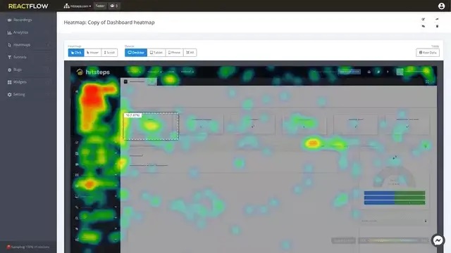
Heatmaps Reactflow Recordings and Heatmaps

Reactflow-Recordings-Heatmaps

Reactflow improves the conversion rate for your Shopify shop. It analyzes your visitors’ behavior and exposes their problems. This allows you to realize a quicker return on your investment. Visitors will arrive on your site with a slew of menus and buttons. You want them to click on the buy link more than any other link. Reactflow supports the following services:

Make videos of all visitors to your website and send them to you for review.

Create a heatmap showing the actions of your website visitors (Clicks and scrolls, mouse hovers).

Identify bugs you missed in the testing process.

Funnel statistics to determine the most valuable sales pages

This includes feedback widgets such as polls, surveys, leads, and more.

Reactflow uses these recordings to extract Heatmap data (clicks, scrolling, and mouse hovers) and gives you an aggregate view of all your website visitors divided by their device.

Reactflow Recordings and Heatmap Features

  • Recordings of sessions.
  • Heatmaps.
  • Bug Analysis
  • Feedback
  • Funnel Analytics.

Pros

  • It’s simple and easy to use
  • The Bug Tracking function works really well.
  • It has a dashboard that displays all information.
  • Excellent product.
  • Session recorders are particularly useful.

Cons

  • Sometimes, the Dashboard Interface is not as responsive.

Pricing

14-day free trial. Unlimited free service

Prices: $19 per month.

Shopify Store Conversions Increased by A/B Testing and Heatmaps

Heat maps are used to help you make changes that convert more customers into paying customers. Heatmaps or A/B Testing may help you make better progress.

Heatmaps and A/B testing both aim to increase conversions. Why not use heatmaps when you evaluate A/B tests. These can be both useful analyses and insightful insights that will help you to prove your hypothesis.

It is easy to set up a heatmap on your website and link it to other apps. It’s the hard part about using it while running A/B testing, which involves testing multiple copies of the same page with different URLs.

You will need to work with a team of experts to avoid making mistakes and solving analytical problems later. 

Heatmaps Integration by an Expert A/B Test Development Agency

These are just a few of the reasons you should hire a specialist team to help you use Heatmaps.

Common errors in complicated testing include code failures, badly formatted CSS, and slow rendering. It is important to identify and correct errors and failures before the test is launched. A bad experiment can cost you money. An A/B testing professional can help you avoid problems and create a detailed A/B test.

Avoid Making Mistakes

Improve Feature Utilization

Heatmaps offer a broad range of capabilities as well as the many platforms and tools that can be connected to them. Experts can use many of the same functionalities and integrations that novices are able to, and they will also know when and how to use them. You may be unaware of the potential for heatmaps until professional shows you.

It’s quick and easy

It is important to use your time wisely. You should not waste it learning or trying to code complicated heatmap integration codes. Heatmaps are easy to deploy on your website when you hire professionals. They can also be used with other tools on the site and used to evaluate A/B testing, as well as all that heatmaps have to offer.

Get expert opinions

Regular practice over a long period of time is what makes you experience. Specialists can help you avoid project faults, address heatmap-related issues, and suggest new techniques for experimenting using heatmaps. They also provide valuable information that will assist you in optimizing your optimization strategies.

Conclusion

This article will provide you with valuable information about the top heatmaps to track the activities of Shopify customers. We also have an experienced team who can help you set up your online shop and modify the themes. Contact us online to discuss your project.

Hotjar Installation on Shopify

Hotjar Installation on Shopify

Shopify is an e-commerce platform that is well-known. It is easy to open a Shopify shop. Online businesses cannot interact with customers in person so it is more challenging to increase leads and revenue. It’s also more difficult to identify what draws shoppers to your store.

Heatmaps can be one of the best tools to understand the behavior of website visitors. Installing the Shopify heatmap app to your website will allow you to see what visitors click, what they look at, and how long they stay on your site.

Hotjar is a contender for the top heatmap software. This software helps e-businesses to overcome the shopper attraction gap. It allows businesses to better understand their customers using its behavior analysis software. This can be used to increase conversion rates. We’ll show you how to set Hotjar up so that you can monitor the behavior of your users on your website.

There are many reasons to install Hotjar

These are the top reasons why you should use Hotjar on Shopify.

  1. Hotjar heatmap shows web pages with high drop-offs.
  2. Shopify heatmap software can be integrated into your eCommerce website to identify design elements that are beneficial or detrimental to visitors’ experience. You can then use this data to create methods to improve them.
  3. Hotjar’s session recording function allows you to better assess user activity. These replays will allow you to see each customer’s experience while they browse the web pages.
  4. Hotjar allows you to quickly add a short quiz after a customer has purchased anything to find out what they think.
  5. It can be difficult to troubleshoot bugs or other problems in Shopify. Hotjar can help you identify problems and problems so you can resolve them as quickly as possible.

Steps to Install Hotjar within Shopify Theme

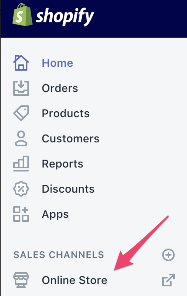
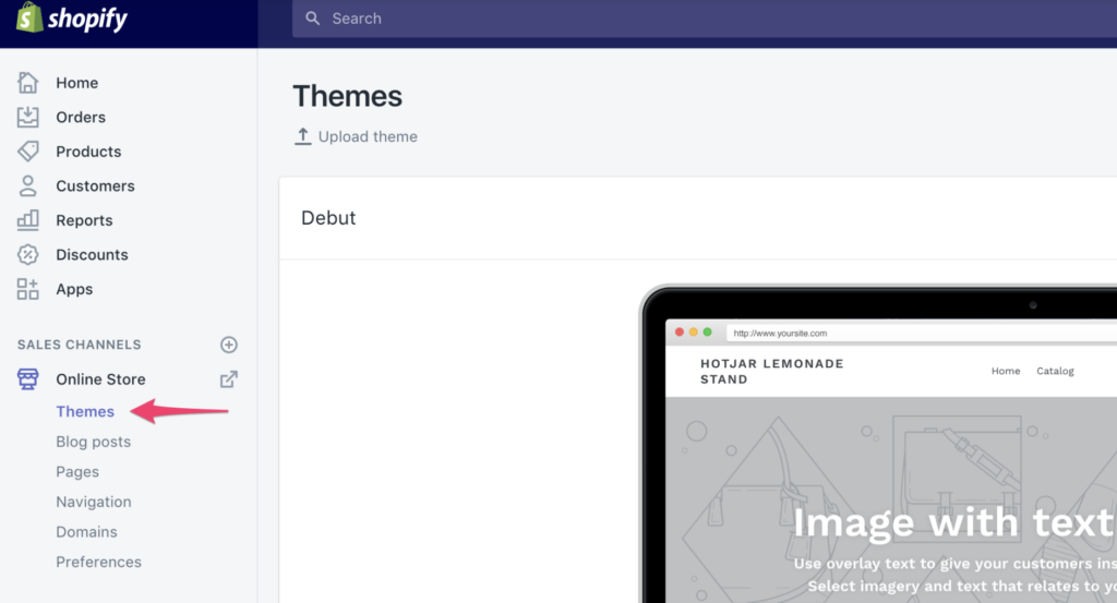
Step 1: Go to Shopify Dashboard and choose Online Store from the drop-down menu.

how to install hotjar on shopify

Step 2: Next, select the Theme option.

how to install hotjar on shopify 2

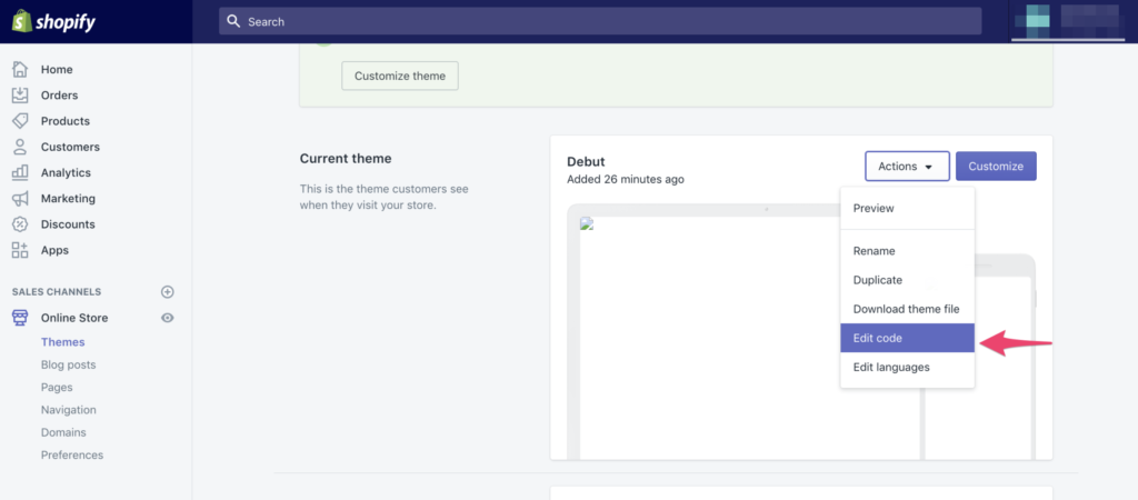
Step 3: Select the theme option and then select Edit code from the Actions menu in the upper right.

how to install hotjar on shopify 3

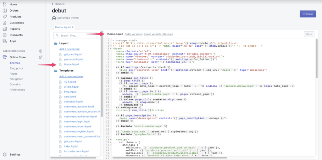
Step 4: Select theme.liquid in the layout drop-down menu.

how to install hotjar on shopify 4

Step 5: Scroll down the page until the tag appears:

how to install hotjar on shopify 5

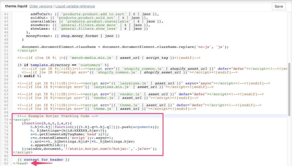
Step 6: Just before you end the element, insert your Hotjar Tracking Code. Insert the code on each page you wish to track visitors and get information.

How to install Hotjar on Shopify 6

Step 7: Click Save and Publish to apply the changes.

Hotjar Tracking Code will be loaded on your website.

To track order confirmations, you will also need to include the Tracking Code in a different area. Follow these steps to do this:

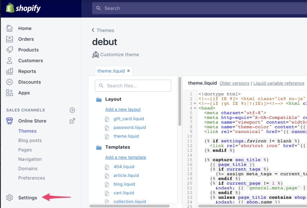
Step 8: To access Options, click the gear symbol at the lower-left:

How to install Hotjar on Shopify 8

Step 9: Click the Checkout link.

how to install hotjar on shopify 9

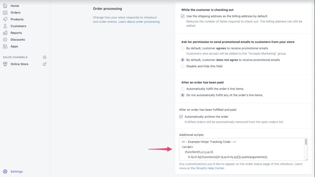
Step 10: Scroll down to the bottom, until you see the box labeled Other Scripts. Copy the Hotjar Tracking code and paste it.

How to install Hotjar on Shopify 10

Step 11: Click the Save button to save your work.

How to install Hotjar on Shopify save

Hotjar Tracking Code must now be located on your Order Confirmation Page, not your Checkout Page.

Step 12: Check your Hotjar Site Dashboard for success.

How to install Hotjar on Shopify 12

Hotjar will verify that the Hotjar Tracking Code has been successfully added to your website after you have done so. Although this usually happens when your website has been updated with the Hotjar Code, you can speed up the process by visiting the page. The Site Dashboard will display the message below when Hotjar detects your Tracking Code.

Source: Hotjar

Once you have installed the tracking code you can start using Hotjar’s services including heatmaps and recordings as well as surveys and incoming feedback.

Hotjar Integration

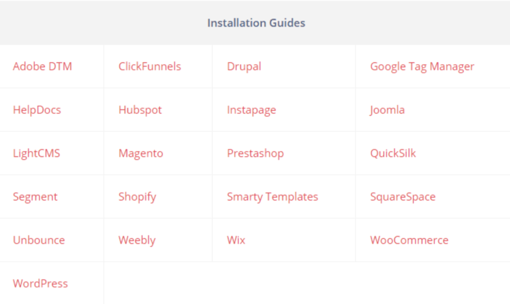
Hotjar, like Shopify, connects to a wide variety of platforms, including:

  • Wix is a website hosting platform.
  • Hubspot is a marketing and CRM service.
  • Innovative technologies like Adobe DTM or Drupal.
  • A/B testing tools like Optimizely or Omniconvert.

Hotjar can also be manually integrated with the tracking code if it is enabled.

Hotjar Integration Benefits – Expert Test Dev Agency

Both Hotjar installation on your site and Hotjar connections to other technologies are very simple. It is possible to use it during an A/B test to optimize your conversion rate. This involves collecting multiple copies for the same URL.

You will need to enlist the help of specialists in order to avoid making mistakes and solving analytical problems later. Hotjar A/B testing is something you should investigate. BrillMark has helped many clients deploy heatmaps and recordings (especially with Hotjar JavaScript triggers).

Hotjar can be used by a team of experts for a variety of reasons.

  • Avoid Mistakes: Code failures, badly coded CSS, and slow rendering are all common in complex testing. Before the test is published, it is important to correct and identify errors and failures. A wrong test can cause financial loss. An A/B specialist can help you avoid problems and set up an A/B test that includes heatmaps and recordings.
  • Increase Feature Utilization: Hotjar offers a wide range of functionality. The various platforms and tools that integrate with Hotjar also offer a variety of features. Professionals may be more adept at using the many integrations and features that Hotjar offers than beginners. They will also need to know when and how to use them. Hotjar’s capabilities can be explained to you by an expert.
  • Keep it Simple and Quick: Time is precious and you should use it for your primary tasks. You shouldn’t waste time learning or getting bogged down in complicated code for Hotjar integration. Hotjar experts can deploy heat maps directly to your website. They can then combine them with other tools on the site and use them for analysis of A/B testing, as well as any other Hotjar functions.
  • Expert opinions: Practicing a skill over a prolonged period of time is what makes you experience. Hotjar-related problems can be addressed by a professional who will help you avoid project failures and offer advice on how to improve your optimization strategies.

Conclusion:

We hope you found this article helpful in installing Hotjar in your Shopify shop to track your visitors’ activities. We also have an experienced team who can help you set up your e-commerce on Shopify or any other platform and launch all the online activities for your e-commerce. We create a custom web design for Shopify or any other e-commerce.

Feel free to contact us online and discuss your tasks.

Recover Lost Sales: 16 Amazing Abandoned Cart Emails

Recover Lost Sales: 16 Amazing Abandoned Cart Emails

Let’s assume you own a successful shop. You have figured out the inventory and you have a lot of traffic. Your customers are loving your products. Did you cover all bases?

Not necessarily. There could be a lot of sales that have been lost. How? Through shopping cart abandonment.

Nearly 88% of online shopping carts are abandoned after a customer has made a purchase. Your sales numbers could be only one-tenth what they might be.

You may not be able to convince all cart abandoners that they should go through checkout. However, you can triple your sales. It is possible that some customers never intended to buy. However, it is worth making the effort to eliminate any remaining hesitations.

This article will discuss how to recover abandoned customers when they abandon their carts using Email Marketing. Next, we will share the email marketing tools needed to create one.

What are abandoned cart emails?

Customers who have added products but did not check out will get abandoned cart emails.

It is an extremely effective customer loyalty tactic. According to Klaviyo, cart recovery emails are able to return 3%-14% sales for businesses, and the average revenue per recipient at $5.81.

This doesn’t sound like a lot. This number is not impressive if you multiply it by thousands of abandoned shopping carts in a year. It’s obvious that abandoned cart emails can generate more revenue.

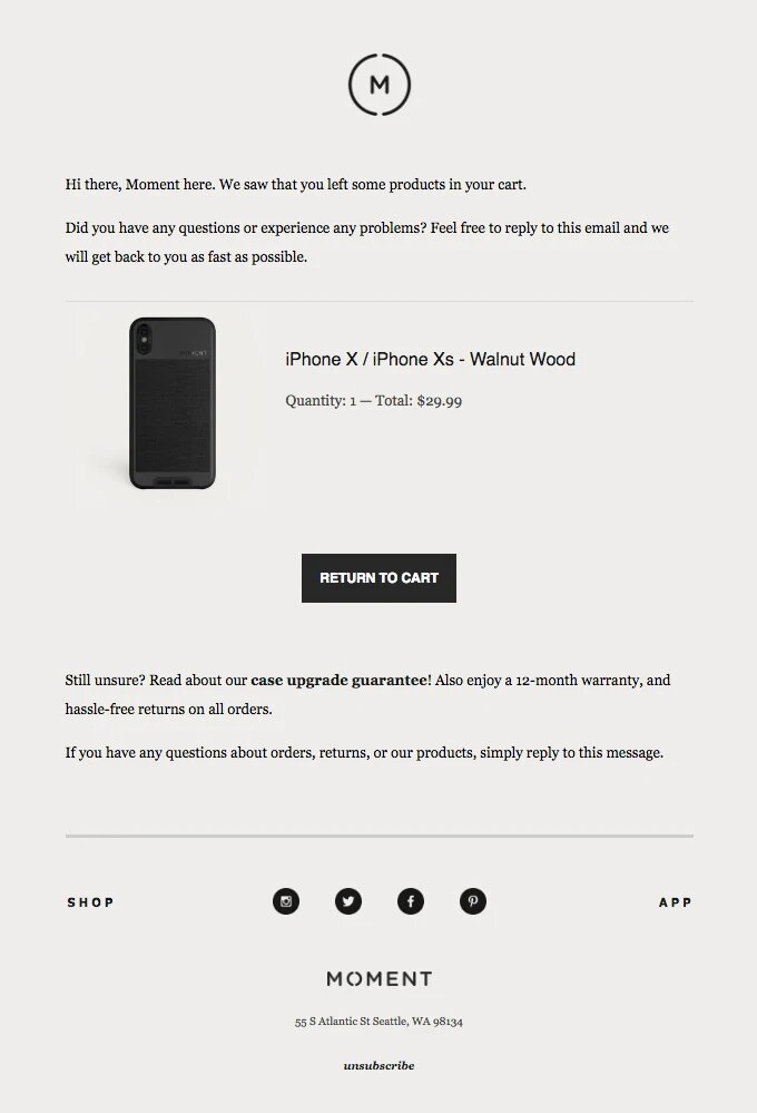
These emails remind shoppers about what they have forgotten and encourage them to return for the full purchase. Emails from abandoned carts can be customized with coupons codes, product images, and CTA buttons to bring people back to checkout.

example email from moment

Statista provides data that shows the average abandonment rate for shopping carts is 88.1%. However, this can vary by industry:

  1. Baby and child: 94%.
  2. Luxury: 94.4%.
  3. Airlines: 90.9%.
  4. Fashion: 90.7%.
  5. Cosmetics: 85.7%.
  6. Retail: 84.5%.

Both small and large companies can send cart abandonment emails to increase conversion rates and recover revenue. You can automate this process by using email market software.

The best examples of abandoned cart emails

Now that you are familiar with what an abandoned cart message is, let’s take a look at some great examples to get inspiration.

  1. Casper.
  2. Rudy’s.
  3. Whisky Loot.
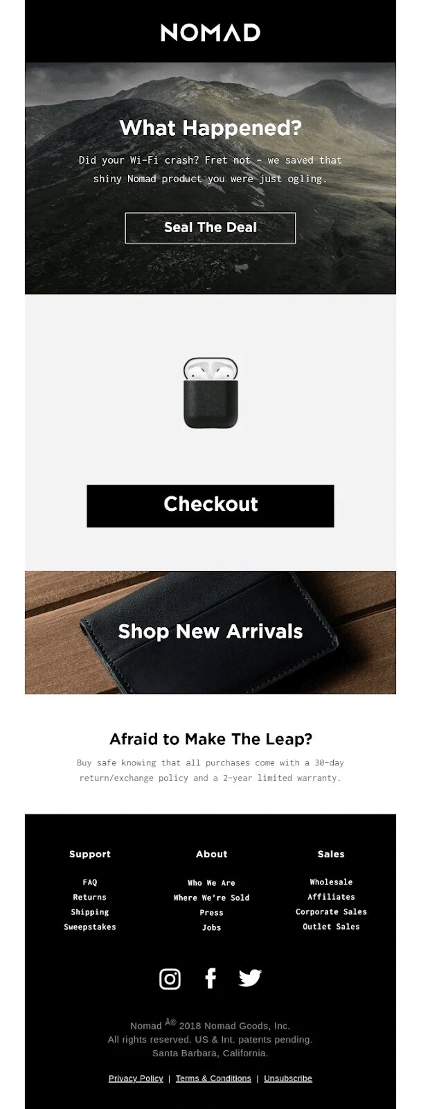
  4. Nomad.
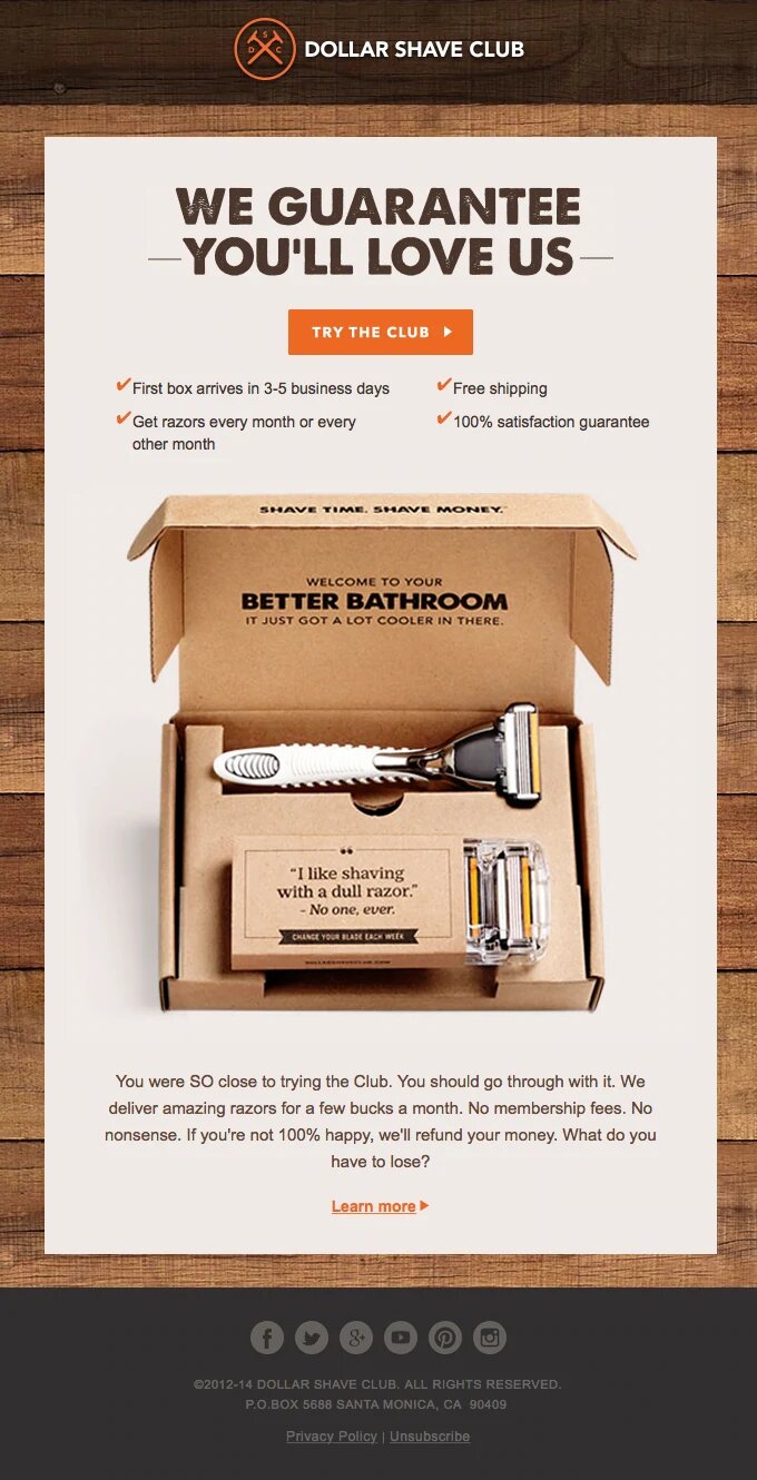
  5. Dollar Shave Club.

Casper

Subject Line: Did someone forget something?

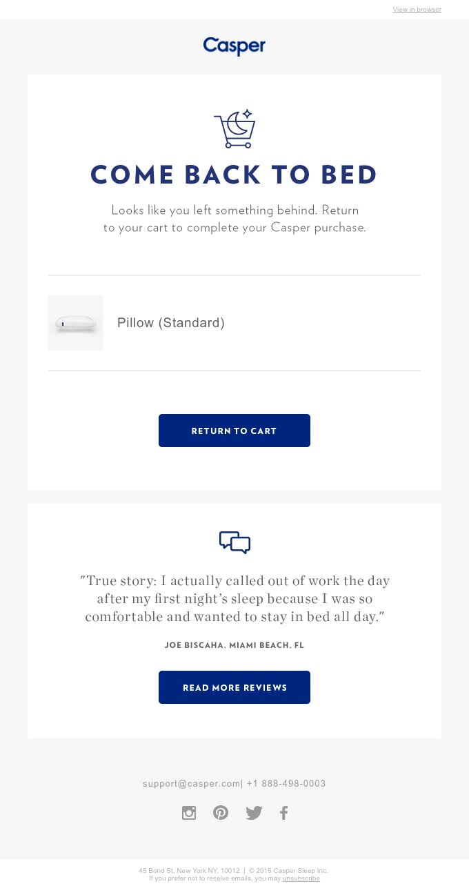
Casper automatically sends you its cart abandonment email if there is anything left on its website. The subject line, “Did I forget something?” is captivating and encourages you to click. To draw you in, the email contains the catchy and playful headline “COME BACKING TO BED”.

example email from casper

Casper’s emails are clean and easy to understand. To show its products’ worth, Casper includes testimonials in its emails. Readers also have the option to view additional reviews if they wish.

Rudy’s

Subject Line: Don’t let free shipping be wasted.

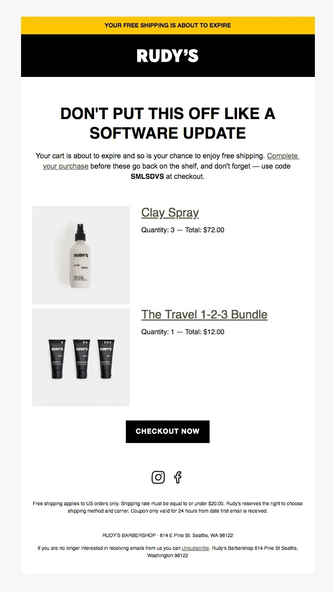
Rudy’s sends an amusing email follow-up as part of its cart abandonment campaign. It is easy to understand the headline “Don’t put it off like a program update”. Customers will be aware that if your software isn’t updated, it could go bad. It is important to remember that bad thing can happen if you do not buy your chosen items.

Rudy’s includes photos of the products left behind and offers free shipping to customers as an incentive to make their purchases.

example email from rudy`s

Whisky Loot

Subject Line: Your cart has just begun to wake you up.

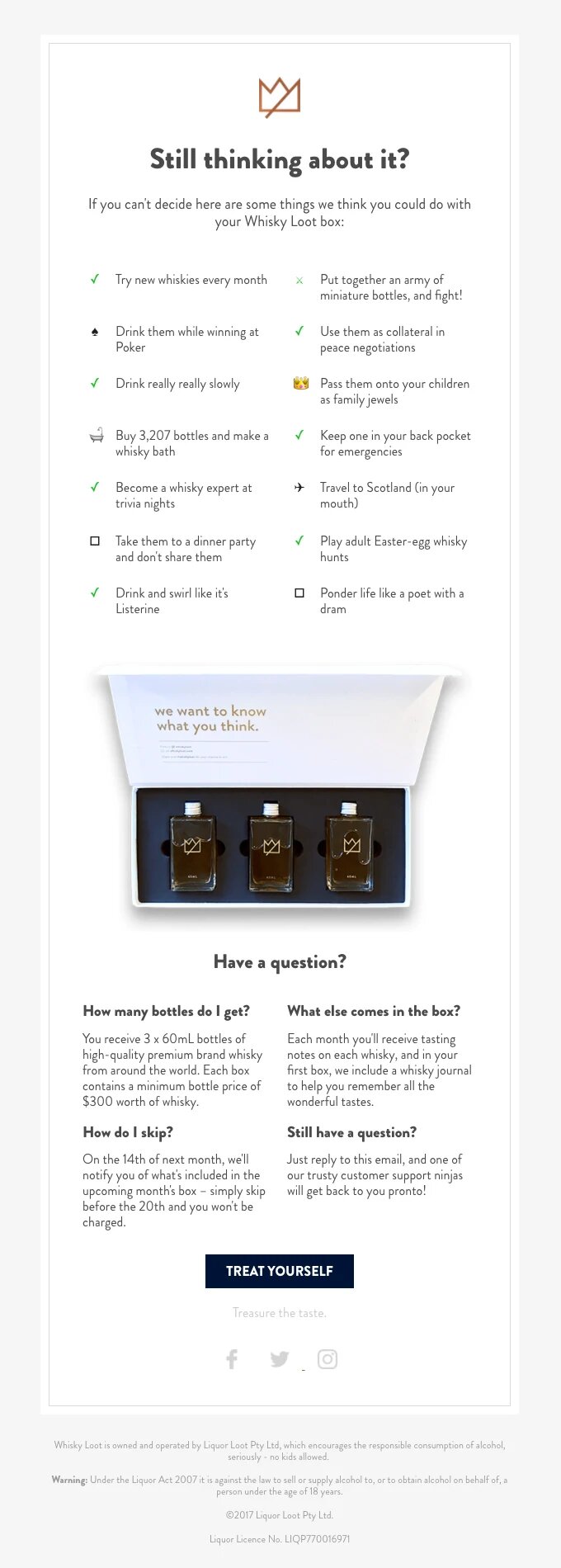
Whisky Loot reminds customers to check their carts every day. It’s a hilarious example. The subject line of “Your cart is sobering-up” is sent when a shopper abandons one of its subscription boxes. This message can help increase the open rate or conversion rate.

The email begins with a question. It then lists all of the possible uses for the whiskies contained in the box. The humorous items make viewers laugh, and they can even imagine themselves using them in these funny ways. Whisky Loot concludes with a FAQ section, and a CTA button stating “TREAT YOURSELF”.

example email from whisky loot

Nomad

Subject Line: Nomad Gear Is Selling Quickly.

Another example of Nomad is the abandoned cart email. The subject line conveys the fear of missing the opportunity (FOMO) to get people to click. The imagery is brand-appropriate, with playful copy and clear instructions on how viewers can get their cart back.

The email addresses another common issue. The email’s section “Afraid of Making the Leap?” provides comforting information about Nomad’s return policy, two-year warranty, and other details. This adds credibility to the email and shows the brand stands behind its products.

example email from nomad

Dollar Shave Club

Subject Line: Where have you been?

Dollar Shave Club has a reputation for its funny and friendly marketing campaigns. The email series that was abandoned is no different. The subject line is brief and gives readers an incentive to read it more.

Bullet-point copy makes it easy for readers to understand and lists the reasons Dollar Shave Club razors make good products. The brand’s monthly boxes are illustrated with clear imagery. Dollar Shave Club provides a money-back guarantee of 100% to all customers, to remove any doubts or encourage them to use the service.

example email from dollar shave club

Email best practices for abandoned cart emails

It is easy to create abandoned cart emails and they can help customers who are reluctant to buy again. Three things should every abandoned cart email include.

An example of the things they’ve left behind

It is possible for your customers to decide that they want to buy again after a few hours. It might take some time for your customers to recall what they saw when they abandoned the items. This is a warm lead, not like the cold reach from a standard company email format.

Customers might abandon carts for unanticipated reasons. Customers may abandon their carts due to problems with their internet provider. However, they might still want to purchase the items. It is possible to get customers back by saving their carts or showing them the items they want to buy.

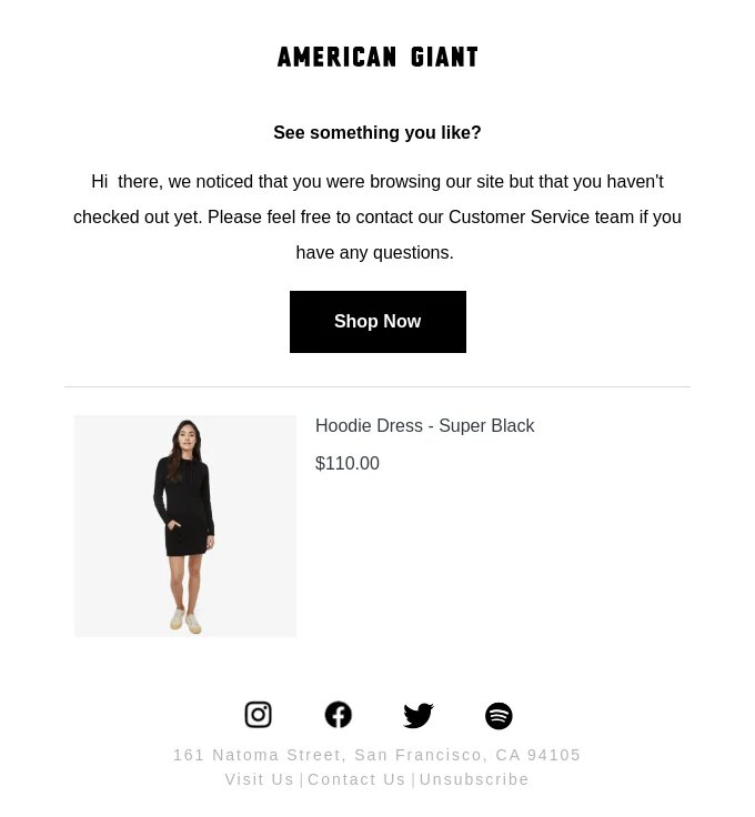
Take a look at this American Giant illustration. It is a simple message that informs the customer about what they have given up. Even better, it provides a link that allows you to quickly return to your cart.

example email from american giant

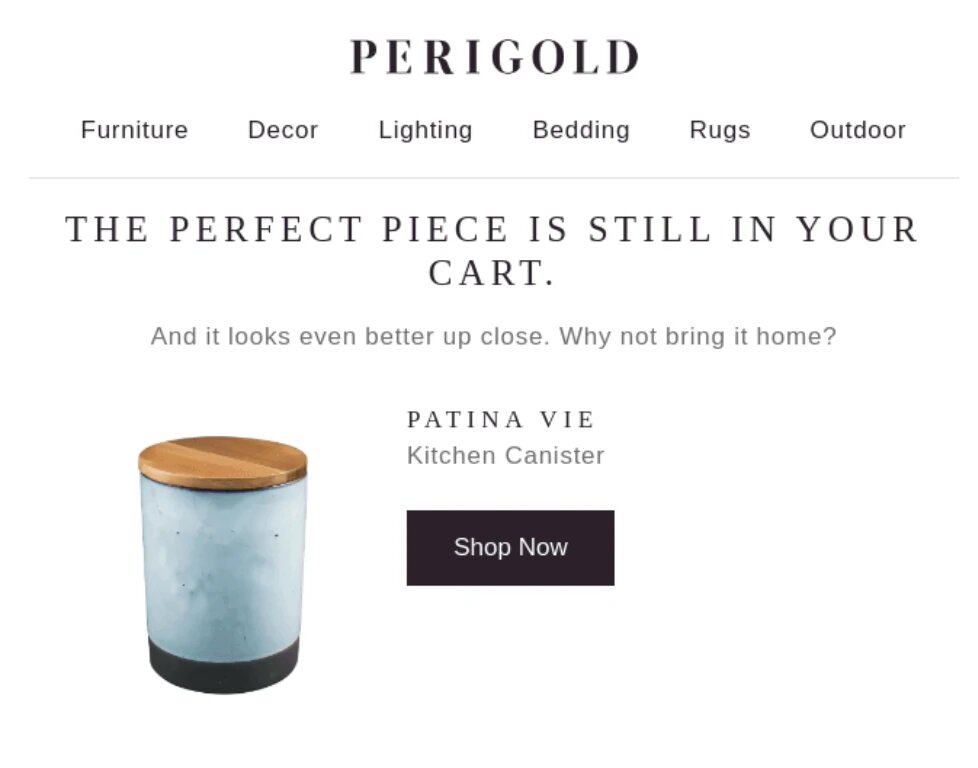
This is another email recovery from Perigold. It’s simple yet effective. It communicates quickly and also offers product recommendations to help people locate other products.

example email from perigold

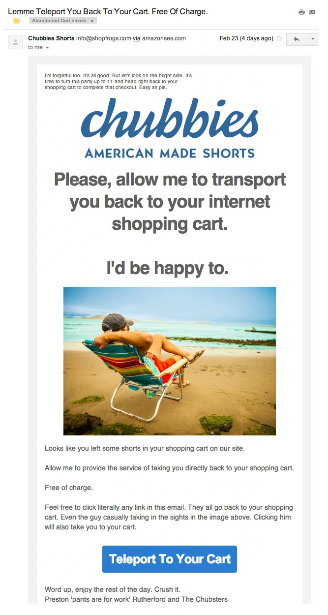
One more outstanding example. Chubies has a great email that excels in three dimensions: compelling visuals and great copy. It also includes multiple links.

example email from chubbies

Pay close attention how Chubbies wrote this email. “Allow us to teleport to you”, “Let’s turn this party into 11” and “Word up” all fit with the image of a shorts retailer running fun-loving individuals. Note that you can return to your cart by clicking on any of these links in the email. (Active links are located in the title, main picture, and the big button at bottom of the email.

Great email copy

As a transition point, the example from Chubbies can be used as a template for great copy.

You can think of abandoned cart emails as a bonus marketing opportunity. Make sure you are making all your marketing materials engaging. Don’t let this happen. You might also find that abandoned cart emails are more in line with welcome emails because of their purpose.

What are the key ingredients of a successful marketing email? A catchy subject line, good copy, and great images are all essential. These emails excel in at least one of these areas.

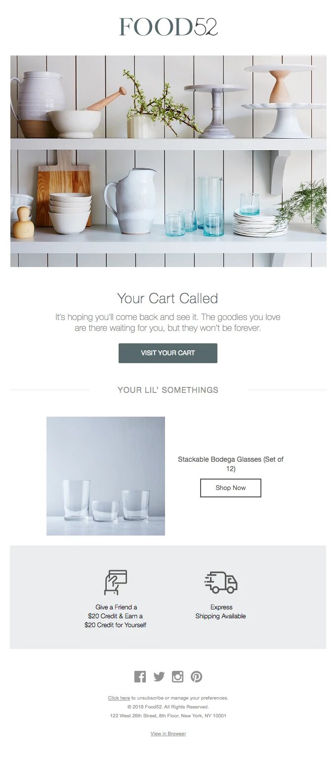
example email from food25

Food52 is our favorite email. We love the copy! The email uses a real-life approach to messaging and displays your items. See: “Your Cart Called” and “It’s hoping you’ll come back to see it”. These phrases personalize the shopping cart and make you feel like a friend should be there.

Adidas uses bold subject lines. It also says: “IS YOUR WI-FI OKAY?” as well as “Maybe you browser crashed when viewing the iconic Gazelle silhouette”. With a link back, the customer’s cart.

example email from addidas

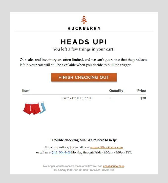
Also, take a look here at this Huckberry.

example email from huckberry

Huckberry has a different appeal.

There is a sense that there is urgency. If you are really desperate for those items, you should not wait. Online retailers who are smart know how to capitalize on scarcity as a psychological sales trigger. Customers worry that the product they want might not sell. Huckberry understands that fear and urges customers to act quickly.

The six stores featured in this article use compelling copy to persuade customers to click back on their cart and complete the purchase.

Include a CTA (call-to-action) button

CTA buttons are used in emails to guide users towards their shopping cart. It’s the area of your email viewers need to click in order to take the action you want. CTA buttons come in many styles depending on what brand you are using, but all of them have the same goal: To get people to their shopping carts.

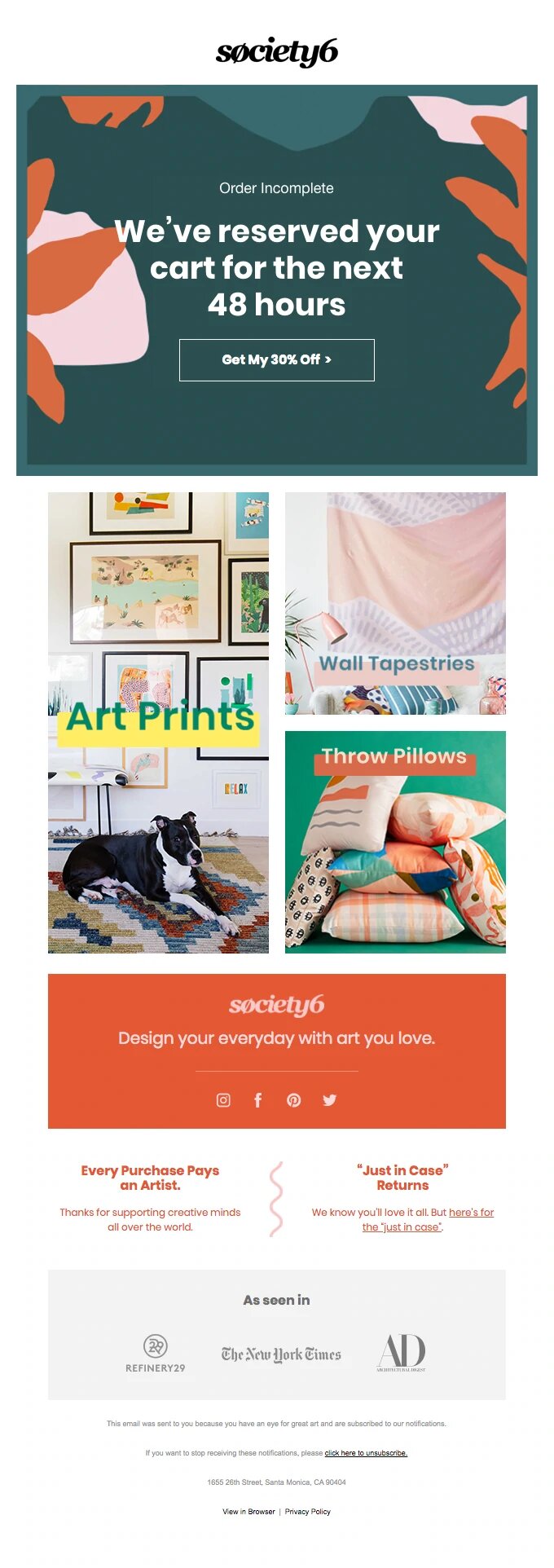
You can either use a standard CTA, such as Return to Cart and Shop Now. You can be more creative with a CTA like Society6, where you can say “Get My 30% Discount”!

example email from society6

You should aim to create a CTA that is both action-packed and effective. Verbs such as “get” or “shop” can be used to encourage people to place items in their cart. In your email marketing software, you can test different CTA messages to find which one resonates with your target audience. This will allow you to generate more revenue per recipient and increase the effectiveness of your cart abandonment program.
Email Strategy Tips for Abandoned Cart

A compelling email about an abandoned cart needs to be included. It should also include a link to return to the cart. Or at least show the items that were removed. If you are able to put them into practice, the following tips will not be a must-have, but they will help you.

Consider timing

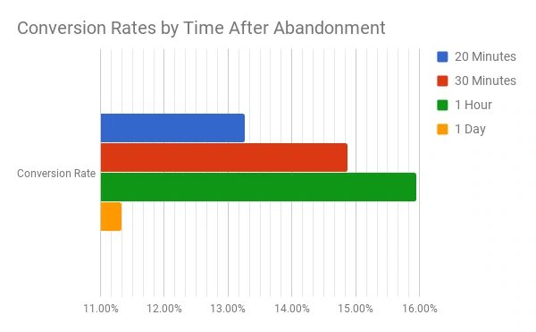
Recent studies have shown that the earlier you send an email to abandon cart emails, the better the results. After analyzing millions of cart recovery emails, Rejoiner found this out. The aim was to find the right timing that would drive revenue for clients.

The results? Rejoiner found that following up emails sent within one hour had an average conversion rate (16%). Sending an email too soon will likely result in lower conversion rates. The results will be even worse if you wait.

statistics when is the best time to send emails

Rejoiner also discovered that the first email may be the most effective but it won’t recover lost sales due to cart abandoners. It suggests using a 3-part series to get the maximum revenue:

  1. First email sent an hour after abandonment.
  2. Second email, sent one-day after abandonment.
  3. Third email sent three days after abandonment.

Offer a discount

Most customers abandon their carts after the final price is higher than they had expected.

When people consider how much they’ll pay for a product, they often add up the cost of each item to their cart. They forget to include shipping costs and taxes, which can lead to them lowering their estimates.

This is why the top reason people abandon cart was because of excessive costs.

It’s easy to get customers back from being scared by the final cost: give them a discount.

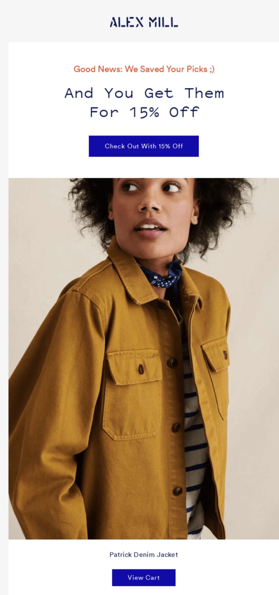
Alex Mill’s abandoned-cart email subject is “Get Them for 15% Off!”. Once you open it, you will see the items you left behind with this 15% off discount. These are the results. It is likely that you will make a sale.

example email from alex mill

You can create discounts easily. Simply choose the amount you want, create a discount code and then leave it in your abandoned cart email.

It’s time to evaluate whether discounts make sense in your business. Although you may know that customers are abandoning carts frequently, every store is different. Although you can encourage customers to buy after receiving a discount, or free shipping, there is no way to guarantee that they will. However, you don’t want your sales to suffer.

It’s not an easy line to walk. You have to decide whether or how to offer discounts. There is no right answer. Your customers might walk away from deals due to prices or for reasons that have little to do with them. It is up to you to find out how they behave.
Add social proof

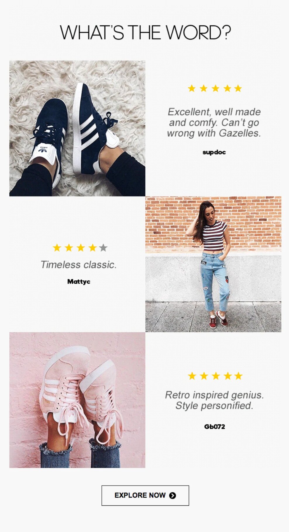
Social proof is one of the most powerful marketing tools you have. It can help you build trust with cart abandoners, and it can also encourage them to purchase. Social proof is a way to get people to look at what other people have to say about a product. They are more likely to trust your brand if they hear good things about it.

Adidas also uses social proof in the email it sent, as described above. Viewers can view customer reviews to see what other buyers think about the shoes.

example email from adidas

The items you wish to reserve can be added to your cart

Remember how we talked about Huckberry using the possibility that your item will sell out to encourage purchase? You can also take advantage of the scarcity effect in another way.

Let me tell you, your customers might be encouraged to use checkout if you promise that you will hold the abandoned items for them for an indefinite but limited period.

Customers understand that popular items are often sold out in small stores with no sophisticated supply chains. Customers may feel more motivated to purchase if they know the items will be kept for them.

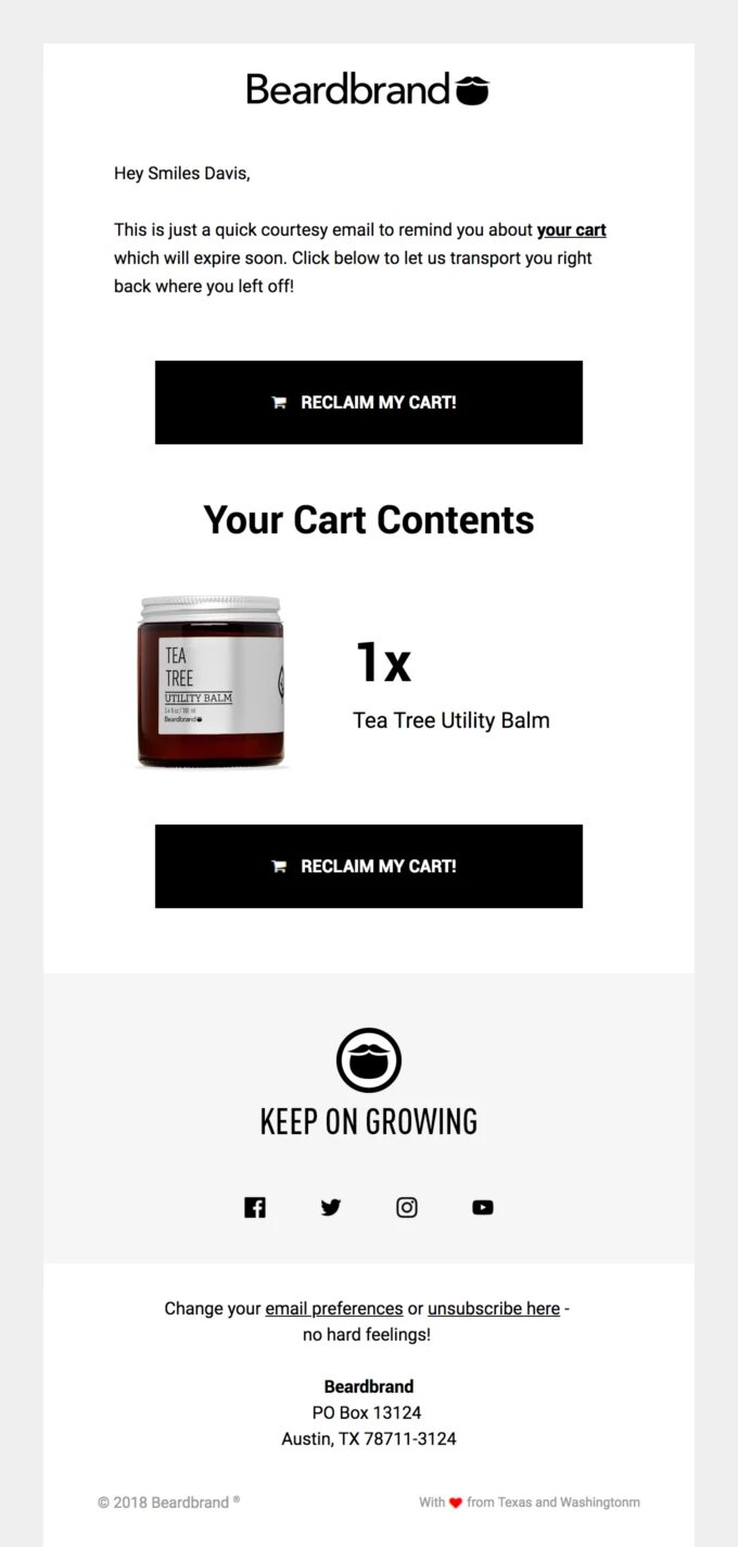
The following Beardbrand email informs shoppers that their items are in reserve, but they will soon be gone. It uses this psychological trick in order to get people to buy before the supply runs out.

example email from beardbrand

We have made “reserve the goods” a great-to-have but not a necessity because we know you want to ship the items to customers who have already prepaid in case of shortages. This is a good idea. Only offer to reserve the cart if your stock is large and you can afford to hold them for others who may not be able to pay.

You can test abandoned cart texts

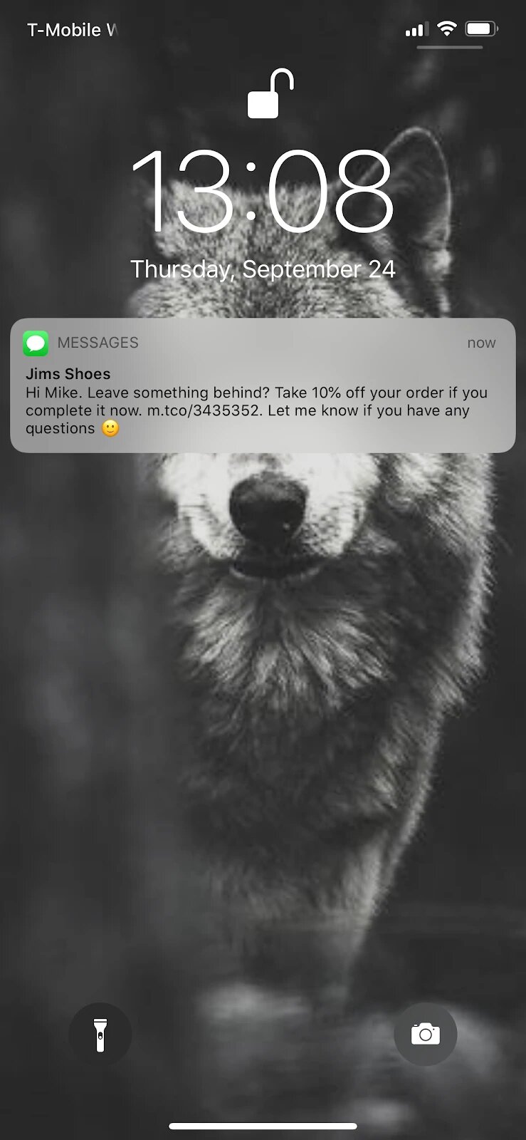
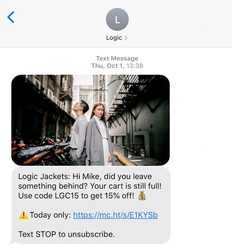
An abandoned cart message, which is similar to an email about abandoned carts, is sent to the person’s mobile phone. This is a more recent sales recovery tactic. However, people are more likely see an SMS push notification rather than an email in their inbox. This can lead to higher click-through rates and sales.

example of a marketing sms mailing

To personalize your text messages, you can use the information you have collected about a customer, such as their name and what products they left behind. ManyChat and other SMS Marketing providers allow you to add one-click links to take customers back to Shopify product pages.

example of a marketing sms mailing

Your e-commerce business can make more sales

Ecommerce marketers and online store owners need to send abandoned cart emails in order to increase sales. Because of the high abandonment rate for shopping carts, they are very easy to set up and should be used by all. Take the advice of these pros to help you get started in recovering sales.

How to install Google Optimize on Shopify

How to install Google Optimize and do AB testing Shopify

Google Optimize allows you to build and run A/B tests and personalization experiments. Optimize is a tool that helps increase conversion rates and improve user satisfaction. It works similarly to other tools such as Optimizely, VWO Unbounce, Convert and Convert. Optimize is unique because it offers all of these services free of charge. Google Optimize and Shopify integration are perfect for what you do. AB testing Shopify is important and can increase your conversion rate.

Shopify allows producers to sell their products online through an e-commerce platform called Shopify. You probably have a Shopify Account if you’re here. Shopify allows A/B testing. This means that it can integrate with Google Optimize and Optimize 360.

This tutorial will show you how to install Google Optimize for Shopify.

Multiple components of Shopify can be tested. You can test for:

  1. A/B testing of a recommendation engine.
  2. Funnel testing for a site redesign.
  3. Multivariate testing is used to determine the optimal combination of elements that will increase conversion rate.
  4. Split URL testing is used to capture the first impression of a new product on an audience.
  5. Personalization allows you to target users more effectively.

These are only a few examples. There are many more.

Before you can follow the Google Optimize/Shopify integration steps, it is necessary that you have created and set-up Google Analytics, Google Tag Manager and Google Optimize accounts.

Once you have these items, you can follow the steps to install Google Optimize in your Shopify store. Then you can start with experimentation yourself or ask your digital marketing agency to take care of it.

How to install Google Optimize on Shopify

Install Google Optimize first through the Shopify admin.

Step 1: Install Shopify’s analytics code

Your Google Analytics Tracking ID can be added to your Shopify store. Under the Sales channel option, go to Online Store, and then click on Preferences. In the dialogue box, enter your tracking ID.

ab testing shopify

Step 2: After completing the required replacements, paste the following code.

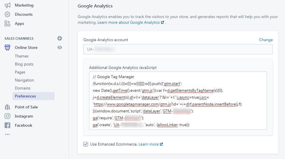
In the Additional Google Analytics JavaScript area, add your Google Tag Manager container. The code is available below. Simply replace the tracking IDs and container with your own.

// Google Tag Manager (function(w,d,s,l,i){w[l]=w[l]||[];w[l].push({‘gtm.start’: new Date().getTime(),event:’gtm.js’});var f=d.getElementsByTagName(s)[0], j=d.createElement(s),dl=l!=’dataLayer’?’&l=’+l:”;j.async=true;j.src= ‘https://www.googletagmanager.com/gtm.js?id=’+i+dl;f.parentNode.insertBefore(j,f); })(window,document,’script’,’dataLayer’,’GTM_CONTAINER_ID‘); ga(‘require’,’GOOGLE_OPTIMIZE_CONTAINER_ID‘); ga(‘create’, ‘GOOGLE_ANALYTICS_ACCOUNT_ID‘, ‘auto’, {allowLinker: true}); //

It’s as simple as that:

ab testing shopify

Step 3: Add the Google Optimize anti-flicker code snippet

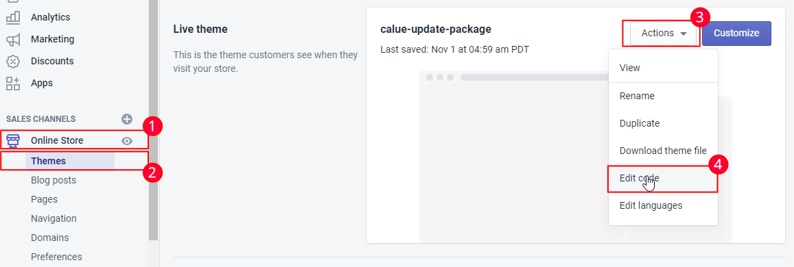
Go to Online Store and choose Themes to add this piece. Click on the Actions menu and choose Edit code.

ab testing shopify

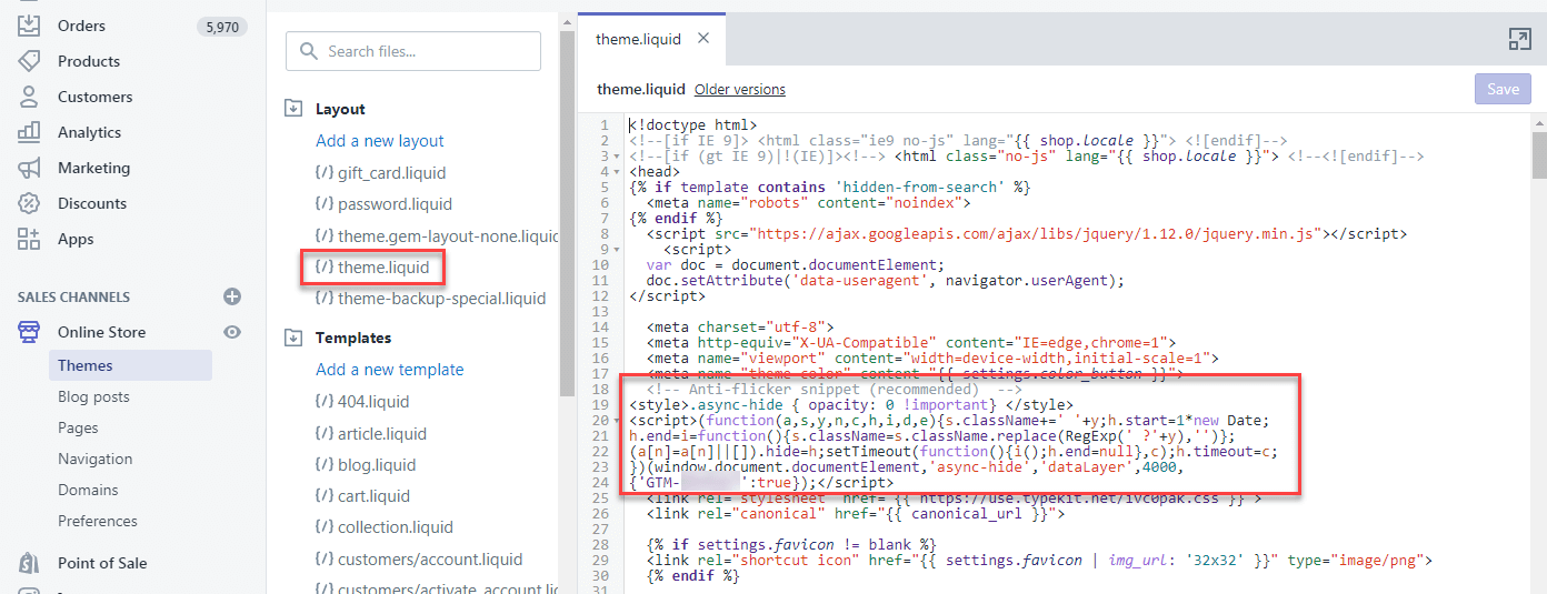
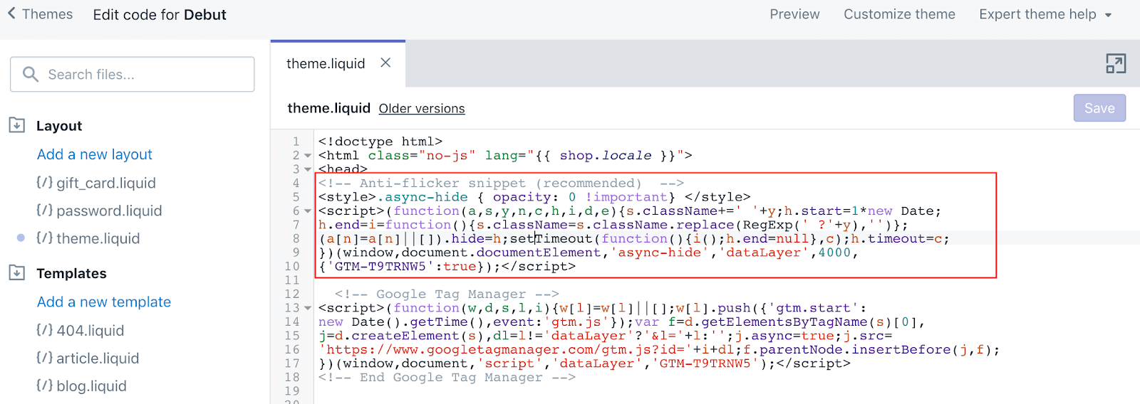
Step 4: Add the Google Optimize antiflicker snippet to the theme.liquid file

This step, even though it is not necessary for the test you wish to run is important to avoid page flickers when running tests on your website. This will block content from being displayed on the page until the variant is ready so that users don’t know the A/B test has begun.

If you are using Shopify Plus, insert this snippet into your head. Tag in theme.liquid or checkout.liquid

// <!– Anti-flicker snippet (recommended) –> <style>.async-hide { opacity: 0 !important} </style> <script>(function(a,s,y,n,c,h,i,d,e){s.className+=’ ‘+y;h.start=1*new Date; h.end=i=function(){s.className=s.className.replace(RegExp(‘ ?’+y),”)}; (a[n]=a[n]||[]).hide=h;setTimeout(function(){i();h.end=null},c);h.timeout=c; })(window,document.documentElement,’async-hide’,’dataLayer’,4000, {‘GTM_CONTAINER_ID‘:true});</script> //

how to insert google optimize snippet into shopify

This can also be used in your GTM:

ab testing shopify

This is to protect against any negative effects from FOOC.

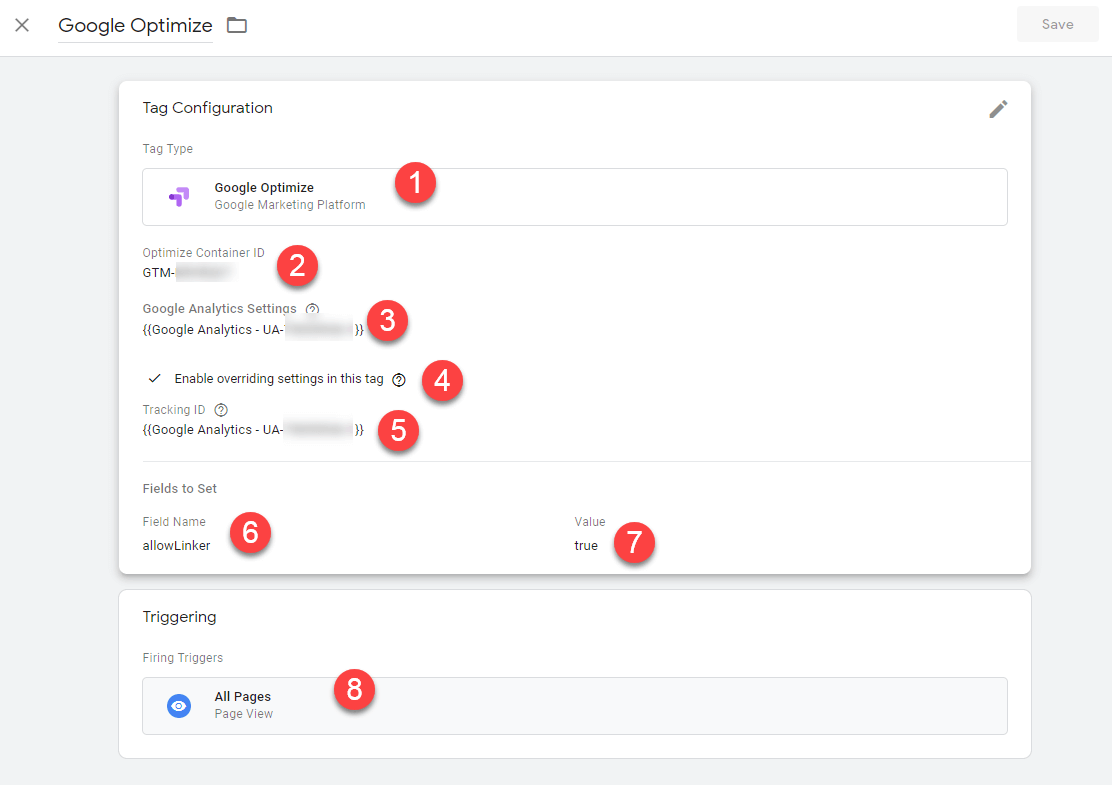
Step 5: Create Google Optimize in Google Tag Manager.

  1. Make a “New” tag.
  2. Select “Google Optimize”.
  3. Paste the Google Optimize Container ID in the “Optimize Container ID” box.
  4. Choose your “Google Analytics Setting” in the drop-down menu.
  5. Check the box that says “Enable overriding settings for this tag”.
  6. Add the Google Analytics Tracking ID variable.
  7. Select “More Options”.
  8. Enter “allowLinker” under “Fields To Set” and change the “Value” to “true”ю
  9. Set the trigger to “All Pages”.

When you are done, it should look this:

ab testing shopify

After all of this is done, save your Container and publish it.

You can now run a diagnostic test with Google Optimize on Shopify. As a confirmation, you will receive this message from Shopify:

ab testing shopify

Conclusion

Google Optimize for Shopify makes testing easy. However, for some experiments, you will need to copy the test snippet and paste it into Shopify. The tools do not manage the changes, so this could cause additional problems.

UAATEAM helps our clients to overcome these issues and ensure that their tests run smoothly. Contact us if you are already struggling with these issues. We will provide additional support to help you get through Shopify testing difficulties. To get in touch, please fill out the form.

25 best website design examples for Shopify

25 best website design examples for Shopify which converts

Are you looking for inspiration when designing your online store? Although there are many websites, many of them look and feel alike especially when you look at e-commerce websites.

It’s tempting not to be creative or to focus on the conversions but the best websites design strike the perfect balance between functionality and creativity.

These “Best Web Design” lists often include websites that are not only visually stunning but also slow and serve one purpose. We wanted to change the rules a bit. Our list will only include functional, beautiful websites that support successful businesses. These sites inspire on both the fundamentals and the flourish and they are equally easy to use.

Websites that are both creative and well-designed will power your business.

1. Magic Spoon

  • Category: Food & Beverage

25 best shopify design that converts

Magic Spoon’s flashy homepage feels almost like magic. You’ll be so taken with the design that you will forget you’re actually shopping for cereal. Magic Spoon is proof positive there are no boring products or boring brands. They continue to impress with illustrated packaging that features a vibrant color palette and charming details behind each click. Bran flakes, you can eat your heart’s content.

Magic Spoon: Why Magic Spoon converts

Orbit Media’s Web Design Standards shows that 80% of brands include a value proposition on their homepage. (We also refer to this as “above the fold,” which is the area of the screen the user sees before scrolling further down). Magic Spoon’s value proposition is “Healthy cereal that sounds too good to be true.” It is simple and direct, but it has a powerful impact. It sells healthy, delicious cereal. This is a significant difference since many healthy cereals taste bland and are often loaded with sugar.

2. Tweet

  • Category: Skincare

best shopify design converts

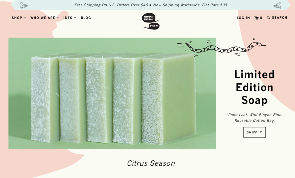
Meow Meow Tweet offers organic vegan skincare products that are low-waste. The brand’s website features simple product photography with fun illustrations and copy. The brand’s website also features fun content on product pages that educates shoppers about the products, their conscious design, and how to use them.

How to convert a Tweet from Meow Meow

Meow Meow Tweet makes shopping easy online and in-person. You will find a section of the main navigation that is dedicated to helping you locate its products. This page allows users to browse both physical and online locations around the globe.

3. Velasca

  • Category: Accessories, apparel, footwear and other accessories

best shopify web designs

Velasca sells Italian-made footwear and belts, as well as wallets, socks, and bags. The website reflects the humble but sophisticated customer it targets. You will find many photos of aspirational lifestyles if you scroll down. Animations add flair and approachability to the design. They also offer a little bit of interactivity to keep it interesting. It is both serious and fun.

Why Velasca converts?

Velasca shows others what Velasca has said about its products and brand. The homepage of Velasca features a quote from, praising Velasca and logos of prominent publications that have written about it. This lends credibility to Velasca’s claims regarding its products and builds trust with potential buyers. Velasca includes customer testimonials to demonstrate a diversity of voices.


4. Knowell

  • Category: Wellness and health

25 best shopify web designs

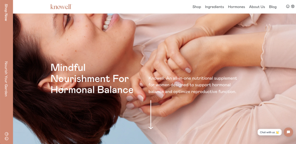
Knowell’s primary visual identity is the smiley face. You’ll find it all over their website in graphic illustrations. You can also see the words transform into smile shapes by hovering over the navigation bar at top. Although Knowell’s branding and website are fun and playful, the brand’s website is clean and simple. The Knowell website is both beautiful to look at and engaging to engage with. It has a balanced mix of photography, illustration, text and color blocks.

Why Knowell converts?

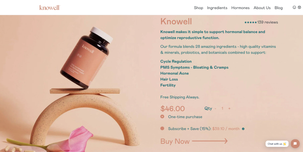
Knowell uses consistent graphic design to indicate clickability and buttons. CTA buttons appear to be shaped like a smile when they are activated. However, CTA “buttons” are actually arrows.

25 best shopify web designs

Knowell uses this design approach to train website visitors how to click on arrows. The arrow becomes larger once they reach the product page. There is also a large Buy Now button.

contact uaateam

5. Allbirds

  • Category: Footwear, apparel

25 best shopify designs that converts

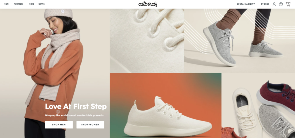
Allbirds sells shoes but its website has more than footwear. You will find inspirational stories about sustainability, high-quality photography, curated product lines, a store locator, and inspiring stories throughout. Even if you aren’t actively looking for shoes, Allbirds’ dedication to quality and attention to detail will appeal to you.

Allbirds converts

It’s becoming increasingly important for consumers to demonstrate how and why their brand is sustainable, as they are more inclined to environmentally conscious buying habits. Allbirds offers a glimpse into the manufacturing process of its sneakers. On its homepage, a visually appealing teaser video is displayed. A click will take users to a page which shows the manufacturing process. This page also includes information about its Forest Stewardship Council certification.

6. Gymshark

  • Category: Apparel

25 shopify designs that converts

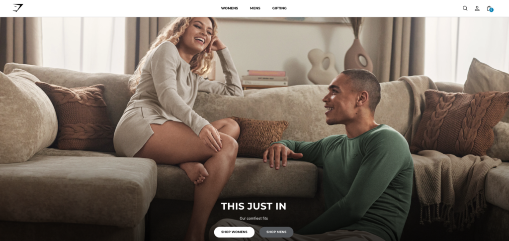
Gymshark’s website showcases its athletic apparel in a clean and professional manner. Gymshark offers more than clothing. It helps customers achieve their maximum potential and maximize their fitness potential. The digital fabric swatch is included with the lifestyle photos to highlight the details in the clothing’s design.

Why Gymshark converts?

Gymshark is a global company that sells to a large audience. It knows it must be able to accept a variety of payment options and ensure compliance. Klarna is one payment option that it offers. Klarna, a secure and direct payment option for Shopify Payments merchants in Austria and Germany, offers several payment options. Clearpay, Afterpay, gift cards, discounts for students, Clearpay and Clearpay are all available.

7. Keap

  • Category: Candles

25 besy shopify design examples

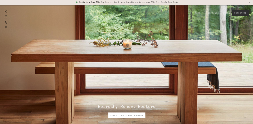
Keap might seem like a website for outdoor photographers at first glance. The website is simple and elegantly designed with an emphasis on nature-inspired imagery. Keap sells candles made from sustainably harvested woods and scents that are inspired by the natural world. It also has a Approach Page, which takes you behind the scenes in a beautifully executed video to show how the candles are made.

Why Keap converts?

The Keap website’s copy is as captivating as its imagery. The homepage’s main CTA button states, “Start your fragrance journey.” This is in contrast to generic options like “Explore products” and “View candles.” It also uses language that complements the imagery. It nods to the user’s journey when they visit the website and view the stunning photos. Users will also think Keap’s candles are a similar engaging journey, and those who are interested will likely make a purchase.

8. Harper Wilde

  • Intimate clothing

25 best shopify designs

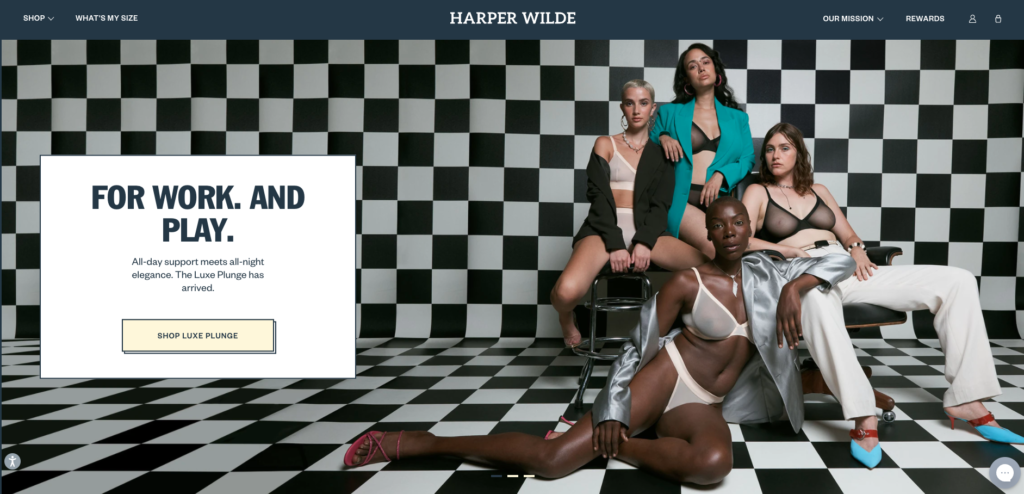
Harper Wilde’s bold fonts reflect its striking branding. It aims to challenge the status-quo in selling bras for women. Harper Wilde doesn’t use pink or sparkles, and instead of displaying models with perfect Photoshop work, its products are displayed on women of all shapes and colors. The site also offers an online measuring guide that will help customers find the right size.

Why Harper Wilde converts?

Harper Wilde is a brand that doesn’t hesitate to stand up for what is right. It has used corporate social responsibility (CSR), a branding strategy, and current events as a tool for conversion. It launched a limited edition bra that expresses its opinions about Texas’ abortion laws and donates to causes related to them.

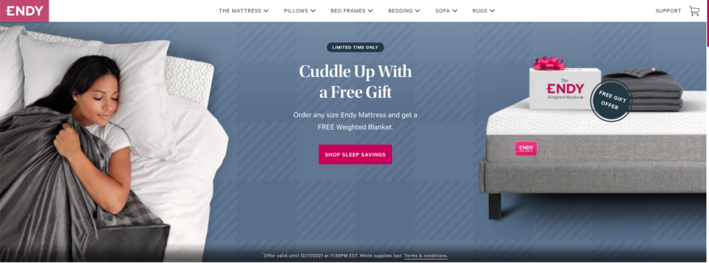
9. Endy

  • Category: Mattresses

25 best design examples shopify

Endy is bolder than most other mattress and sleep-related brands. Canada-based mattress retailer e-tailer, Endy, uses the industry-standard color blue, but adds bright pink headlines and CTA buttons. Clicking over to the product pages allows users to get up close and personal with the product. There are animated GIFs, detailed images and videos that highlight the best features. Endy should not be underestimated by competitors.

Why Endy converts?

According to Orbit Media’s web design standards, nearly a quarter (25%) of eCommerce websites have an email signup section in their footer. Endy is one. Users are prompted to sign up by a bright pink block at the bottom of this page.

10. Guava

  • Category: Baby gear and child gear
  • We caught our attention: TK
  • Final verdict:

25 best shopify design

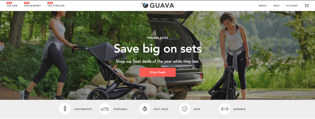
Guava’s website is very engaging, especially considering that it only sells three products. It is easy to navigate, has high-quality photography and a clear design with lots of whitespaces. This is especially important for busy parents.

Why Guava converts?

Guava recognizes its unique features and places them at the top of its website. Instead of focusing on the features, Guava emphasizes the end result or benefit to users. It is lightweight, portable and foldable, safe, durable, and easy to use. These are the key attributes that parents seek, especially when purchasing products for their children. To ease any hesitation, they offer free shipping as well as returns.

11. Bison Coolers

  • Category: Outdoor accessories

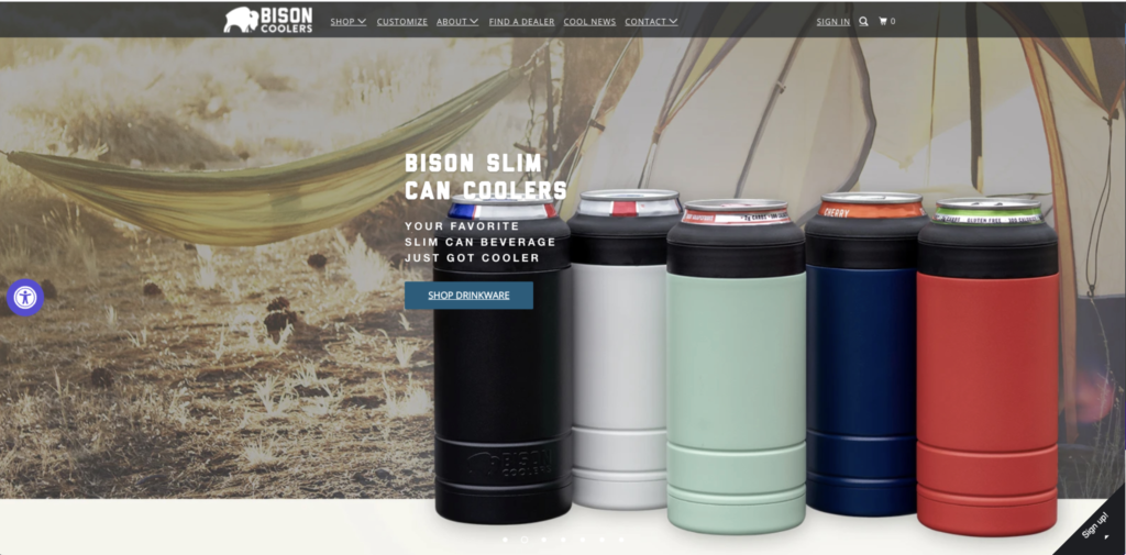
Bison Coolers sells ice chests and drinkware to keep your food and beverages fresh while you enjoy the outdoors. Its website is as strong as its products. The site features eye-catching headline copy, a brand voice, stunning background photography, and graphic design that is simple but powerful.

Why Bison Coolers converts?

Bison Coolers products were made in America, and the brand proudly boasts this fact throughout its website. The topic is even covered on a page. A survey found that 70% of Americans want products made in America. 20% are willing to pay more to get such products. Bison Coolers capitalizes on this conversion opportunity and highlights this feature of its product.

12. Heraldic Jewelry

  • Category: Jewel

25 best shopify design examples

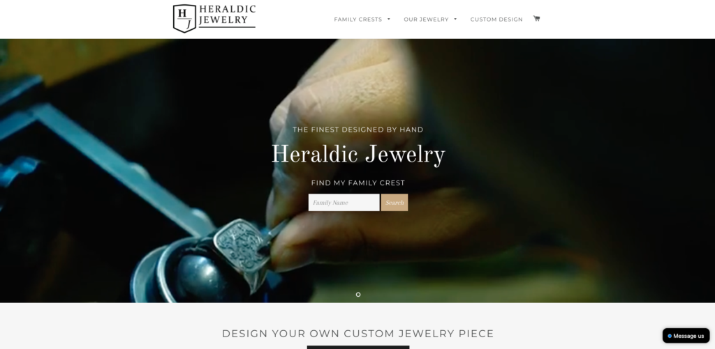
Heraldic Jewelry believes that beauty lies in the details, both for its products as well as its website design. Heraldic’s homepage has more than just a static image. It also features a series of beautifully shot videos that showcase how handcrafted pieces are made. This is just the beginning. Clicking around the site and scrolling will reveal more content about “how it’s manufactured”, a key value proposition for the brand.

Why Heraldic Jewelry converts?

The website is gorgeous, but it’s not very conversion-oriented. The Buy Now button is not located above the fold. To get a quote on their design, shoppers must request a consultation. It’s not an easy process. A person shopping for jewelry that is unique, such as a family crest, will likely conduct more research into the quality of the piece.

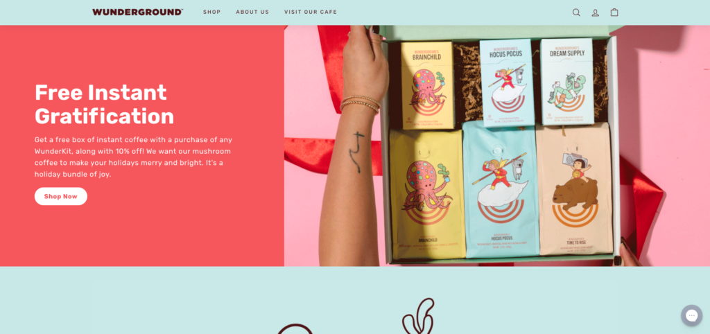
13. Wunderground Coffee

  • Category: Food & Beverage

25 best shopify designs

Wunderground, like many other top website designs, uses illustration to add personality and fun to its branding. Illustrations are used by the mushroom coffee seller to emphasize the benefits of its products as well as educate customers about what mushroom coffee is and how it can be cared for.

Why Wunderground converts?

25 best shopify web designs

Wunderground displays the discounted price for some products on its product collection pages. This tactic encourages users to go to product pages in search of discounted products since there is an expected deal at the destination.

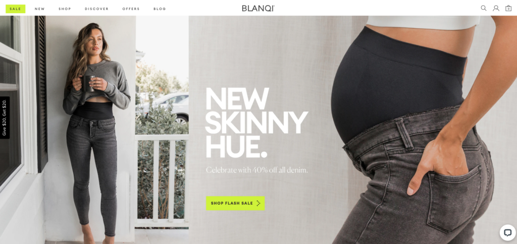
14. BLANQI

  • Category: Women’s clothing and maternity wear

25 best shopify web design examples

BLANQI sells maternity clothes and accessories through a beautiful website. BLANQI’s website is simple and uses subtle pops of color, refined white fonts, and large-format imagery. Although the website design and photography are simple, they are very BLANQI.

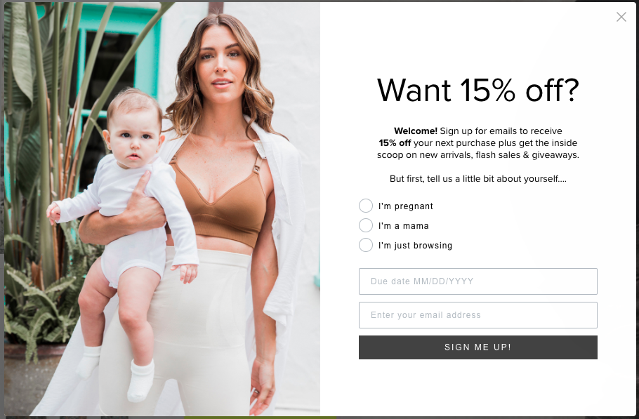
Why BLANQI converts?

25 best shopify designs

BLANQI is well-informed about its customers, as shown by the email signup. The brand requires users to provide some information about themselves. They’ll get more relevant content in return. BLANQI also has an email subscriber list that is segmented. 

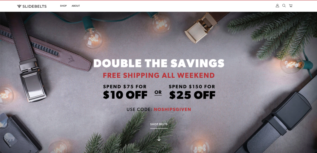
15. SlideBelts

  • Category: Accessory

25 best shopify website designs

SlideBelts sells, you guessed it, belts. Although it might seem like a luxury brand, more exploration shows that it is not. SlideBelts uses interactivity in a variety of ways throughout its website. SlideBelts’ homepage arrow is animated to encourage users to scroll down the page. Its About page is the best for creativity.

Why SlideBelts converts?

SlideBelts does not use interactivity or motion graphics to make it look great. These features are also used to increase conversions. Pop-ups or sliders show the benefits of the product and its features. It was so much fun to shop for belts!

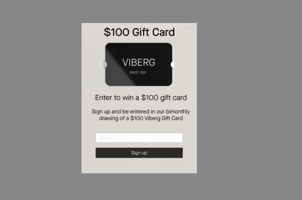
16. Viberg

  • Category: Shoes

25 shopify design that best converts

Viberg isn’t trying too hard. It lets the quality of its products speak for itself. It is the same with its website design approach. It doesn’t incorporate CTAs, content blocks, and interactive experiences on the site. Instead, it focuses instead on product imagery that speaks for its self.

Why Viberg converts?

25 best shopify design converts

It might seem difficult at first to see the path from purchase. Viberg offers a variety of products for users to browse between the large featured images. The beautiful imagery is replaced by product-oriented carousels, which take users to product pages. Viberg seems to believe that the average user has some brand buy-in. Therefore, the path to purchase is as short as possible. Viberg uses product pages to further educate its users.

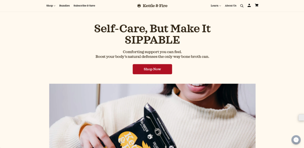
17. Kettle & Fire

  • Category: Food & Beverage

25 best shopify web design

Kettle & Fire’s website makes bone soup exciting. You’ll notice a typical layout for an eCommerce website above the fold. A few clicks and scrolls later, you’ll see that there is more to it. Kettle & Fire’s website features images of vegetables, which are key ingredients in its products. To bring out the fun, it uses humorous slogans such as “yummy in your stomach” and “warm you soul”.

Why Kettle & Fire converts?

Kettle & Fire offers a wide range of bone broths. Even though most people are familiar with the differences, choosing the right one can cause confusion and send shoppers running. Kettle & Fire has a quiz shoppers may take to determine which bone broth product is best for them. The brand also has key data about its visitors, which it can use for key business decisions.

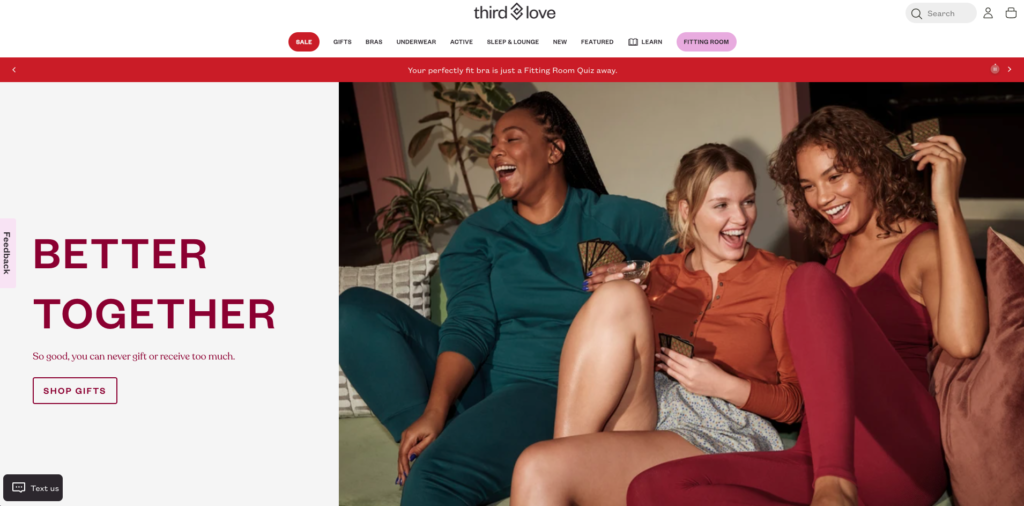
18. ThirdLove

  • Category Intimate clothing

best shopify web design

ThirdLove sells underwear and bras to women through its beautiful website. The website is well-balanced between text and lifestyle photography. Both the design and copy are very approachable. ThirdLove’s “fitting rooms” will guide users through a questionnaire to help them determine the right size. When you hover over navigation menus, beautiful imagery is revealed.

Why ThirdLove converts?

Many eCommerce websites require an email signup to receive a discount. ThirdLove skips this step and provides details about what subscribers can expect. ThirdLove emails subscribers about limited edition products and includes a countdown to the next drop. This creates urgency and provides an incentive for users to sign up.

These are some resources that will help you to create your email marketing strategy.

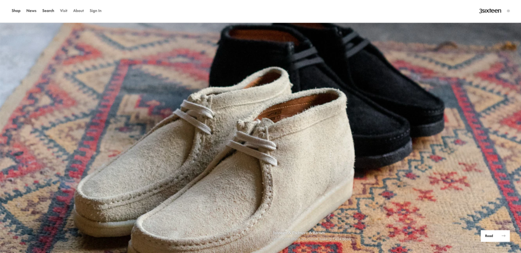
19. 3sixteen

  • Category: Men’s clothing

25 best shopify web design

3sixteen’s photos are stunning, and you may wonder if they’re a portfolio of photographers or an actual online shop. This menswear brand is the latter. This website features stunning product photography. It is also very well designed with lots of white space and a strong focus on the product.

Why 3sixteen converts?

3sixteen’s website may be driving online sales but it may also drive foot traffic to its NYC and LA retail shops. 3sixteen, in compliance with COVID-19, has made arrangements for customers to have a more enjoyable and safer in-person shopping experience. Shoppers can make 30-minute appointments to have the whole store to themselves. This is a truly memorable experience.


20. GREATS

  • Category: Footwear

25 best shopify web design

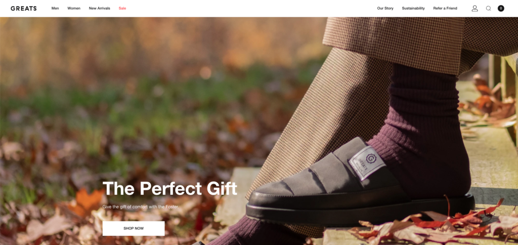
GREATS lets its photos speak for itself when designing its website. GREATS does not use a lot interactivity or hidden content. They stick to a simple approach. It clearly found its voice and created a friendly brand that is easy to get along with. The images showcase both product details as well as lifestyle shots.

Great reasons to convert to GREATS

Great Shopping offers three main benefits: free gift with purchase, free shipping and free returns The brand doesn’t hesitate to remind customers of this. These are great tools to reduce hesitancy or alleviate doubt among potential customers. Free shipping and a gift for every $150+ order can increase the average order value (AOV) and lower the cart abandonment rates. Free returns take a lot out of the buying process.

21. Studio Neat

  • Category: Products for Office

25 best convert design shopify

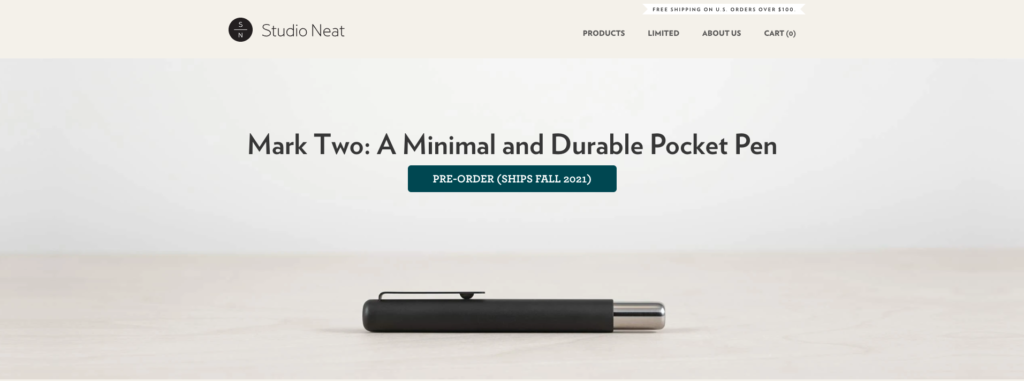
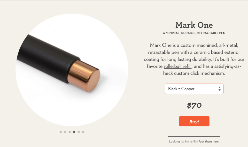
Studio Neat sells a limited number of products for the home. The brand clearly invests in high-quality product photos. These images are almost an illustration icon in the dropdown menu. The site is simple, elegant, and beautiful–just like its products.

Studio Neat is a great conversion:

Studio Neat uses the psychology of scarcity in order to drive online sales. Clicking on “Limited”, in the main navigation, takes you to a page that focuses exclusively on the current limited edition product. Studio Neat also includes a key conversion component: a countdown to the remaining quantity.

22. OLIPOP

  • Category: Food & Beverage

best shopify design that converts

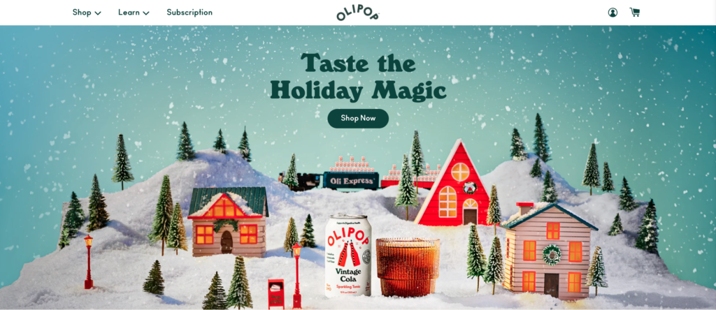
The website of OLIPOP is fun and clean, much like the soda. It uses its website to promote the soda’s healthy ingredients as well as how it is better than other carbonated beverages. Its photography is complemented by vibrant colors and a strong, but an approachable brand voice. It’s fun to look at, with headlines such as “Meet The Squad” and “We are all just bacteria babies.”

How OLIPOP converts?

OLIPOP offers gift certificates through its website, which is ideal for the upcoming holiday season. The gift cards can also be purchased digitally which lowers fulfillment costs and supports contactless commerce within a COVID-19 economic system.

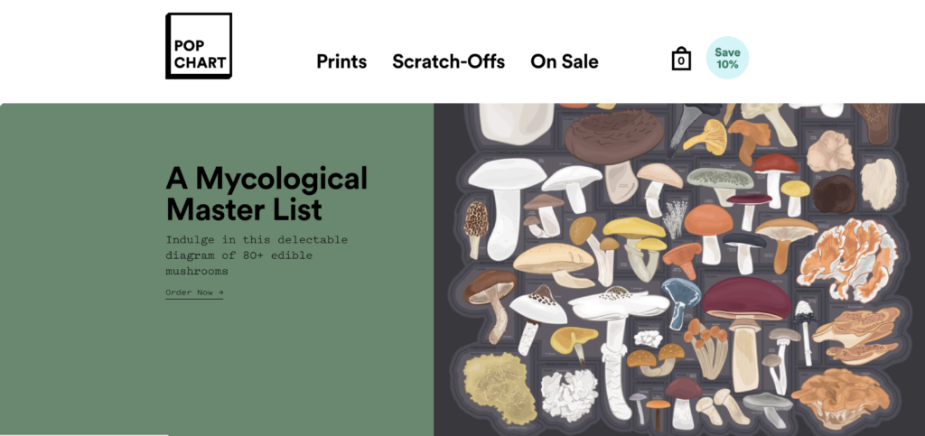
23. Pop Chart

  • Category: art

best shopify design

Pop Chart sells scratch-off and printed artworks. It’s not surprising that this design-focused brand also put a lot into its website design. Although it may seem straightforward, bold fonts and a simple background allow the products and artwork to take center stage. If you hover over a content block, you’ll notice a little interactivity. The block appears 3D and has a colorful shadow behind it. These little touches of humor make the website seem more fun to use.

Why pop chart converts?

Pop Chart is more than a direct-to-consumer business. It also offers wholesale. Scroll to the bottom of this page and you will see “Wholesale” in the footer. Pop Chart will return users’ information via a quick click. Wholesale is a great way to increase sales and expose your brand to new customers.

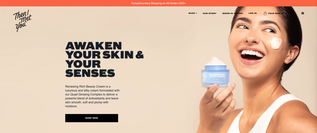
24. I Met You

  • Category: Skincare

the best shopify design that converts

The skincare products sold by “Then I Met You” are targeted at combating acne. The website is easy to navigate and lively. There are customer reviews and a message from Charlotte Cho. It is easy to navigate the website, which features bold text and a simple background. Although the website is simple, you can click on many places to expand to see more information. User-generated Content (UGC) adds authenticity to the brand’s community-rooted website.

Why I Met You converts?

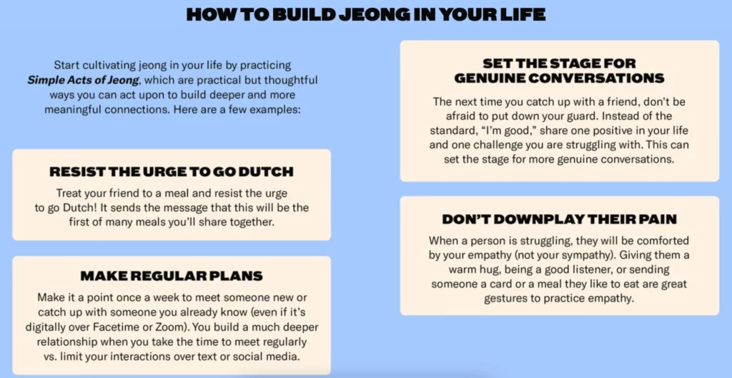
Jeong is a Korean value that is deeply rooted in community connections. The goal of “Then I Met You” is to create Jeong among its customers through its products and authentic community connections. It also has a page dedicated to Jeong. This page explains how the brand supports philanthropy as well as how customers can create Jeong in their own lives. It encourages sharing by giving gifts and encourages purchase.

best shopify design that converts

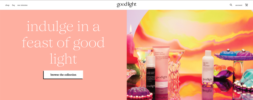
25. Good light beauty

best shopify design that converts

  • Category: Cosmetics and beauty

Good light’s website and branding are both elegantly understated and spirited. Beautiful photography is combined with clean fonts and subdued bright colors. The homepage features products that spin 360 degrees in animated GIFs. This allows you to distinguish what is usually a simple image.

Good light conversions

You’ll find a Text Us button in the lower-left corner of Good Light’s website. This button is where you would expect to see a live chat window. SMS text messages are the fastest way to contact over three-quarters of consumers. Additionally, SMS campaigns have a 99% average open rate. This channel is also a great way to reach a large audience.

4 most popular SEO problems with Shopify and their solutions

4 most popular SEO problems with Shopify and their solutions

Shopify is a widely used e-commerce platform that makes it easier for businesses to sell their products online. The easy-to-use CMS made the platform particularly profitable for small retailers during the pandemic, allowing them to recover about 94% of the profits that could have simply been lost due to quarantine restrictions.

As with any new website, a new Shopify store will require a lot of effort on the part of its webmaster to provide the necessary visibility for users to find the site, let alone convert users to customers. And, as with any other CMS, there are several SEO hurdles that store owners need to eliminate in order for their website to effectively find its audience.

LIMITED URL STRUCTURE

Shopify CMS allows you to divide product lists into two main categories – products and collections, along with more general posts, pages and blogs. Creating a new product on Shopify allows you to list individual items that you have for sale, while collections give you the ability to combine your disparate products and sort them into categories that are easy to find.

The problem most people face is that Shopify also provides a pre-defined hierarchical structure with limited customization options. The /product and /collection subfolders must be included in the URL of every new product or collection you upload.

Even though this is a huge bone of contention among users, Shopify has not yet solved this problem, and there is currently no solution. As a result, you will need to be extremely careful with the URL label (the only part that can be customized). Make sure you use the right keywords in the title, and classify your posts intelligently so that your products are best found.

AUTOMATICALLY GENERATED REPEATING CONTENT

Another unpleasant problem with classification occurs when people add a particular product to a collection. This is because, although there is already an URL for the product page, linking the product to a collection automatically creates an additional URL for it in the same collection.

Shopify automatically treats the collection URL-address as canonical for internal links, rather than as a product URL-address, which can make the task much more difficult when it comes to ensuring that the correct pages are indexed.

However, in this case, Shopify allowed the fixes, although this is due to editing the code in the back-end of your store’s theme. Following these instructions, the collection pages of your Shopify site will only point internal links to the canonical / product / URLs.

NO REDIRECTION AT THE END OF THE SLASH

Another problem with duplicating Shopify content is related to the trailing slash at the end of the URL used to indicate the catalog. Google treats URLs with and without slashes as unique pages. By default, Shopify automatically terminates an URL without a slash, but variations of the same URL with a slash at the end are available to both users and search engines. This can usually be avoided by applying a trailing slash redirect to the entire site via the website’s htaccess file, but Shopify does not allow access to the htaccess file.

Instead, Shopify recommends that SEO specialists use canonical tags to tell Google which version of each page is preferred for indexing. This is the only fix available at the moment, but it is far from perfect and often leads to problems with data attribution in Google Analytics and other tracking programs.

NO CONTROL OVER THE FILE ROBOTS.TXT ON THE SITE

In addition to forcing users to create duplicate versions of pages against their will, Shopify also prevents webmasters from manually editing the file robots.txt of the store. Apparently, Shopify sees this as a privilege, solving unpleasant technical SEO issues on your behalf. However, when products run out or collections disappear, you can’t use either noindex or nofollow for the remaining redundant pages.

In this case, you can edit the theme of your store by adding robot meta tags to the <head> section of each corresponding page. Shopify has created a step-by-step guide on how to hide duplicate pages from the search here.

Open->
to new

Start working with #UAATEAM

  • United States+1
  • Afghanistan (‫افغانستان‬‎)+93
  • Albania (Shqipëri)+355
  • Algeria (‫الجزائر‬‎)+213
  • American Samoa+1
  • Andorra+376
  • Angola+244
  • Anguilla+1
  • Antigua and Barbuda+1
  • Argentina+54
  • Armenia (Հայաստան)+374
  • Aruba+297
  • Australia+61
  • Austria (Österreich)+43
  • Azerbaijan (Azərbaycan)+994
  • Bahamas+1
  • Bahrain (‫البحرين‬‎)+973
  • Bangladesh (বাংলাদেশ)+880
  • Barbados+1
  • Belarus (Беларусь)+375
  • Belgium (België)+32
  • Belize+501
  • Benin (Bénin)+229
  • Bermuda+1
  • Bhutan (འབྲུག)+975
  • Bolivia+591
  • Bosnia and Herzegovina (Босна и Херцеговина)+387
  • Botswana+267
  • Brazil (Brasil)+55
  • British Indian Ocean Territory+246
  • British Virgin Islands+1
  • Brunei+673
  • Bulgaria (България)+359
  • Burkina Faso+226
  • Burundi (Uburundi)+257
  • Cambodia (កម្ពុជា)+855
  • Cameroon (Cameroun)+237
  • Canada+1
  • Cape Verde (Kabu Verdi)+238
  • Caribbean Netherlands+599
  • Cayman Islands+1
  • Central African Republic (République centrafricaine)+236
  • Chad (Tchad)+235
  • Chile+56
  • China (中国)+86
  • Christmas Island+61
  • Cocos (Keeling) Islands+61
  • Colombia+57
  • Comoros (‫جزر القمر‬‎)+269
  • Congo (DRC) (Jamhuri ya Kidemokrasia ya Kongo)+243
  • Congo (Republic) (Congo-Brazzaville)+242
  • Cook Islands+682
  • Costa Rica+506
  • Côte d’Ivoire+225
  • Croatia (Hrvatska)+385
  • Cuba+53
  • Curaçao+599
  • Cyprus (Κύπρος)+357
  • Czech Republic (Česká republika)+420
  • Denmark (Danmark)+45
  • Djibouti+253
  • Dominica+1
  • Dominican Republic (República Dominicana)+1
  • Ecuador+593
  • Egypt (‫مصر‬‎)+20
  • El Salvador+503
  • Equatorial Guinea (Guinea Ecuatorial)+240
  • Eritrea+291
  • Estonia (Eesti)+372
  • Ethiopia+251
  • Falkland Islands (Islas Malvinas)+500
  • Faroe Islands (Føroyar)+298
  • Fiji+679
  • Finland (Suomi)+358
  • France+33
  • French Guiana (Guyane française)+594
  • French Polynesia (Polynésie française)+689
  • Gabon+241
  • Gambia+220
  • Georgia (საქართველო)+995
  • Germany (Deutschland)+49
  • Ghana (Gaana)+233
  • Gibraltar+350
  • Greece (Ελλάδα)+30
  • Greenland (Kalaallit Nunaat)+299
  • Grenada+1
  • Guadeloupe+590
  • Guam+1
  • Guatemala+502
  • Guernsey+44
  • Guinea (Guinée)+224
  • Guinea-Bissau (Guiné Bissau)+245
  • Guyana+592
  • Haiti+509
  • Honduras+504
  • Hong Kong (香港)+852
  • Hungary (Magyarország)+36
  • Iceland (Ísland)+354
  • India (भारत)+91
  • Indonesia+62
  • Iran (‫ایران‬‎)+98
  • Iraq (‫العراق‬‎)+964
  • Ireland+353
  • Isle of Man+44
  • Israel (‫ישראל‬‎)+972
  • Italy (Italia)+39
  • Jamaica+1
  • Japan (日本)+81
  • Jersey+44
  • Jordan (‫الأردن‬‎)+962
  • Kazakhstan (Казахстан)+7
  • Kenya+254
  • Kiribati+686
  • Kosovo+383
  • Kuwait (‫الكويت‬‎)+965
  • Kyrgyzstan (Кыргызстан)+996
  • Laos (ລາວ)+856
  • Latvia (Latvija)+371
  • Lebanon (‫لبنان‬‎)+961
  • Lesotho+266
  • Liberia+231
  • Libya (‫ليبيا‬‎)+218
  • Liechtenstein+423
  • Lithuania (Lietuva)+370
  • Luxembourg+352
  • Macau (澳門)+853
  • Macedonia (FYROM) (Македонија)+389
  • Madagascar (Madagasikara)+261
  • Malawi+265
  • Malaysia+60
  • Maldives+960
  • Mali+223
  • Malta+356
  • Marshall Islands+692
  • Martinique+596
  • Mauritania (‫موريتانيا‬‎)+222
  • Mauritius (Moris)+230
  • Mayotte+262
  • Mexico (México)+52
  • Micronesia+691
  • Moldova (Republica Moldova)+373
  • Monaco+377
  • Mongolia (Монгол)+976
  • Montenegro (Crna Gora)+382
  • Montserrat+1
  • Morocco (‫المغرب‬‎)+212
  • Mozambique (Moçambique)+258
  • Myanmar (Burma) (မြန်မာ)+95
  • Namibia (Namibië)+264
  • Nauru+674
  • Nepal (नेपाल)+977
  • Netherlands (Nederland)+31
  • New Caledonia (Nouvelle-Calédonie)+687
  • New Zealand+64
  • Nicaragua+505
  • Niger (Nijar)+227
  • Nigeria+234
  • Niue+683
  • Norfolk Island+672
  • North Korea (조선 민주주의 인민 공화국)+850
  • Northern Mariana Islands+1
  • Norway (Norge)+47
  • Oman (‫عُمان‬‎)+968
  • Pakistan (‫پاکستان‬‎)+92
  • Palau+680
  • Palestine (‫فلسطين‬‎)+970
  • Panama (Panamá)+507
  • Papua New Guinea+675
  • Paraguay+595
  • Peru (Perú)+51
  • Philippines+63
  • Poland (Polska)+48
  • Portugal+351
  • Puerto Rico+1
  • Qatar (‫قطر‬‎)+974
  • Réunion (La Réunion)+262
  • Romania (România)+40
  • Russia (Россия)+7
  • Rwanda+250
  • Saint Barthélemy+590
  • Saint Helena+290
  • Saint Kitts and Nevis+1
  • Saint Lucia+1
  • Saint Martin (Saint-Martin (partie française))+590
  • Saint Pierre and Miquelon (Saint-Pierre-et-Miquelon)+508
  • Saint Vincent and the Grenadines+1
  • Samoa+685
  • San Marino+378
  • São Tomé and Príncipe (São Tomé e Príncipe)+239
  • Saudi Arabia (‫المملكة العربية السعودية‬‎)+966
  • Senegal (Sénégal)+221
  • Serbia (Србија)+381
  • Seychelles+248
  • Sierra Leone+232
  • Singapore+65
  • Sint Maarten+1
  • Slovakia (Slovensko)+421
  • Slovenia (Slovenija)+386
  • Solomon Islands+677
  • Somalia (Soomaaliya)+252
  • South Africa+27
  • South Korea (대한민국)+82
  • South Sudan (‫جنوب السودان‬‎)+211
  • Spain (España)+34
  • Sri Lanka (ශ්‍රී ලංකාව)+94
  • Sudan (‫السودان‬‎)+249
  • Suriname+597
  • Svalbard and Jan Mayen+47
  • Swaziland+268
  • Sweden (Sverige)+46
  • Switzerland (Schweiz)+41
  • Syria (‫سوريا‬‎)+963
  • Taiwan (台灣)+886
  • Tajikistan+992
  • Tanzania+255
  • Thailand (ไทย)+66
  • Timor-Leste+670
  • Togo+228
  • Tokelau+690
  • Tonga+676
  • Trinidad and Tobago+1
  • Tunisia (‫تونس‬‎)+216
  • Turkey (Türkiye)+90
  • Turkmenistan+993
  • Turks and Caicos Islands+1
  • Tuvalu+688
  • U.S. Virgin Islands+1
  • Uganda+256
  • Ukraine (Україна)+380
  • United Arab Emirates (‫الإمارات العربية المتحدة‬‎)+971
  • United Kingdom+44
  • United States+1
  • Uruguay+598
  • Uzbekistan (Oʻzbekiston)+998
  • Vanuatu+678
  • Vatican City (Città del Vaticano)+39
  • Venezuela+58
  • Vietnam (Việt Nam)+84
  • Wallis and Futuna (Wallis-et-Futuna)+681
  • Western Sahara (‫الصحراء الغربية‬‎)+212
  • Yemen (‫اليمن‬‎)+967
  • Zambia+260
  • Zimbabwe+263
  • Åland Islands+358
Select a Service:
Please fill in all required form fields