
case study
Conversion rate optimization for
software selling platform
SOFTMONSTR


Location
CIS

Start date
September 2020

Category
Soft

View
Website 
Task
- Keep the current ROAS;
- Increase the conversion rate from the site with the current traffic and the current budget;
Project features
- Work across the entire CIS;
- Google can sometimes ban products;

Google Analytics

Google Optimize

Hotjar
Tools and services
Project description
The client sells licensed software from the world's leading companies. Our task is to optimize the site and increase conversion.

Solution
Сonversion rate optimization for software selling website
For any online store, a good conversion rate optimization is one of the important points of marketing optimization. After all, most online marketing channels (i.e., traffic channels) generate traffic to the site and stimulate the user’s desire to buy a product. The final decision is made by the person already on the site.
For our client, we offered the CRO (conversion rate optimization) service to increase the number of sales and increase profits, while not adding to the budget or increasing the amount of traffic.
Сonversion rate optimization start
First of all, we analyzed the current state of the site and the data in analytics to understand what we have to work with and what weaknesses the website has.
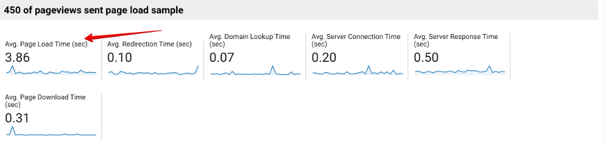
The first thing we noticed was the website loading time and the image loading speed. It was the weak point of the website, though it was not too low.
The average loading speed of the website was about 4 seconds, but for today’s situation, it is too much.
We also calculated the approximate benefit only from website acceleration:
On average, the website receives 300 sales of $59 each, which is $17,700 per month. If there are 30 more sales, the revenue will increase by $1,770.
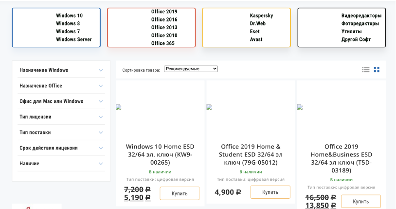
The next point that we noticed is the display of discounts on the website. This item was not explicitly indicated in any way and, most likely, it was not always clear to the user that a discount was offered:

Some products on the website are delivered by order in advance, but this is not shown in any way. For the product in stock and for the product by order in advance, there is the same “buy” button. When you click on this button for the product “by order in advance”, a callback form pops up and the client is negotiated regarding the purchase.

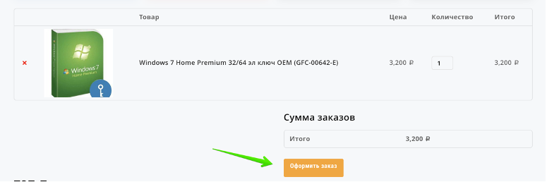
Changing the “place order” button should be aligned, and made clearer, and it is possible to experiment with the color and placement of the button:
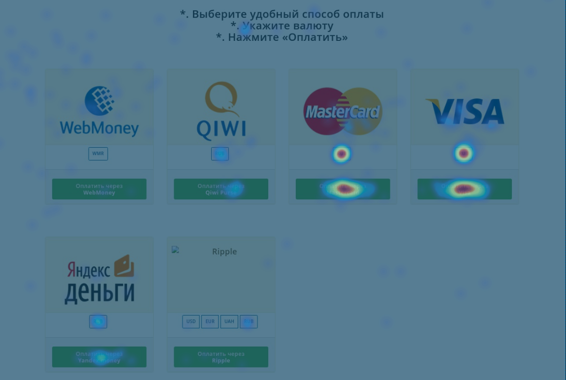
At the checkout stage, you must first select the currency and only then proceed to payment. But since the currency is the same for all payment options, you can simply remove this item and it will remove unnecessary clicks made by the user. This error is also clearly visible on the heat maps in Hotjar:
We also found a lot of bugs in the mobile version of the website, which affect the display of elements and, as a result, the conversion from mobile devices:


After we discussed with the client the main points of the project and the shortcomings, the indicators were recorded at the time of the start of work and the KPIs were set.
Some of the identified problems were immediately fixed by the developer on the client’s side, such as site loading speed, currency at the checkout stage, pop-up forms when calling buttons, and so on. Based on the most important points we noticed, we developed hypotheses about improvement and started testing.
For testing purposes, test versions of the pages were created using Google Optimize, and tests were run with a 50/50 traffic split between the original and test pages. Depending on the amount of traffic to a particular page, the test was faster or slower.
RESULTS OF THE EXPERIMENTS
Experiment with changing the display of the discount on the product.
Original version:

Test version:

Results of the experiment:
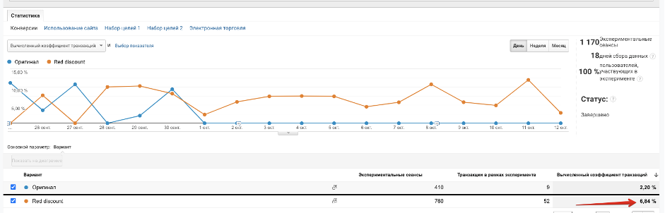
As you can see from the screenshot from Google Analytics, the test version showed a much better result in terms of conversion. For the old version, the conversion rate was 2.2%, and for the new version – 6.84%.
Experiment with changing the color of the “Buy” button
For the test, we changed the color of the “Buy” button to green. This color is often chosen for such buttons, as it is perceived better by users.
Test version:

Test results:
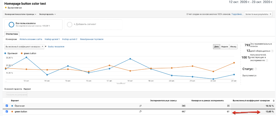
As you can see from the screenshot from Google Analytics, the conversion rate for the test version is 3.5% higher and the test version brought 2 times more orders just during the testing period.
Experiment with moving the order button on the product card
The results of the experiment with the product card showed that it is worth leaving both the “Buy” and “Add to cart” buttons, but they work much more effectively if you move them to the right:
Original:

Test version:

Results of the experiment:
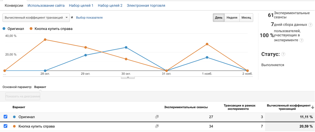
As you can see from the screenshot from Google Analytics, changing the position of the button on the product card led to a 2-fold increase in conversion in a fairly short period, from 11.11% to 20.50%.
+11%
Growth of the conversion rate
+30%
Profit growth
+18,5%
Growth in the number of orders
Results
Using analytics and heat maps, we developed theories and tested them in practice in test mode. As a result, the conversion of the site increased and sales increased.
View other cases
Optimizing the conversion rate for a Shopify store with a new page design.


Advertising for a luxury segment bathroom furniture store.

Setting up and launching advertising campaigns with further expansion of reach and optimization of the account. Focusing on account sales service.

Promotion of a cyber security company in Germany.


ARE YOU READY TO IMPROVE YOUR PROJECT WITH #UAATEAM?
We will be happy to discuss your project, along with your main goals and objectives. You can schedule a meeting with one of our managers.