+44 7727 978782
ua
Submit Request

How to boost your site’s conversion rate

How to boost your site’s conversion rate through page optimization

Let’s delve into the details: what impacts conversion, how it’s calculated, and what strategies can enhance the conversion rate on your website’s product pages.

OPTIMIZING SITE PAGES: ENHANCING EFFECTIVENESS AND BOOSTING CONVERSION RATE

It’s the elusive concept of “conversion” that preoccupies the minds of many online store owners, e-commerce entrepreneurs, and marketers, who often consider it a holy grail. But how does one achieve high conversion rates? Is it an economic miracle? Is it realistically achievable? And how do you even measure and improve it?

Let’s uncover the answers to these questions and outline a toolkit of techniques and approaches to effectively elevate the conversion rate for your website’s product pages.

UNDERSTANDING THE TERMINOLOGY: CONVERSION, CONVERSION RATE – WHAT ARE THEY AND WHAT DO THEY SIGNIFY?

First off, what exactly is conversion? While used across marketing, advertising, and sales, conversion essentially denotes the desired action a user takes on the Internet concerning your website or advertisement.

In advertising, conversion might refer to the clicks on a link within an ad relative to the total impressions. In the realm of online sales, conversion represents the proportion of visitors who take a specific action when visiting a product page out of the total number of visitors.

To simplify: if out of 100 visitors, 25 engage in actions like adding a product to the cart, registering on the site, or completing a purchase, then your conversion rate stands at 25/100 = 0.25 or 1/4 of all visitors.

For clarity in sales, the conversion rate, essentially the same ratio but expressed as a percentage, comes into play. Hence, the conversion rate formula reads as follows:

CR = (number of visitors who completed the target action / total number of page visitors) * 100%

It’s worth noting that there are various types of conversions, encompassing actions beyond immediate purchases. These include registering on the site, subscribing to newsletters, adding items to carts, initiating online chats with product managers, or providing contact details for future interactions. While these actions may not yield immediate profits, they contribute to eventual purchases, rendering them valuable to sellers and driving profits.

Typically, inquiries about the normal conversion rate for a website yield a somewhat vague response from platforms like Google, citing a range of 2 to 5%. This wide range underscores the importance of considering your specific business niche to gauge what constitutes a norm.

Another common query among website owners pertains to the calculation of “conversion.” With built-in statistical tools on your site, you can access pertinent information on page entries, unique users, and actions performed. Calculating the conversion rate becomes a matter of applying the same formula. Alternatively, Google Analytics offers accurate calculations should you encounter difficulties.

If the data obtained fails to inspire optimism, what steps can be taken? There exist several effective methods and tools for bolstering the conversion of product pages on your website. Let’s now delve into them.

ENHANCING CONVERSION THROUGH PAGE OPTIMIZATION:

How might a prospective customer be dissuaded from engaging with your product on your website? Common pitfalls encountered by owners and marketers include:

  1. Confusing site functionality: Visitors may feel bewildered if they can’t grasp essential information about the product or understand how to make a purchase.
  2. Irrelevant product positioning: Misaligned campaigns may lead to incorrect categorization or irrelevant descriptions, alienating potential buyers.
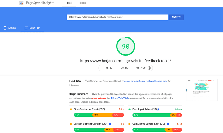
  3. Lack of mobile adaptation: Given the prevalence of smartphone usage, inadequately optimized sites for mobile devices risk losing potential sales. You can check your website with https://pagespeed.web.dev/ :
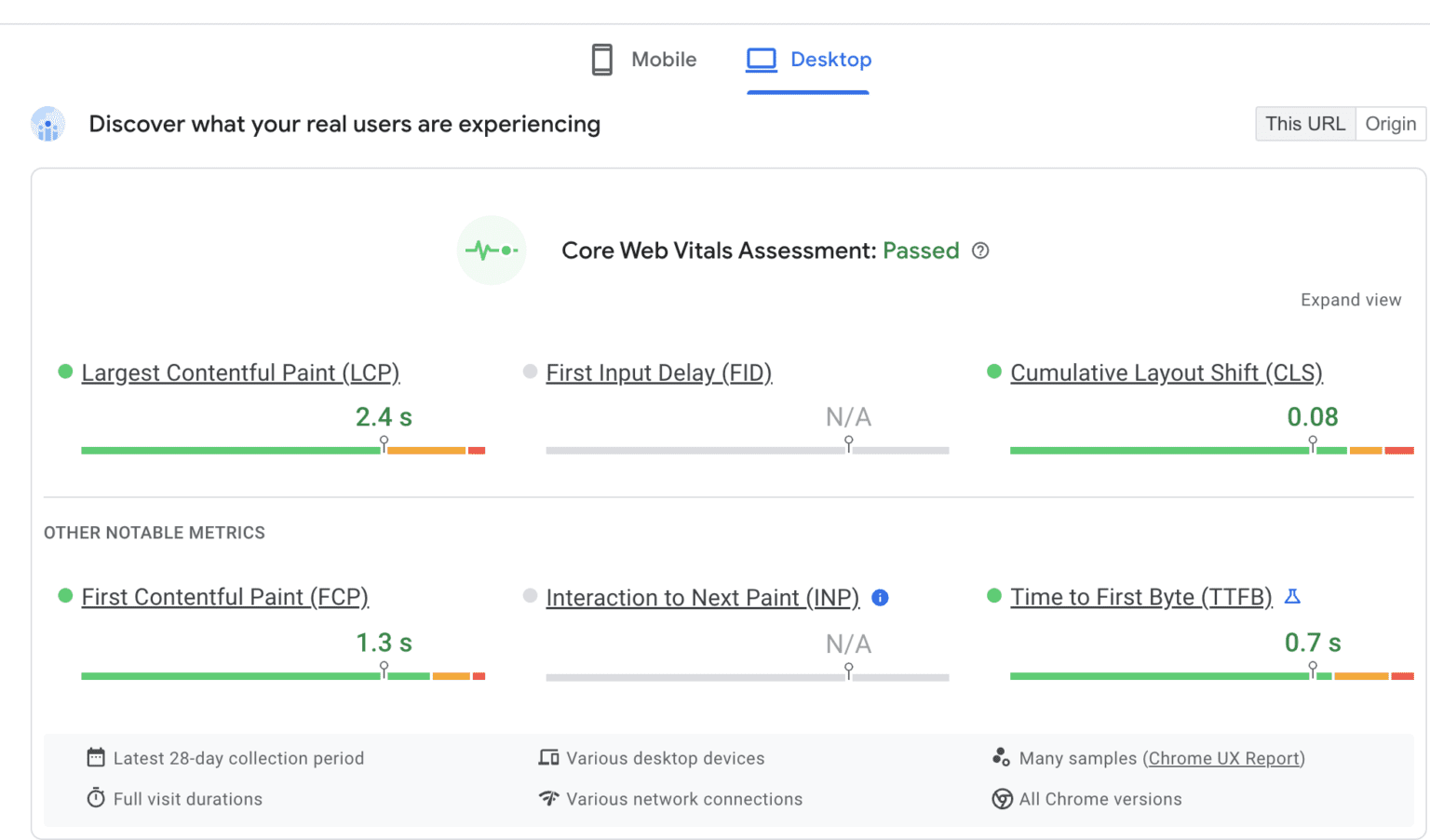
    How to boost your site's conversion rate
  4. Technical site errors: Broken links, faulty redirects, or poorly laid-out pages detract from the user experience and hinder purchases.
  5. Insufficient informative and motivational content: Detailed product descriptions, accompanied by high-quality visuals, are essential for informed purchasing decisions.

TO-DO LIST FOR BUSINESS OWNERS: AREAS FOR IMPROVING CONVERSION

What aspects of your site’s pages can be optimized to boost conversion? Consider this checklist to identify and rectify potential shortcomings:

  • The site and page design
  • User Experience (UX): ease of navigation and use
  • Unique and relevant content
  • Page loading speed
  • Mobile adaptability
  • Traffic sources
  • SEO technical issues
  • Advertising strategies
  • Search engine ranking

Let’s delve into strategies for optimizing each of these areas.

INFLUENTIAL METHODS: ENHANCING PRODUCT PAGES FOR HIGHER CONVERSIONS

How can you optimize your website and its pages to drive conversions?

  1. Evaluate site design and adherence to UX/UI principles for improved usability and a seamless purchasing experience.
  2. Prioritize technical site maintenance to rectify issues like broken links, faulty redirects, and other technical errors.
  3. Address page loading speed to ensure swift access, leveraging tools like Google’s PageSpeed Insights for optimization.
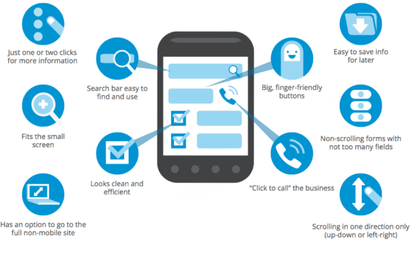
  4. Enhance mobile design and functionality to cater to users across various devices and browsers.
  5. Curate informative, unique, and SEO-optimized content, including detailed product descriptions and high-quality visuals. Ask for SEO audit to be sure you’re optimized.
  6. Implement comprehensive SEO strategies, encompassing on-page and off-page optimization, to boost search engine visibility.
  7. Tailor advertising campaigns and traffic sources to attract relevant, high-quality leads.

What are the outcomes of increased conversions? Elevating conversion rates yields several benefits:

  • Enhanced customer experience
  • Improved search engine visibility
  • Increased influx of targeted traffic
  • Augmented sales and profitability

When these outcomes align, potential customers discover your store through search engines, navigate effortlessly, and take desired actions, culminating in purchases and potentially even referrals.

In essence, conversion serves as a crucial metric for assessing the effectiveness of product pages, highlighting the importance of optimization efforts. By leveraging technical, contextual, and informational optimization techniques, you can unlock new levels of profitability while minimizing marketing costs. Conversion isn’t just a metric—it’s a roadmap to refining your website’s trajectory and maximizing sales potential.


Improve your conversion rate with optimized mobile version

Improve your conversion rate with mobile optimization

When conversion rates are low, it’s tempting to throw money at the problem in search of a quick solution. Resist this temptation, as the key to a higher conversion rate is not always to invest more money in advertising campaigns or a flashy new marketing initiative.

No, the solution is considerably simpler. Mobile optimization!

Beginning with the mobile experience of your website makes sense. More than 50% of Americans spend about 5-6 hours per day on their smartphones. They will likely access your website through their mobile devices. That is, your website must be prepared.

Below are our top four mobile conversion rate optimization recommendations. Follow them, and you’ll end up with a site that is clean, compelling, and focused on the customer – and ready to convert.

What does mobile optimization mean?

Mobile optimization is the process of customizing your website for users who access it via a mobile device, such as a smartphone or tablet, rather than a desktop computer.

It involves ensuring that the layout, structure, and content of your website are optimized for mobile devices. So why is this significant?

Consider the consequences of a website that is not mobile-optimized. The content appears misshapen or improperly sized. Elements on the page appear to have a life of their own; you must zoom in and out frantically to read the text on the screen.

The user experience (UX) is poor. Furthermore, it is detrimental to business. 57% of mobile users will not recommend a company with inadequate mobile optimization.

Inadequate mobile optimization, or its absence, results in a frustrated user. And frustrated users seldom convert to paying customers!

How to maximize conversion rate with a mobile optimization: 4 best tips

Prepared to maximize your conversion rates and make your website mobile-friendly simultaneously? Here are our four top tips for mobile optimization:

  • Provide a streamlined checkout process
  • Add product recommendations to the page
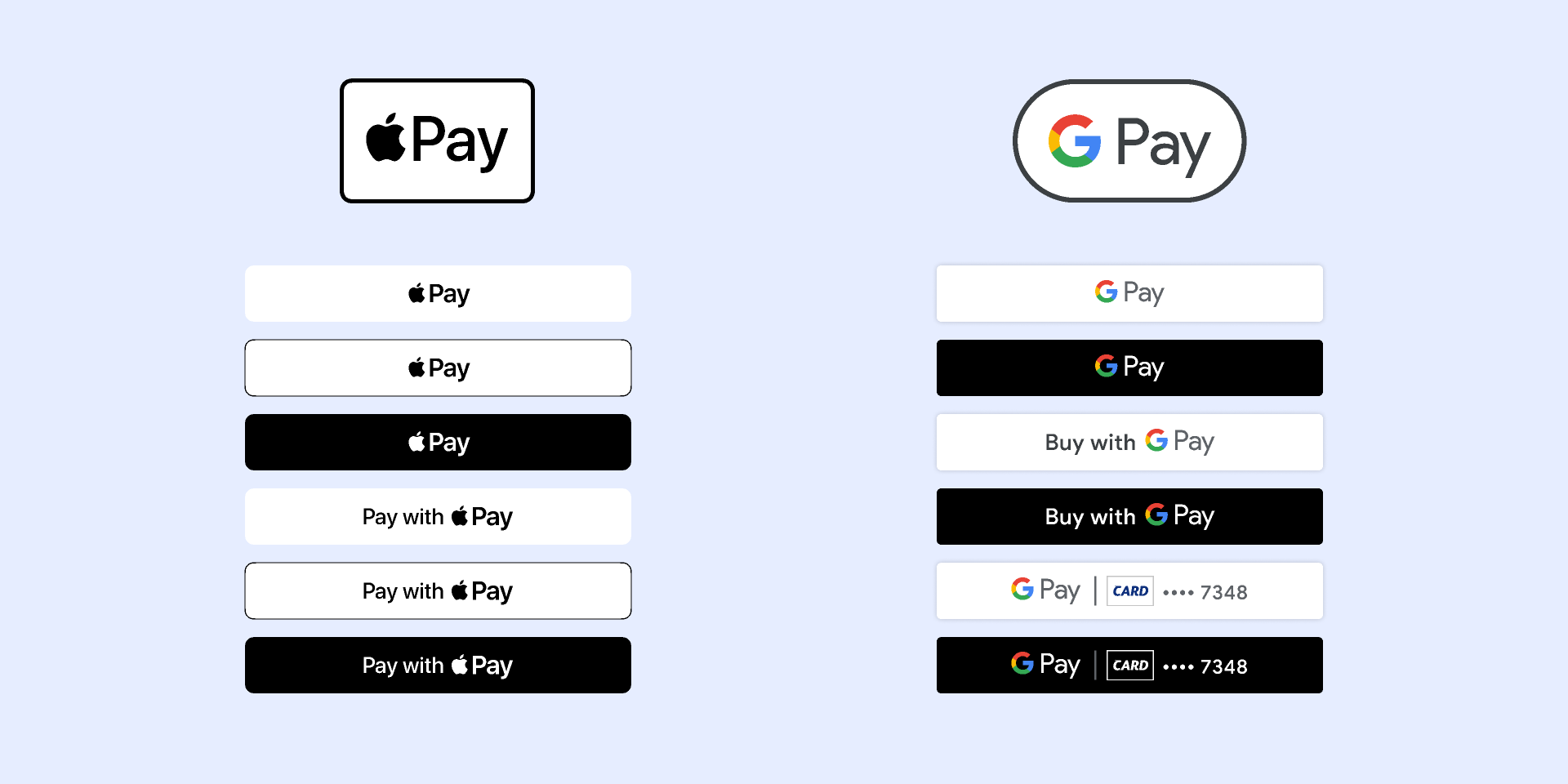
  • Offer more payment options.
  • Enhance your calls to action – and make them remarkable

improve your conversion rate with mobile version

Offer a clean and easy checkout process

The first way to increase conversion rates on your mobile site? Optimizing your checkout flow to provide a frictionless checkout experience.

How you accomplish this depends on how you constructed your website. However, a few general tips include:

  • Enabling guest checkout so that users are not deterred from purchasing by having to create an account.
  • Offering a variety of shipping options
  • Reducing the number of form fields (i.e., the depth of customer information required)
  • Displaying identification badges to increase consumer confidence.

Add Product Recommendations to the Page

Including product recommendations directly on the product page is a low-effort and high-impact action for mobile optimization.

On-page product recommendations could be products the customer has recently viewed or products that are comparable to the ones they are currently viewing. These will appear in the frame as the customer browses your store on their mobile device, allowing them to quickly and easily navigate to products of interest.

On-page product suggestions are excellent for UX. However, they are also beneficial to your conversion rates, as they remove one more obstacle to a customer making a purchase.

Provide additional payment options

Providing a variety of payment options is no longer a “nice-to-have” in the present day.

It is indispensable. It’s one of the most important decisions you’ll make for your website, along with selecting a web host and constructing your site on the most suitable platform.

Today’s consumers are more discerning than ever before. Many are skeptical of the online payment process, while others want it to be as streamlined, seamless, and quick as possible.

What’s your role? To ensure that your customers can use a variety of payment methods, including:

  • Mobile wallets: Google pay, Apple pay, etc.
  • Debit and credit cards.
  • PayPal wallet or app.

Millennials are particularly fond of the ease and convenience that mobile wallet payments provide. According to Statista, Generation Y accounts for 46% of digital or mobile wallet payments in the United States.

Also, you can target Generation Z by providing a “Buy Now, Pay Later” (BNPL) service. 55.1 percent of Gen Z consumers aged 14 and older in the United States will use a BNPL service at least once this year.

Enhance Your Calls-To-Action – And Their Visibility

To maximize conversions, compelling calls to action are required.

Therefore, take the time to evaluate the content, placement, and design of your website’s current calls to action. Are they:

  • Start with commanding verbs that generate interest and enthusiasm.
  • Develop a sense of urgency?
  • Demonstrate to the customer the advantages of taking action.

Remember that you are optimizing these CTAs for mobile devices. Consider your users and how they interact with your website. They are already on their phones, so how can you leverage this to improve your calls to action?

One tip is to use CTAs based on phone calls. Instead of asking them to fill out a lengthy contact form or send an email – both of which are more difficult to complete on a mobile device or while on the go – invite them to call with their questions.

Moreover, CTAs are not just about the text – what they say – but also about their appearance. Ensure that they stand out from the rest of the page’s content (you want people to realize they’re viewing a CTA, after all!). Utilize the effective simplicity of white space. And, if there is a button, ensure that it is large, bold, and screams “Click me!”

Summary

Mobile optimization will not only enhance the appearance, feel, and functionality of your website. It will boost your conversion rates and help you expand your online business. Your google ads campaigns or search engine optimization give you more results with a good optimized website.

Therefore, best of luck, and have a great time applying these tips. Mobile optimization is a complex and time-consuming process. But the result will be worth it – believe us!

Conversion funnels optimisation tips

Conversion funnels optimization tips

A clear understanding of your conversion funnels can be likened to having directions (or setting Google Maps up) to the place you want. Because you and your team can communicate in the same language, a good conversion funnel will help optimize your marketing efforts. Obsolete data will eliminate the anecdote-driven analysis that plagues many businesses.

This post will show you how to create your own conversion funnel. It’ll also demonstrate how to visualize it and analyze it. Let’s get started and map your funnel.

What is a Conversion Funnel?

conversion rate funnels

A conversion funnel simply describes the sequence of steps that a user must follow to convert. There may be multiple steps involved in the conversion process. You can buy something, open an account, or take any other action you wish.

Every product or website must have a unique funnel. This is how they view customer satisfaction and marketing. Users may not always follow your perfectly designed funnel and enter your funnel in unexpected ways.

Let’s try our best to create your funnel. There are many frameworks available online, but I prefer the Buyer’s Journey framework by Hubspot, which includes three stages: Awareness, Consideration, and Decision.

The stage of awareness is when a prospect (or potential customer) is researching the best solution to their problem. Consideration is when they commit to solving their problem. The decision is when they are weighing all options and are ready to buy. Prospects may move back and forth between these stages as they gain more information.

Visualizing and Analyzing your Conversion Funnel

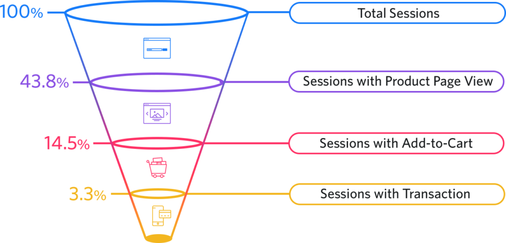
You can visualize your funnel in analytics data to see where users are dropping off, and then choose a strategy (our next section).

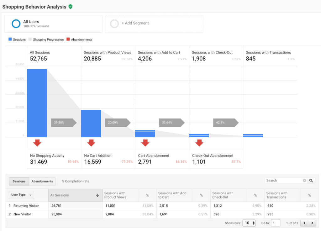
This section’s goal is to produce a report similar to this one.

You can see the conversion funnel and the dropoffs. We could also segment the funnel by different dimensions, e.g. country, city, browser, device, marketing campaign, etc.

To track the correct data, you will need to collaborate with your engineering team. However, it will likely include a combination of analytics events as well as user attributes. You will find below links that provide more information about which popular tools can visualize this report. I’ll also show you how it is done within Google Analytics and Amplitude.

How to Analyze your Conversion Funnel with Google Analytics

Google Analytics is capable of many things, but funnels are one of its major weaknesses, especially the free version. There are two types of funnels in GA.

You create the goal completion manually by creating the funnel attached. Although it does the job, the data can be confusing, especially if users have the ability to enter your funnel at any stage.

The ecommerce checkout behavior is the second and most preferred option. It is intended for ecommerce shops, but it could be used for any type of sales funnel.

This will allow you to create a funnel by using advanced segments. These funnels must be created in advance and can’t be modified once they are established. This is a small price to pay for the flexibility that Amplitude offers when creating funnels.

We can now look at 3 strategies to optimize your conversion funnel once we have the data.

3 Strategies for Conversion Funnel Optimization

Now you have created your conversion funnel. You visualized it with your favorite analytics tool. Now you can optimize your conversion funnel to increase conversion rates. Although it may seem like there are endless possibilities, you can organize them into three main strategies.

1. Locate Outlier Segments

First, you need to identify customer segments that convert at higher rates than the average. It is possible that users who are referred to you via email marketing convert at a higher rate than those who are referred through social media ads. This is where it’s crucial to have the right data as it will allow you to break down your funnel into possible segments.

After you have identified a segment, it is important to ensure that there is a strong correlation between your results and the conversion rates. This can be confirmed by running additional A/B tests and gathering data. Communication such as cart abandonment email is another area that can be used.

This strategy is great because it allows you to tap into what is already working well and then double down.

2. Fix the Biggest Holes

The second strategy is to address the most serious problems or drop-offs. It is possible that half of your users abandon their carts after adding an item to them. This could be because of technical issues, or a lack of trust in your landing page or website.

I would pay particular attention to the dropoff rates at bottom of the funnel. If a user is already in the checkout process and has committed to buying something, high dropoff rates would alarm them.

A common problem I’ve seen in some companies is their refusal to disclose pricing, terms, or caveats. They hope the momentum will help the user move forward. You’re not giving the user the right information if they are shocked at the end of your funnel.

This strategy can make a big difference in your conversion rate, especially if you have not audited the site’s feel and performance to “regular” users.

3. Eliminate Steps

The final strategy is to eliminate all steps from your funnel. The general rule of thumb is that fewer steps will increase your overall conversion rate. Although this is not always true, it’s a good rule of thumb to reduce or eliminate steps.

Amazon’s “1-Click checkout” option for some products is one of my favorites. Some users, like myself, know that they want the product or service. I prefer to avoid extra steps because Amazon knows my defaults for shipping and payment.

Analyzing your conversion funnel does not have to be complicated.
There are a few strategies, but it is important to ensure that your testing is done correctly. This includes designing the right A/B tests and properly reading the data.

These 30+ website optimization tools will help you grow your website

These 30+ website optimization tools will help you grow your website

To sustain long-term growth, it is crucial to continuously optimize your website. Your most important weapon in the fight for visitors and conversions is your ability constantly to improve your website. User expectations and the competition change, so you need to be able to continuously update your website.

It’s like taking your website to the next level. You’ve already spent a lot of time building it, now it’s time for optimization. This will keep you ahead of the rest and allow you to achieve iterative growth.

This guide will help you find the best website optimization tools, along with two additional tips that may surprise you.

What is website optimization?

Website optimization is the process of optimizing your website’s user experience (UX), accessibility and search performance and making changes to improve traffic and conversions. Website optimization can be achieved using a variety of tools and strategies such as search engine optimization (SEO), conversion rates optimization (CRO), mobile browsing optimization, page speed improvement and many others.

Top 7 Free Website Optimization Tools That Work in 2022 (And Beyond)

1. PageSpeed Insights

What it is: created by Google, PageSpeed Insights is a simple, free website speed checker.

What can you optimize? Website page speed, desktop website performance and mobile page speed.

Use it: Enter any URL and then click “Analyze”. PageSpeed Insights will give you a score of 100 for your site’s speed and make suggestions to improve it.

2. Hotjar


What it is: Hotjar is behavior analytics software that measures website visitor interactions and feedback.

What can you optimize? Find and fix bugs, optimize pages for conversion rate, improve UX.

Use it: Sign up and add the Hotjar tracking code to your website. You’ll start recording sessions and generate heatmaps. To get user feedback, set up a survey. Hotjar is completely free for 35 sessions/day, and 3 surveys .

3. Google Search Console (GSC)

What it is: Search Console is a free search optimization tool from Google.

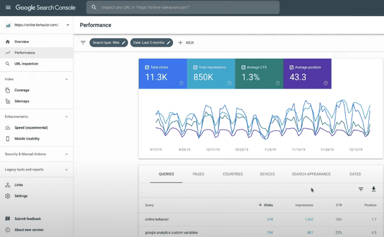
What can you optimize? You can measure your SEO performance, view keyword clicks and impressions, check your backlinks and look for crawling or speed errors.

Use it: Sign in with your Google account to verify site ownership and wait for data.

4. Screaming Frog

What it is: Screaming Frog is website crawling software for PC, Mac, or Linux.

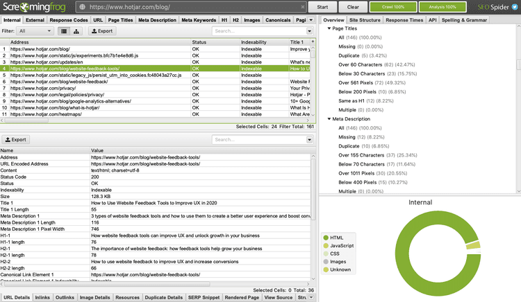
What can you optimize: On-page and technical SEO – find broken links, check HTML sitemaps and XML sitemaps. Find duplicate content, check redirects and analyze page titles.

Use it: Download Screaming Frog, and then enter a URL (or sitemap) to begin crawling. Screaming Frog can be used for up to 500 URLs.

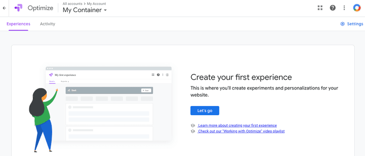
5. Google Optimize

What it is: Google Optimize is a free website experiment platform that integrates with Google Analytics.

You can optimize Use A/B Testing, Split Testing, and Multivariate Testing (MVT), to test different pages and determine their performance. To use it, sign up with Google Optimize using your Google account. After creating page variants, add the tag and install the Chrome extension.

Did You Know? The Hotjar integration with Google Optimize automatically detects when visitors enter an Optimize experiment. You can filter Hotjar sessions by Optimize experiment ID to see how visitors scroll, click and browse each test page.

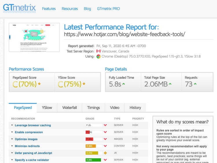
6. GTmetrix

What it is: GTMetrix is a web page speed tool.

How to optimize Page load speed

Use it: Enter any URL and click “Test Your Site” to run a speed test. To learn how to speed up your site’s loading time, click the drop-down next to each recommendation.

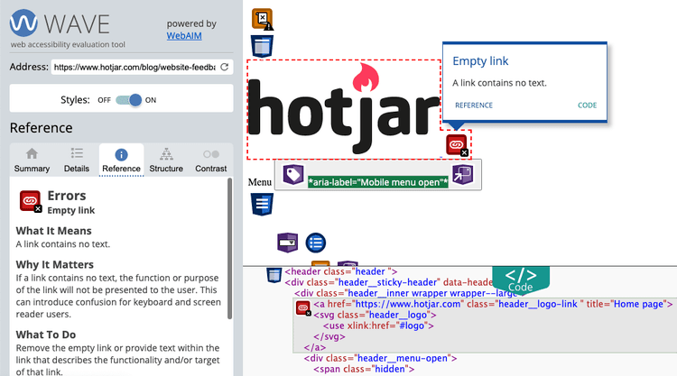
7. WAVE

What it is: WAVE is a web accessibility evaluation tool.

What can you optimize? Find accessibility issues such as missing alt text, small font size, or contrast errors that render your content unaccessible for screen readers. Use it: Enter any URL and scroll through the icons-coded errors to find out what you can change and why accessibility is so important.

You don’t have to spend a lot of money to optimize your website. Now you are ready to play with some of the tools that we have just mentioned.

If you’re interested in optimizing a particular area of your website, such as making it load faster or finding new keywords for blog posts, here are some examples of the various types of web optimization that you can use and additional tools that can help you do the job.

Six types of website optimization tools

Website optimization is a huge topic. However, the tools that you can use fall under six main categories.

  1. Page speed
  2. Search engine optimization
  3. User experience (UX),
  4. Conversion rate optimization (CRO)
  5. Mobile-first
  6. Accessibility

You can use some tools to work on multiple areas at once. Hotjar, for example, can help improve UX on mobile and desktop. However, you will need to use multiple tools to optimize your entire site.

It’s like an optimization ecosystem. If you increase your website speed, it will also improve your SEO, UX and CRO efforts. The tools below will help you a lot if your focus is on improving your website.

1. Web page speed tools

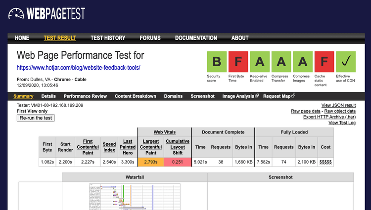
An example of a web page test on WEBPAGETEST

Slow websites can cause users to leave and harm search engine rankings. Website speed tools won’t fix slow websites by themselves. However, they will measure site speed and show what is slowing it down.

  • Reduce and compress HTML, CSS, JavaScript and images
  • Caching content
  • Use faster-hosting servers

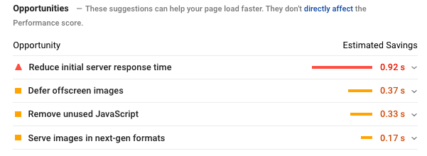
Speed improvement suggestions from Google Pagespeed Insights 

Popular Website Speed Optimization Tools

Are you using WordPress? These popular optimization plugins will speed up your website:

2. SEO tools

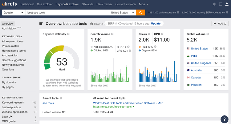
A keyword analysis dashboard from Ahrefs

SEO (search engine optimization), can help you receive more website traffic via search engines such as Google and Bing. You can optimize everything, from the structure of your website to how well you rank for specific keywords. There are many SEO tools available.

  • Technical SEO Tools to audit on-page SEO (such as checking meta robots tags and 404 links).
  • Keyword research tools to find keyword ideas
  • Rank tracking to measure and compare search Traffic and show you where your site ranks within the SERPs for target keyword phrases
  • Content optimization tools to optimize for target keywords
  • Backlink analysis tool to check which pages link back to your site (or those of your competitors).
  • Video SEO Tools to optimize your videos for high ranking on sites such as YouTube

There are two types of SEO tools: one-purpose tools like Screaming Frog, which is a technical SEO tool, and all-in-one tools like Ahrefs that do everything.

Most popular SEO tools

WordPress: These SEO plugins will help you optimize your WordPress site.


3. Tools for UX optimization

A great UX (user experience), will keep your visitors happy, and lower friction to your site. This will ultimately lead to higher conversions and more revenue.

While UX optimization tools won’t magically improve user experience, usability tests will help to understand user behavior and diagnose issues so that you can optimize pages for people to continue browsing and purchasing from your site.

UX tools assist with every step of the page optimization process, from finding where users get stuck to user research to spotting problems.

The most popular UX optimization tools

Read the bonus: Heatmaps are a very popular tool for UX optimization. They show how visitors interact with specific page elements. 

4. Tools for CRO

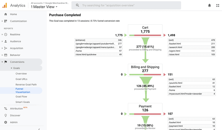
An eCommerce funnel visualization on Google Analytics

CRO (conversion rate optimization), can increase your website visitors who become customers or perform any other desired action.

A combination of several tools can improve your conversion rate.

  • Traditional analytics ( tools such as Google Analytics).
  • Software for behavior analytics (tools such as heatmaps session recordings or on-site surveys)
  • Test tools (e.g. Google Optimize

Get a complete view of your site to help you give people the information they need.

Popular CRO tools

5. Mobile optimization tools

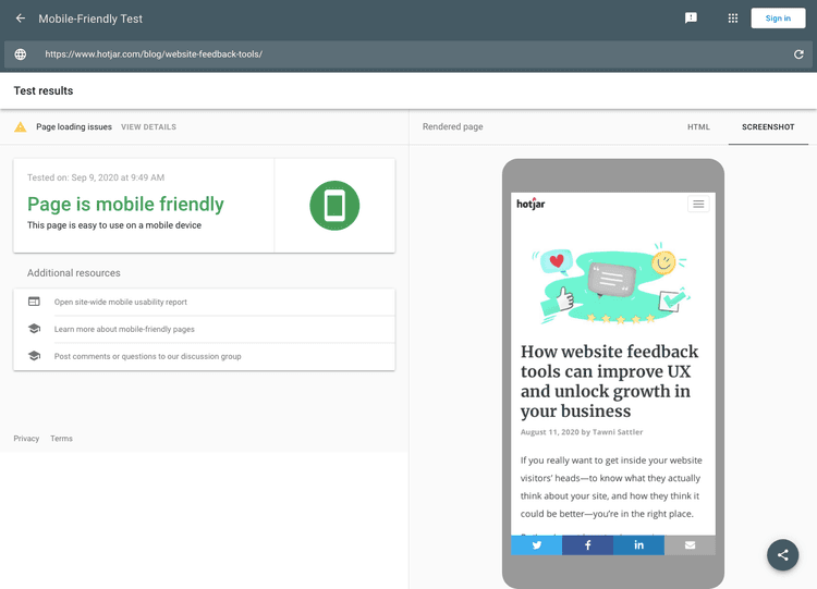
A Google mobile-friendly test results page

Mobile is more popular than desktop browsers, so mobile-first SEO can help you make sure that your website works well on mobile devices. Your site can be difficult to navigate on mobile with web elements such as pop-ups and image-heavy pages.

However, generalizations can be misleading. Check your analytics data to see what percentage of your customers and users browse on mobile devices. This will help you understand how important mobile optimization for your business is.

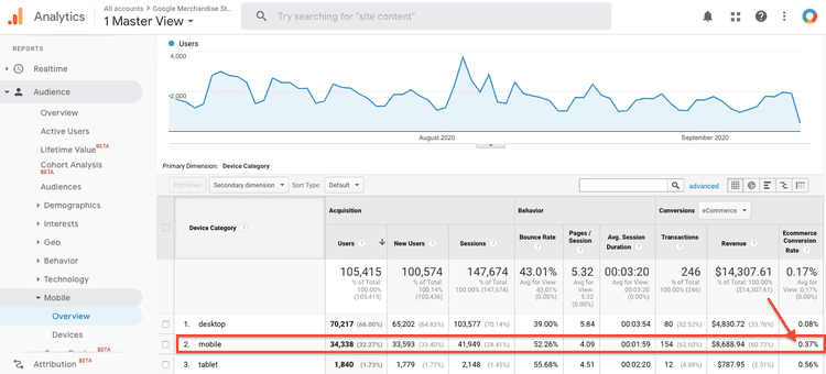
For example, if you use Google Analytics, the Audience >Mobile > Overview report is recommended.

Google Analytics data showing high eCommerce conversion rate for mobile users

Mobile optimization tools that are popular

6. Accessibility tools

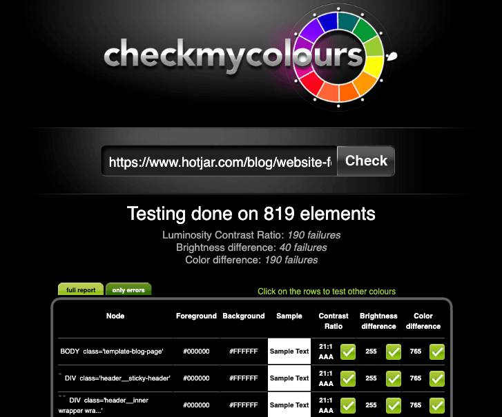
A website color contrast test on Checkmycolors 

A website that is accessible is simple to use – which is great for both you and your customers.

Accessibility tools allow you to see how landing pages appear to screen readers or people with different impairments (for instance, different types and colors of colorblindness). They also provide suggestions for making your website more accessible.

Popular tools for accessibility optimization

Inclusion does not mean designing for everyone. It means designing for everyone. It is possible to capture more of the consumer market by including, learning from, and working with people from different perspectives. 

– Ilana Davis, Shopify & Squarespace consultant

Two core strategies for website optimization that work every time

We’ve already listed over 30 web optimization tools you can use to increase your website traffic and generate more revenue. There are many more from which they came. But it’s not from any tool. Although you have the same optimization tools as your competitors, one thing is unique to you: how your customers behave on your website. The tool(s), you use to improve your website, is only a tool. It’s not the end in itself.

1. Session recordings allow you to observe real user behavior

Even if you have the fastest website on the planet, and rank high for your target keywords, no amount of speed or search engine optimization “best practices” will help you understand what your users do on your site or how they experience its pages.

Session recordings will help you understand how users navigate your website. You will see frustrated clicking, learn how to spot and fix web bugs, and gain a clear view of what your website needs.

2. Use surveys and feedback widgets to get input from your users

There’s one extremely valuable optimization resource that only you have access to: your customers .

You can receive feedback from customers or users in a variety of ways:

  • NPS
  • On-site surveys
  • Survey invitation link for off-site: Send a survey invite link directly to your customers or email subscribers so that they can respond in their own time

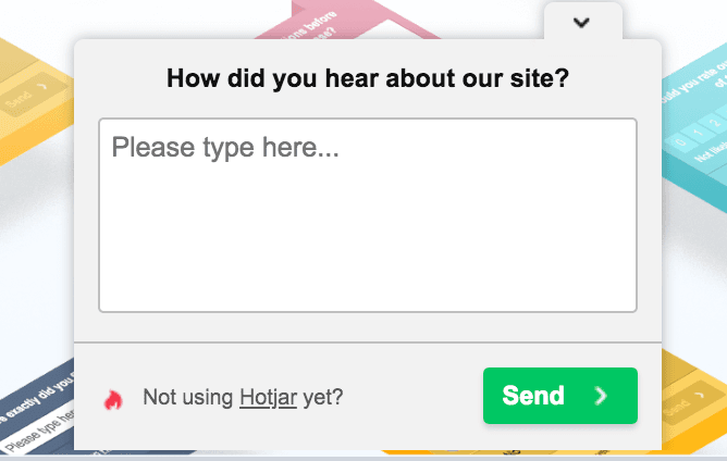
Feedback widgets such as Incoming feedback allow users to express their love or hate for your page. Users can click on any element and add a comment.

Heatmap Apps to Increase Shopify Store Conversions

Heatmap Apps to Increase Shopify Store Conversions

Shopify is a popular platform to host e-commerce websites. There is not much information available about optimizing Shopify-hosted E-commerce sites from the client side. Sometimes, you might need to understand how visitors navigate your website, what catches their attention, and what draws them away. You’ll find the right tool with a heatmap.

What is a Heatmap?

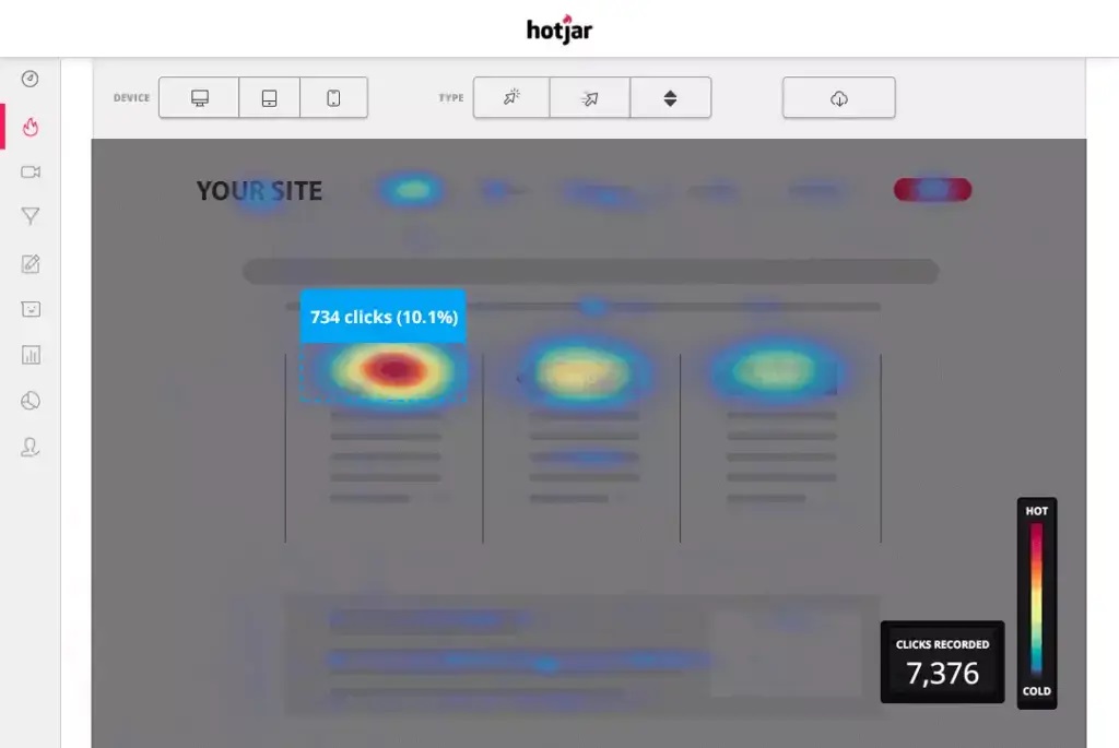
Heatmaps show where most visitors clicked, browsed, and returned to. Scroll heatmaps show how far visitors have traveled before leaving, as well as whether or not they reached your top products or CTAs.

These heatmap tools can help you analyze website issues and make adjustments to improve customer experience and convert more customers. This will help you identify the areas that are most popular with customers in your Shopify store.

Here’s a list of heat map-generators that can help optimize your store. Let’s get started!

Heatmaps have many benefits

Let’s look at how heatmaps can help Shopify shop optimization.

Instant Overview

Heatmaps, despite having other analytics benefits, are able to immediately alert you to any serious issues on your website.

Heatmaps that display clicking habits of your users are available by clicking here. Scroll heatmaps show your pages’ average visibility. Heatmaps of user interaction reveal the areas that are most attractive to visitors. Heatmaps that track mouse movements are used to track them. Geo heatmaps, which show users’ locations in pseudonymous ways, are the final.

Visual Approach

Heatmaps can be as precise as spreadsheets but heatmap visuals have a better performance than Excel’s columns and rows of statistics.

An Excel spreadsheet might reveal which links have the lowest click rates, or which pages have higher bounce rates and spend more time on them than others.

However, the spreadsheet statistics will not reveal Why. The same statistics can be analyzed in a properly designed heatmap. This could indicate that a link is becoming difficult to see or that a high bounce rate can be explained by a low visibility page.

It’s easier to learn

While surveys and questionnaires are useful, we all have biases. Heatmaps on the other hand can be used to show users’ navigational patterns, which may be considered immediate feedback.

Heatmaps and A/B Testing can be used together to improve your knowledge without being intrusive. You are able to evaluate design options before they are released to a wider audience. This will help you avoid offending your users.

Chooses that Improve the Bottom Line

Heatmaps help business managers make better web design decisions to increase sales and engagement. Heatmaps are about increasing revenue. Heatmaps are all about increasing revenue. This is evident by the wide use of heatmap online diagnostic tools.

Top Shopify Apps Heatmaps Apps

Hotjar

Hotjar is an excellent tool to display your customers’ online activity. Hotjar combines analytics with review features to give you a better understanding of how to make your website more user-friendly and productive.

Analytics tools allow you to monitor user activity by allowing you see what visitors do. Evaluation tools let you hear what consumers say (by polling them using surveys).

Hotjar Features

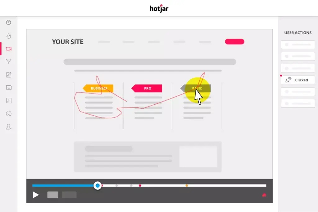
Heatmaps:

hotjar heatmap

Recording:

hotjar screen recording

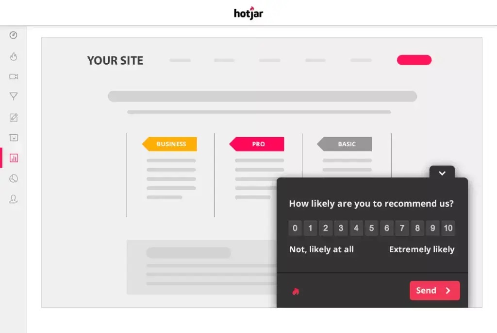
Surveys:

hotjar surveys

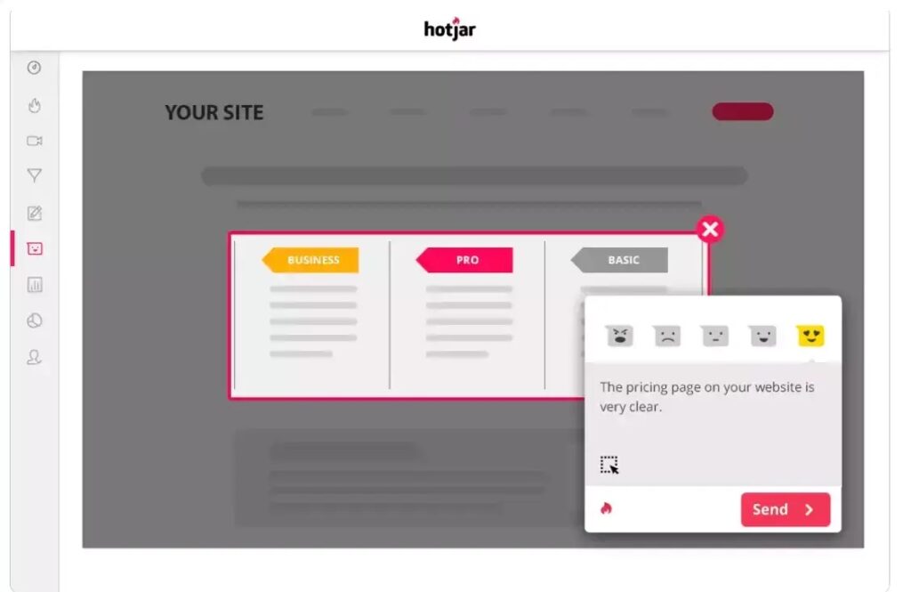
Feedback:

hotjar feedback

Pros

  • Quick customer insights.
  • It is easy to use.
  • Traffic view with accuracy
  • Software features are constantly improved.
  • Certified GDPR and CCPA
  • Many integrations

Cons

  • There is less flexibility with free features.

Pricing

Free Trial: Free Plan for Life

Prices: $39 per month.

Hotjar can be used to convert Shopify stores. Read our article: How to Increase Shopify Store Conversions. Leverage Hotjar, Google Analytics & Littledata.

Crazy Egg

Crazy Egg makes it easy to create a website without spending a lot of money. With a simple and intuitive interface, Crazy Egg is easy to set up and use. You can quickly modify your website based on your visitors’ usage habits.

Crazy Egg Features

Heatmaps:

crazy egg heatmaps

Confetti. Find out where people click and what attracts them there.

crazy egg confetti

Scroll maps. These show how far users scroll down, so you can see when they leave the site.

crazy egg heatmap

Overlays. Additional information on each element of your website.

crazy egg overlays

Get a list of reports. You can see only numerical data about the number of clicks on your website elements.

crazy egg reports

Pros

  • Visual representation of user behavior
  • It is clear which elements of your content get the most interaction.
  • Simple implementation on-site
  • The tool has a great UX and UI.

Cons

  • It is necessary to find a better way to organize historical snapshot data.
  • Price increases

Pricing

30-day Free Trial

Prices: $24 per month.

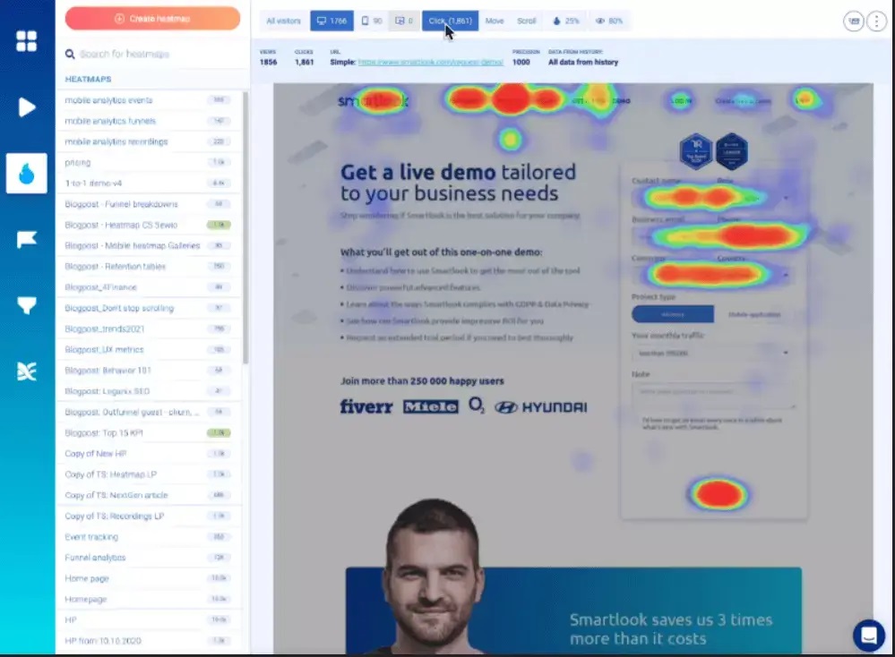
Smartlook

Smartlook heatmaps

Smartlook, a qualitative analytics platform for mobile and website, has helped over 200,000 companies from all sectors and industries to answer the “whys” behind their user behavior. Why are they not using a feature? Why don’t they use a feature? It is now possible to do without guessing.

Smartlook Features

  • Recording.
  • Website and mobile heatmaps
  • Events.
  • Funnels.
  • Analytics and reporting.
  • Retention tables.

Pros

  • Clear insights can be gained by recording visitor behavior.
  • Keep track of the activities and return users.
  • You can distinguish between random browsing and deliberate actions.
  • Analyze funnel conversion statistics.

Cons

  • A variety of small bugs — they are not dangerous but can cause some problems.

Pricing

10-day free trial. You can also get a free plan.
Prices: $31 per month.

Mouseflow

Mouseflow heatmaps

Mouseflow, a behavior analytics tool, helps UX professionals, product managers, digital marketers, startups, small businesses, and corporations increase website engagements in order to increase conversions. It allows you to instantly view the sessions of visitors and create heatmaps for all your pages.

To observe the bounces of your visitors, you can create funnels and use form analytics to increase your lead generation. You can also launch feedback campaigns to learn more about your visitors. Mouseflow is able to help you find answers that other analytics tools cannot.

Mouseflow Features

  • Replays of sessions.
  • Heatmaps.
  • Funnels.
  • Forms.
  • Feedback.

Pros

  • You can easily integrate with any platform.
  • It is easy to use
  • Ability to filter recordings by a variety of variables

Cons

  • The free version may include more features.
  • Optimized for better viewing on mobile devices

Pricing

14-day free trial. You can also get a free plan for life.
Prices: $24 per month.

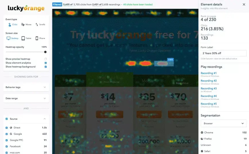
Lucky Orange Heatmaps & Replay

Lucky-Orange-Heatmaps-Replay

Lucky Orange offers a complete conversion optimization package to businesses of all sizes. Lucky Orange also helps website owners identify the reasons why visitors aren’t converting.

With dynamic heatmaps and visitor records, users can see everything a customer does on a website. They can also discover drops in conversion rates using conversion funnels, form analytics and surveys to find out where customers are losing their interest.

Lucky Orange’s conversion funnels enable users to see when customers abandon a process like “making an account” and “checking out” to help them pinpoint the problem areas.

Customers can connect directly with customer service representatives via the website by using fully responsive chat technologies. The chat interface offers a variety of options, including operator transfers, canned replies, typing preview, and co-browsing. It also has a custom data API, which allows users to view information about the person they are chatting with.

All chat widgets can be customized to match the website’s overall design.

Lucky Orange Features

  • Recordings of sessions.
  • Dynamic heatmaps
  • Live Views
  • Visitor Profile
  • Surveys
  • Form Analytics
  • Conversion Funnel.

Pros

  • It’s easy to set up and use, and the product is great.
  • This package includes several analytics tools that developers can use to better understand users’ behaviour.
  • Session recorders are particularly useful.
  • Lucky Orange’s email updates are a great way to keep up with the number of people visiting our site each day.

Cons

  • Sometimes it can be very slow

Pricing

7-day Free Trial

Prices: $10 per month.

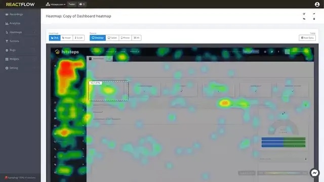
Heatmaps Reactflow Recordings and Heatmaps

Reactflow-Recordings-Heatmaps

Reactflow improves the conversion rate for your Shopify shop. It analyzes your visitors’ behavior and exposes their problems. This allows you to realize a quicker return on your investment. Visitors will arrive on your site with a slew of menus and buttons. You want them to click on the buy link more than any other link. Reactflow supports the following services:

Make videos of all visitors to your website and send them to you for review.

Create a heatmap showing the actions of your website visitors (Clicks and scrolls, mouse hovers).

Identify bugs you missed in the testing process.

Funnel statistics to determine the most valuable sales pages

This includes feedback widgets such as polls, surveys, leads, and more.

Reactflow uses these recordings to extract Heatmap data (clicks, scrolling, and mouse hovers) and gives you an aggregate view of all your website visitors divided by their device.

Reactflow Recordings and Heatmap Features

  • Recordings of sessions.
  • Heatmaps.
  • Bug Analysis
  • Feedback
  • Funnel Analytics.

Pros

  • It’s simple and easy to use
  • The Bug Tracking function works really well.
  • It has a dashboard that displays all information.
  • Excellent product.
  • Session recorders are particularly useful.

Cons

  • Sometimes, the Dashboard Interface is not as responsive.

Pricing

14-day free trial. Unlimited free service

Prices: $19 per month.

Shopify Store Conversions Increased by A/B Testing and Heatmaps

Heat maps are used to help you make changes that convert more customers into paying customers. Heatmaps or A/B Testing may help you make better progress.

Heatmaps and A/B testing both aim to increase conversions. Why not use heatmaps when you evaluate A/B tests. These can be both useful analyses and insightful insights that will help you to prove your hypothesis.

It is easy to set up a heatmap on your website and link it to other apps. It’s the hard part about using it while running A/B testing, which involves testing multiple copies of the same page with different URLs.

You will need to work with a team of experts to avoid making mistakes and solving analytical problems later. 

Heatmaps Integration by an Expert A/B Test Development Agency

These are just a few of the reasons you should hire a specialist team to help you use Heatmaps.

Common errors in complicated testing include code failures, badly formatted CSS, and slow rendering. It is important to identify and correct errors and failures before the test is launched. A bad experiment can cost you money. An A/B testing professional can help you avoid problems and create a detailed A/B test.

Avoid Making Mistakes

Improve Feature Utilization

Heatmaps offer a broad range of capabilities as well as the many platforms and tools that can be connected to them. Experts can use many of the same functionalities and integrations that novices are able to, and they will also know when and how to use them. You may be unaware of the potential for heatmaps until professional shows you.

It’s quick and easy

It is important to use your time wisely. You should not waste it learning or trying to code complicated heatmap integration codes. Heatmaps are easy to deploy on your website when you hire professionals. They can also be used with other tools on the site and used to evaluate A/B testing, as well as all that heatmaps have to offer.

Get expert opinions

Regular practice over a long period of time is what makes you experience. Specialists can help you avoid project faults, address heatmap-related issues, and suggest new techniques for experimenting using heatmaps. They also provide valuable information that will assist you in optimizing your optimization strategies.

Conclusion

This article will provide you with valuable information about the top heatmaps to track the activities of Shopify customers. We also have an experienced team who can help you set up your online shop and modify the themes. Contact us online to discuss your project.

Hotjar Installation on Shopify

Hotjar Installation on Shopify

Shopify is an e-commerce platform that is well-known. It is easy to open a Shopify shop. Online businesses cannot interact with customers in person so it is more challenging to increase leads and revenue. It’s also more difficult to identify what draws shoppers to your store.

Heatmaps can be one of the best tools to understand the behavior of website visitors. Installing the Shopify heatmap app to your website will allow you to see what visitors click, what they look at, and how long they stay on your site.

Hotjar is a contender for the top heatmap software. This software helps e-businesses to overcome the shopper attraction gap. It allows businesses to better understand their customers using its behavior analysis software. This can be used to increase conversion rates. We’ll show you how to set Hotjar up so that you can monitor the behavior of your users on your website.

There are many reasons to install Hotjar

These are the top reasons why you should use Hotjar on Shopify.

  1. Hotjar heatmap shows web pages with high drop-offs.
  2. Shopify heatmap software can be integrated into your eCommerce website to identify design elements that are beneficial or detrimental to visitors’ experience. You can then use this data to create methods to improve them.
  3. Hotjar’s session recording function allows you to better assess user activity. These replays will allow you to see each customer’s experience while they browse the web pages.
  4. Hotjar allows you to quickly add a short quiz after a customer has purchased anything to find out what they think.
  5. It can be difficult to troubleshoot bugs or other problems in Shopify. Hotjar can help you identify problems and problems so you can resolve them as quickly as possible.

Steps to Install Hotjar within Shopify Theme

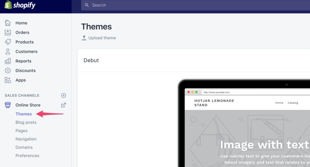
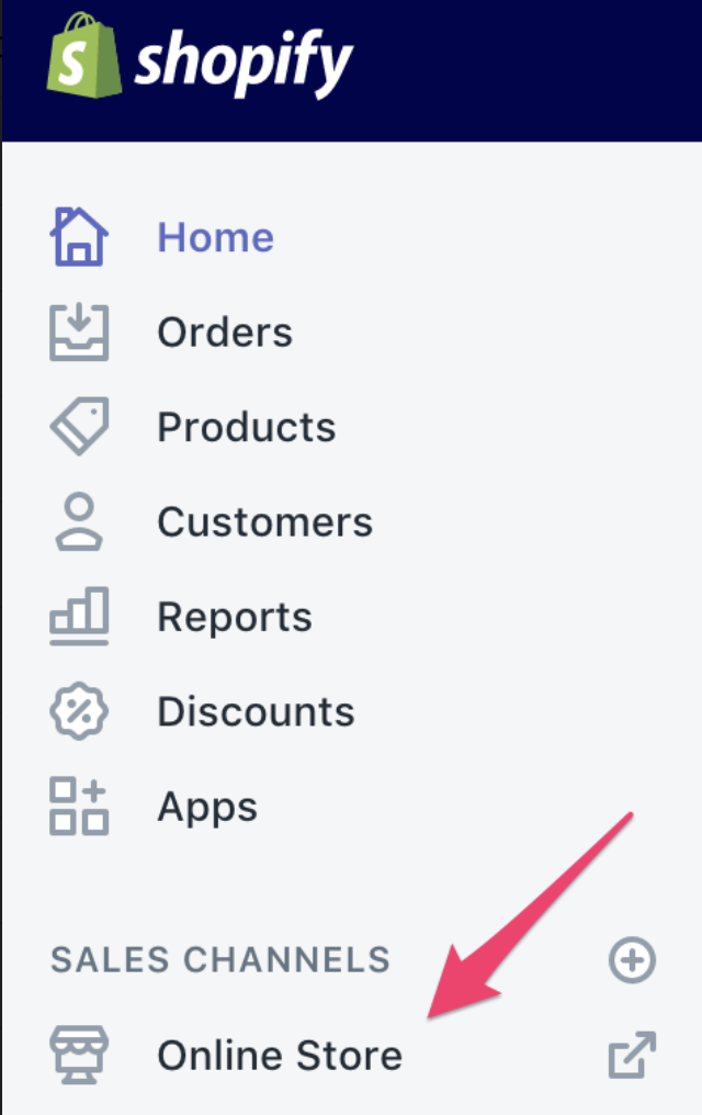
Step 1: Go to Shopify Dashboard and choose Online Store from the drop-down menu.

how to install hotjar on shopify

Step 2: Next, select the Theme option.

how to install hotjar on shopify 2

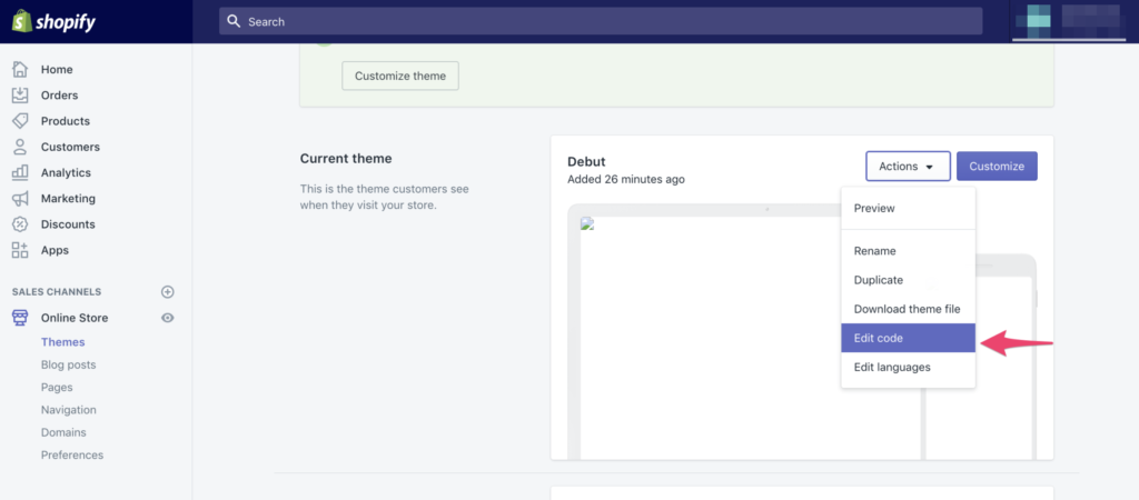
Step 3: Select the theme option and then select Edit code from the Actions menu in the upper right.

how to install hotjar on shopify 3

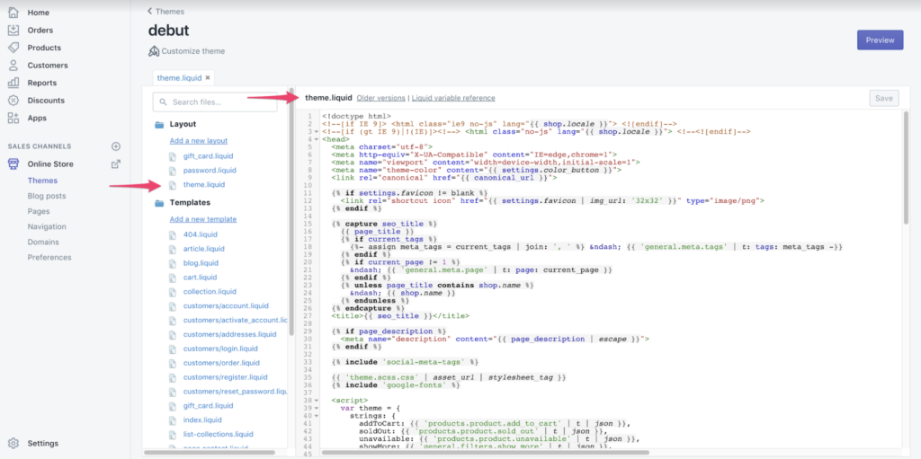
Step 4: Select theme.liquid in the layout drop-down menu.

how to install hotjar on shopify 4

Step 5: Scroll down the page until the tag appears:

how to install hotjar on shopify 5

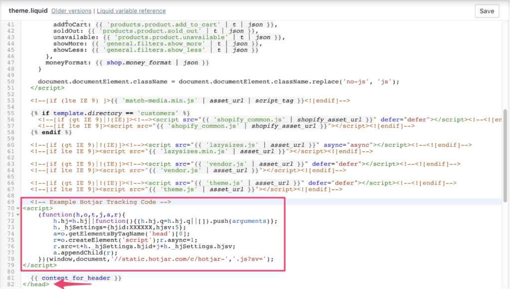
Step 6: Just before you end the element, insert your Hotjar Tracking Code. Insert the code on each page you wish to track visitors and get information.

How to install Hotjar on Shopify 6

Step 7: Click Save and Publish to apply the changes.

Hotjar Tracking Code will be loaded on your website.

To track order confirmations, you will also need to include the Tracking Code in a different area. Follow these steps to do this:

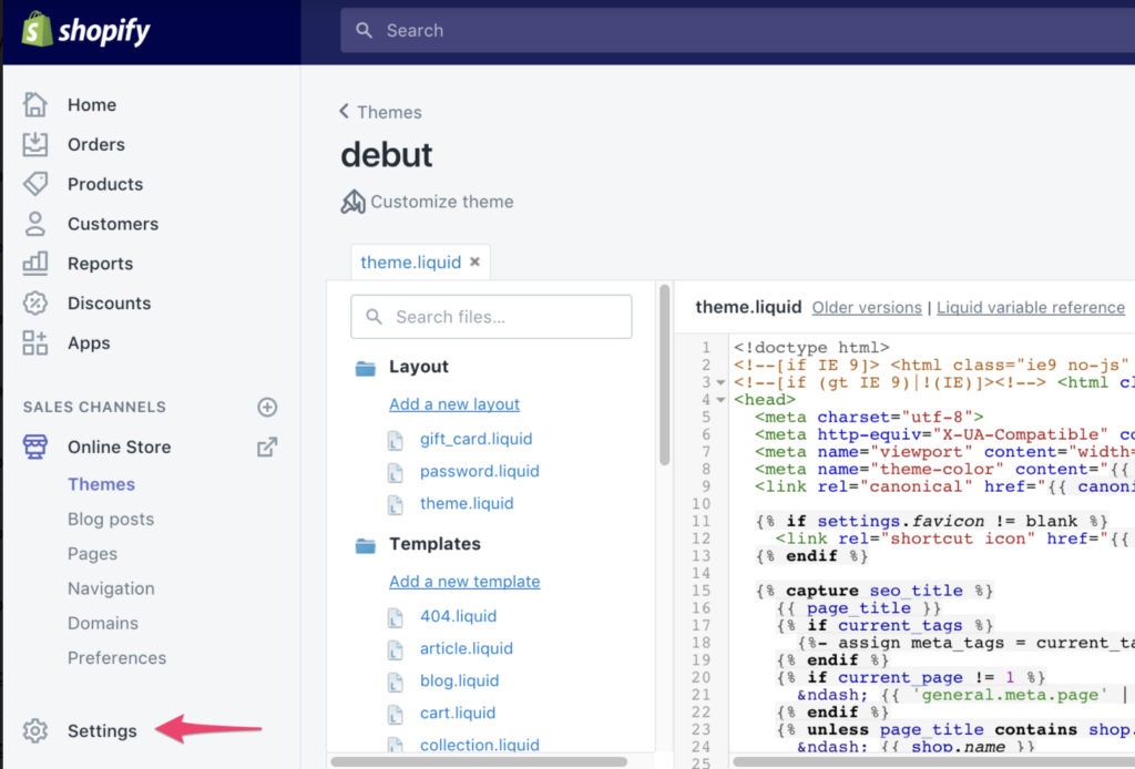
Step 8: To access Options, click the gear symbol at the lower-left:

How to install Hotjar on Shopify 8

Step 9: Click the Checkout link.

how to install hotjar on shopify 9

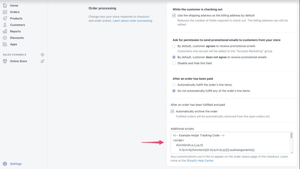
Step 10: Scroll down to the bottom, until you see the box labeled Other Scripts. Copy the Hotjar Tracking code and paste it.

How to install Hotjar on Shopify 10

Step 11: Click the Save button to save your work.

How to install Hotjar on Shopify save

Hotjar Tracking Code must now be located on your Order Confirmation Page, not your Checkout Page.

Step 12: Check your Hotjar Site Dashboard for success.

How to install Hotjar on Shopify 12

Hotjar will verify that the Hotjar Tracking Code has been successfully added to your website after you have done so. Although this usually happens when your website has been updated with the Hotjar Code, you can speed up the process by visiting the page. The Site Dashboard will display the message below when Hotjar detects your Tracking Code.

Source: Hotjar

Once you have installed the tracking code you can start using Hotjar’s services including heatmaps and recordings as well as surveys and incoming feedback.

Hotjar Integration

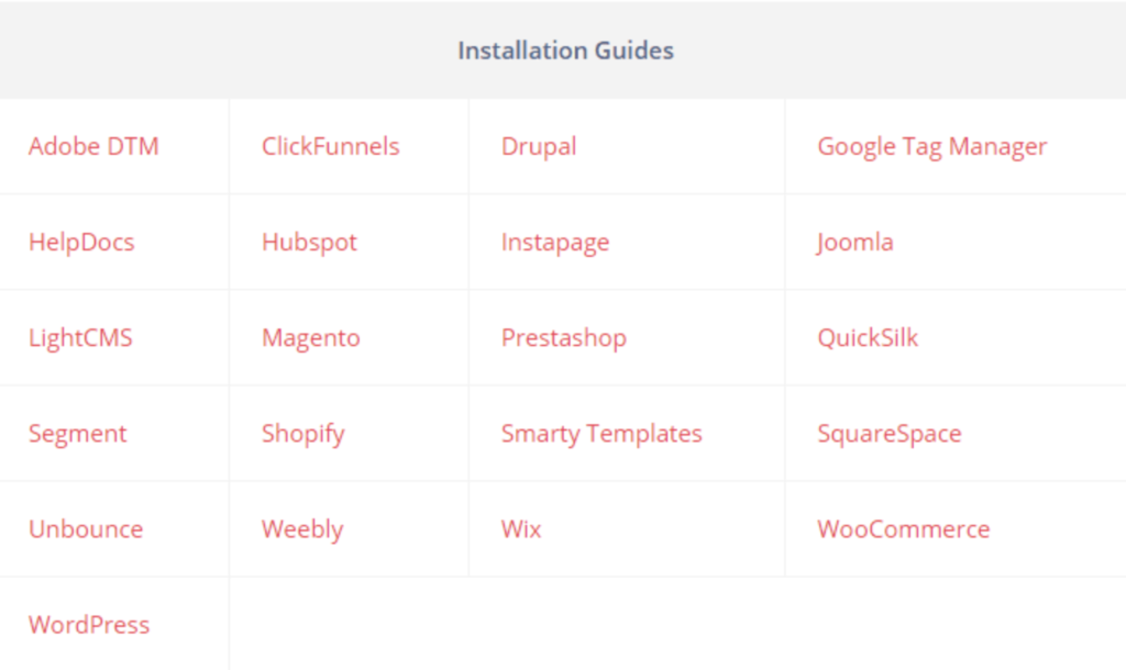
Hotjar, like Shopify, connects to a wide variety of platforms, including:

  • Wix is a website hosting platform.
  • Hubspot is a marketing and CRM service.
  • Innovative technologies like Adobe DTM or Drupal.
  • A/B testing tools like Optimizely or Omniconvert.

Hotjar can also be manually integrated with the tracking code if it is enabled.

Hotjar Integration Benefits – Expert Test Dev Agency

Both Hotjar installation on your site and Hotjar connections to other technologies are very simple. It is possible to use it during an A/B test to optimize your conversion rate. This involves collecting multiple copies for the same URL.

You will need to enlist the help of specialists in order to avoid making mistakes and solving analytical problems later. Hotjar A/B testing is something you should investigate. BrillMark has helped many clients deploy heatmaps and recordings (especially with Hotjar JavaScript triggers).

Hotjar can be used by a team of experts for a variety of reasons.

  • Avoid Mistakes: Code failures, badly coded CSS, and slow rendering are all common in complex testing. Before the test is published, it is important to correct and identify errors and failures. A wrong test can cause financial loss. An A/B specialist can help you avoid problems and set up an A/B test that includes heatmaps and recordings.
  • Increase Feature Utilization: Hotjar offers a wide range of functionality. The various platforms and tools that integrate with Hotjar also offer a variety of features. Professionals may be more adept at using the many integrations and features that Hotjar offers than beginners. They will also need to know when and how to use them. Hotjar’s capabilities can be explained to you by an expert.
  • Keep it Simple and Quick: Time is precious and you should use it for your primary tasks. You shouldn’t waste time learning or getting bogged down in complicated code for Hotjar integration. Hotjar experts can deploy heat maps directly to your website. They can then combine them with other tools on the site and use them for analysis of A/B testing, as well as any other Hotjar functions.
  • Expert opinions: Practicing a skill over a prolonged period of time is what makes you experience. Hotjar-related problems can be addressed by a professional who will help you avoid project failures and offer advice on how to improve your optimization strategies.

Conclusion:

We hope you found this article helpful in installing Hotjar in your Shopify shop to track your visitors’ activities. We also have an experienced team who can help you set up your e-commerce on Shopify or any other platform and launch all the online activities for your e-commerce. We create a custom web design for Shopify or any other e-commerce.

Feel free to contact us online and discuss your tasks.

10 Best Practices for Shopping Cart Page Optimization

10 Best Practices for Shopping Cart Page Optimization

It’s not known how many people abandon their shopping carts. Some studies claim that 80% of people abandon their shopping carts, while others say it’s closer to 65%.

Because of industry differences, it is impossible to determine the exact abandonment rates.

The Baymard Institute compiled an astonishing analysis of 37 studies that examined shopping cart abandonment rates.

The average abandonment rate for carts was 70% as of 2017.

This may not be surprising to e-marketers who have been in the business for a while, but 7/10 people will abandon their cart after adding their products.

Implementing best practices to reduce the abandonment rate should be a top priority for any website that wants to increase conversions.

Before we start our top selections for the best shopping Cart practices, we want to remind you that conversion rate is also dependent on other interesting variables.

10 best practices for your shopping cart pages

Let’s get started with the basics.

Your shopping cart should contain:

  1. Clear.
  2. Simple.
  3. Fast.

This easy 3-step formula (CSF), forms the cornerstone of any cart page.

Let’s take a closer glance at these three elements.

Clear

Clear refers to a cart page that is clean and uncluttered. It should be able to display all of the relevant information on one page.

Simple

The cart page will be simple. This means it will have all the information you need in one place. It is also important to avoid confusing color codes and structure.

Fast

Your cart page will be less popular if they take longer to view. You should make your cart page easy and clear by incorporating the two most important elements (simple+clear). People will be able to view their orders in a short time before making a purchase.

With these three crucial elements in mind, it’s time to look at our 10 best practices.

1. The Product Summary is Complete

Just seconds before your customers make checkout, they will land on your cart page. It has one purpose: to lead your customers to actually pay.

Most e-commerce buyers use the cart to review their orders.

You have to make sure they are aware of all details about the product.

Remember to include:

  1. Image (see point 3).
  2. Name exactly (especially important if you’re selling similar products).
  3. Specifications (e.g., power, capacity, and memory, features.
  4. Quantity (some people may wish to buy more than one).
  5. For clothes, fashion and so on, size is very important.
  6. Color is a major factor in product returns.

All these elements should be clearly explained to customers in order to allow them to review their order quickly before purchasing: This will decrease the likelihood of customers abandoning their cart due to unclear information.

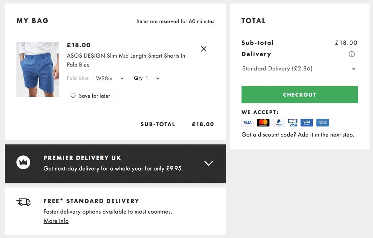
example of a product card with the most filled in characteristics

ASOS, an online fashion retailer based in the UK, allows you to easily review your order. You can see which product you’re looking at as well as its color and quantity.

A special bonus point for the button “Save for Later” (see point 8).

2. A simple, easy-to-use color code

Many studies have been conducted on the psychology behind color use.

To be fair there isn’t a single solution or color that will suit all websites and solve all abandonment rates problems. Each industry uses its own color code for the checkout button.

It is clear that users love UX harmony and clear design.

Be sure to match the overall color scheme when creating your cart page. Also, it should be reassuring.

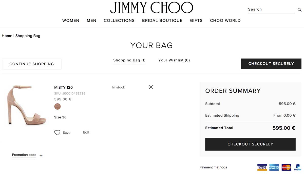
example of a product card with the correct color code

Jimmy Choo, the famous shoemaker, uses an elegant but efficient black-and-white color code to clearly show the information on his cart page.

You will notice that the checkout button is clearly visible as the only button in black on the page. This makes it easy to click.

3. Thumbnail images that are precise and bright

Nothing is more irritating than a small, ridiculous thumbnail that can’t help you identify the product.

Lets customers see their product properly in a convenient resolution.

Mobile users will also appreciate a larger image.

example of a product card with a large photo

Apple makes it very simple to recognize the product that you choose on their shopping cart page. It’s easy to know that it’s the right one.

Apple’s image was bright and clear. We are absolutely certain that our bag has the right color.

4. Clever information hierarchy & noncompeting CTAs

Information hierarchy is the system used to rank and display information according to its importance.

When designing cart pages, pay close attention to the logic of buttons, columns, titles, and headings as these will significantly influence users’ perception.

Simply stated, the rule is to keep things simple and clear so as not to create confusion.

There are many options for colors. We recommend using at most 3-4 colors.

Yes, colors can be used to draw attention:

  1. Highlight important information
  2. You can distinguish the CTA by using a different color
  3. You can structure your page using lines or columns

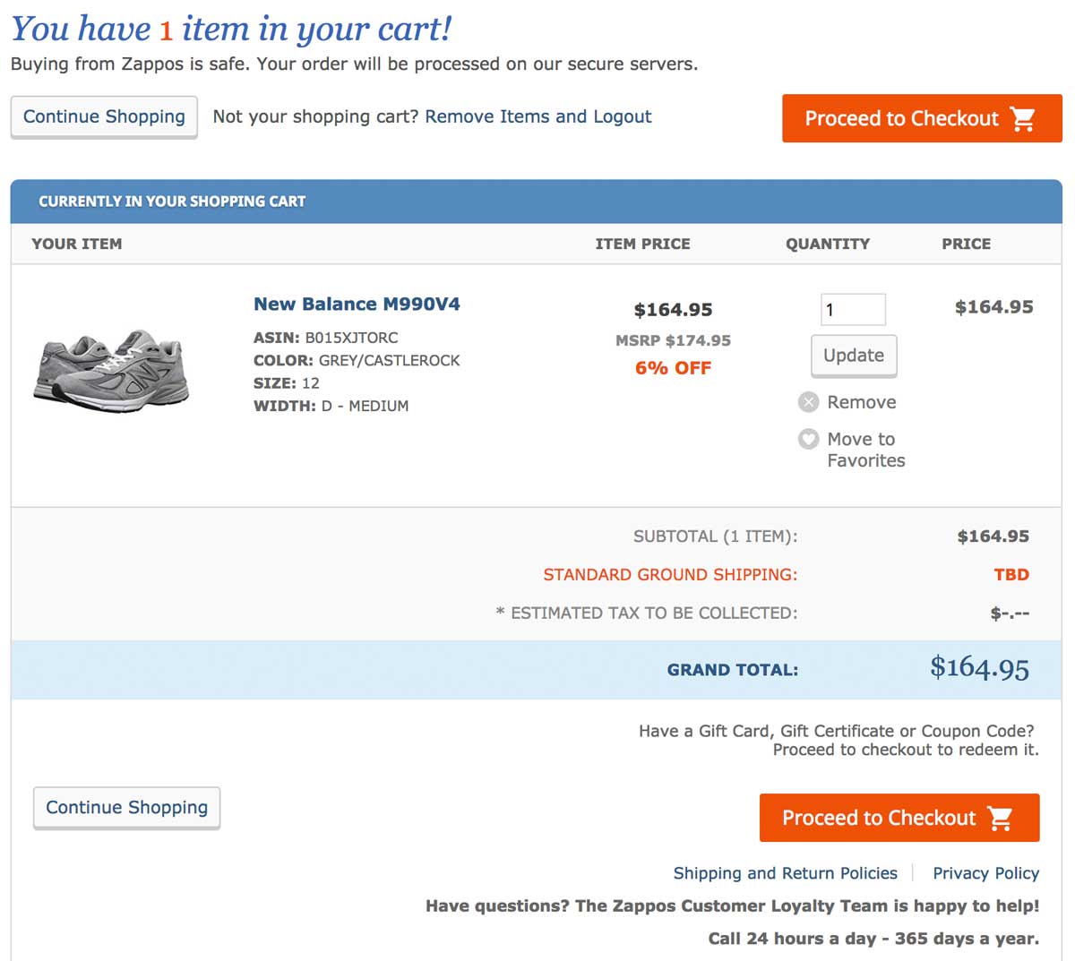
example of a product card with the correct location of information

Zappos, an American shoe marketplace, excels at providing a simple and easy shopping experience.

Its shopping cart page is no less and expertly guides customers through their buying journey. We love the clean layout accented by a simple 3-step code (orange=very significant; blue=important; gray=secondary).

5. You can offer payment options your users love

Different payment options are a must in today’s competitive eCommerce marketplace.

This will help you increase conversions and reassure customers who are familiar with a specific payment solution.

Control estimates that 50% would cancel their order if they didn’t have their preferred payment method.

When you are operating an international e-commerce shop, keep in mind that payment methods can differ between countries. For example, what is used in the US may not be the same in Europe and Asia.

Last but not least, you should redirect customers based on their IP location to give them a personalized experience based on their preferred payment method and currency.

Statista has a study that shows the top online payment methods.

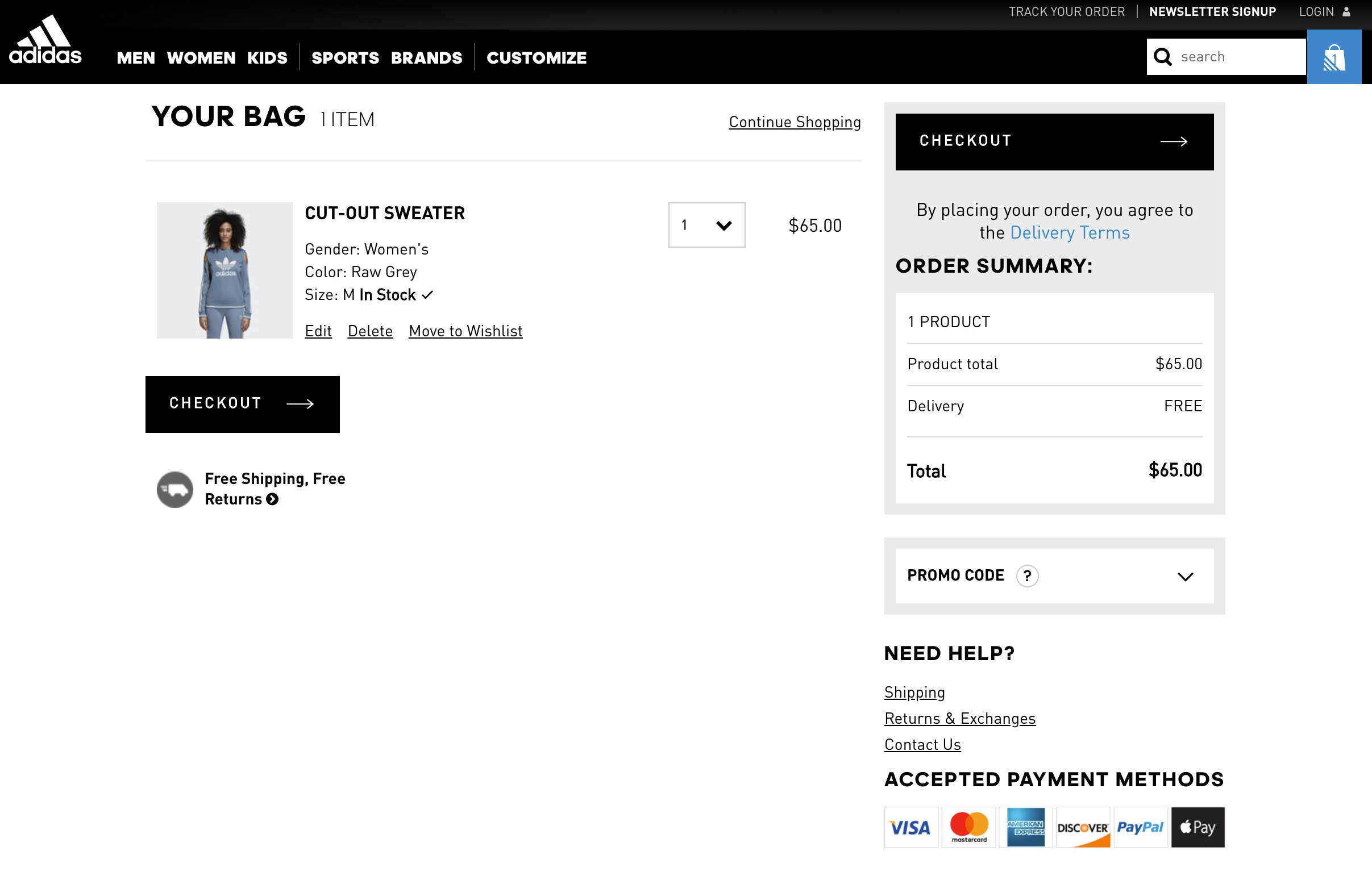
example of a product card with several payment methods

Adidas is a worldwide sportswear company that offers six payment methods, including VISA, Apple Pay, and Paypal. It’s a must-have for global or large stores.

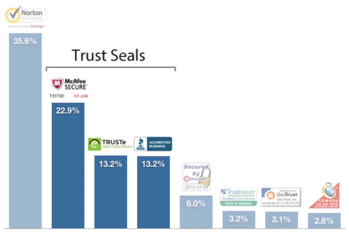
6. Trust seals, reassuring elements

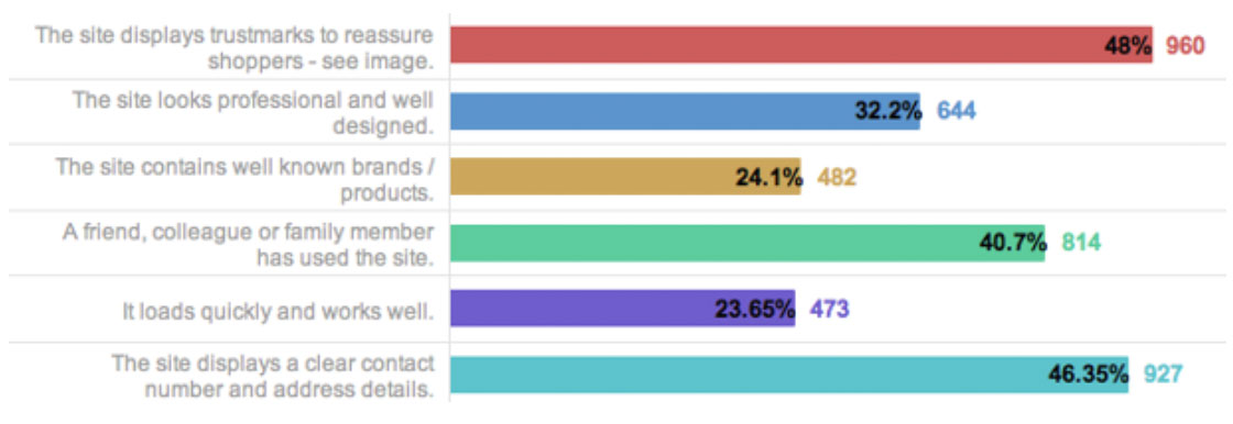
Econsultancy conducted a recent survey that found trust seals are the best way to win customers’ loyalty towards a website.

Are actually more important than peer recommendation or trusted design.

why website security is important for good sales

Do not move if you do not know which seal to choose and want to find the best trust seals.

Baymard did an in-depth analysis of the original 2018 study and updated it for 2021:

what security service do users of online stores trust?

7. Chat, phone, or email support

Econsultancy’s study looking at the most important factors that influence customers’ trust found that “displaying a clear address and contact number” was close behind.

Visitors want to feel human behind your website. This is called customer service.

Even though it isn’t a new option for e-marketers, providing a live chat/phone assistance service directly on the cart page will increase conversions, gain customers’ trust, and leverage your brand image.

Brand recognition is what we all want, aren’t we?

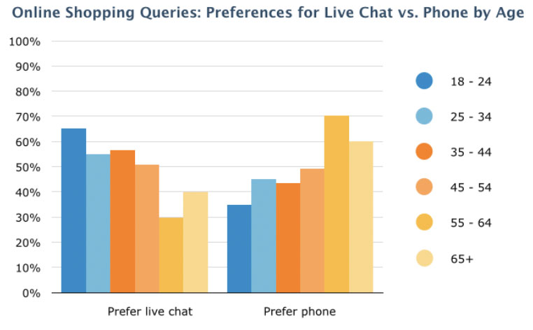
Remember that millennials prefer live chat when it comes to choosing between phone assistance and live chat. Software Advice’s survey clearly shows this.

how users prefer to contact support for online stores

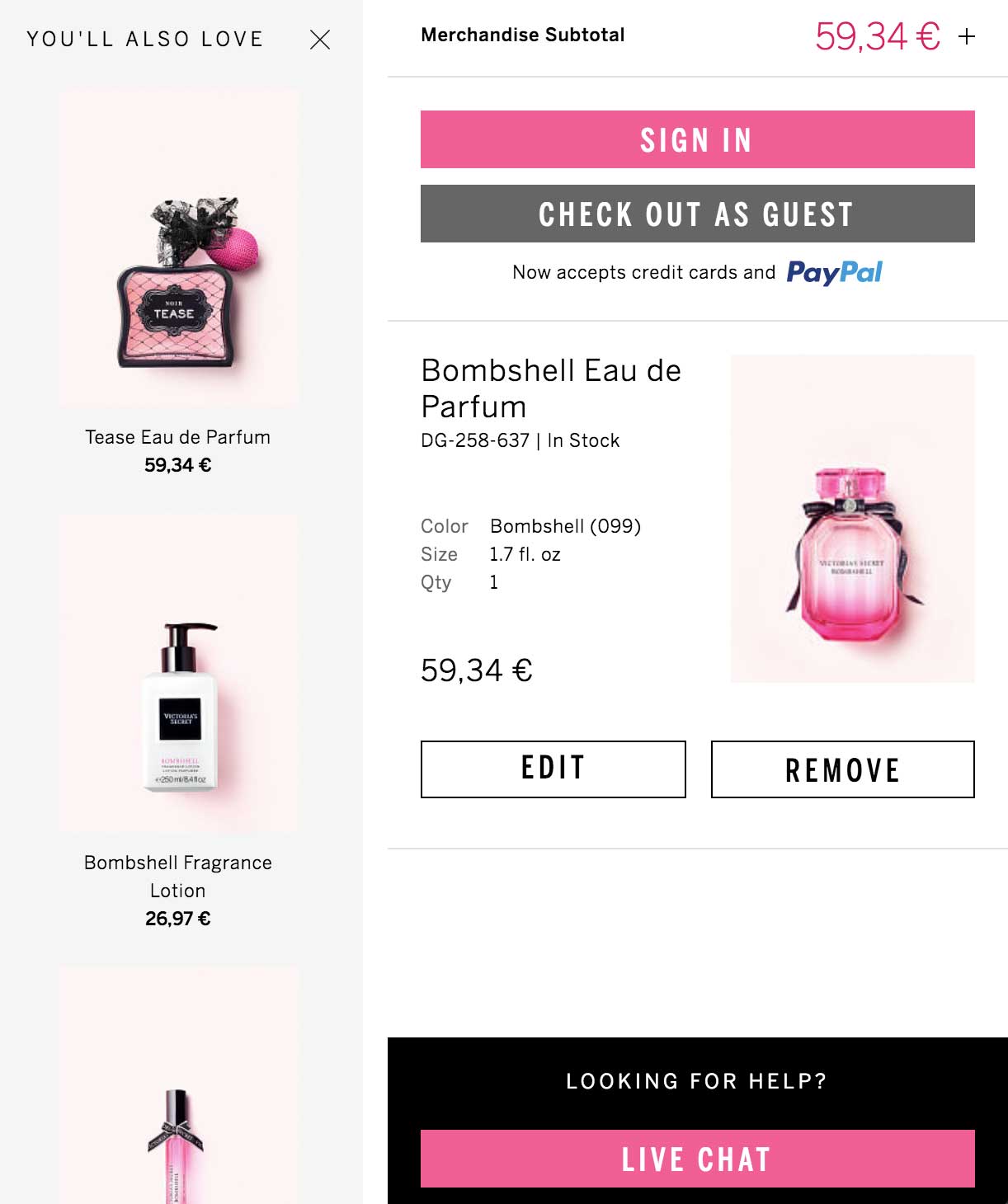
Victoria’s Secret focuses on the flashy colors of its products to raise their call-to-action visibility.

The live chat option is cleverly offered within the cart page. This allows you to bypass any potential purchase barriers and it also provides a quick way to answer any last-minute questions.

8. Continue Shopping

We’ll get to that one quickly, but a continue-shopping option is a clever way to give your visitors an easy way to abandon their cart without leaving your website.

Online shoppers can also use carts to store future purchases, which they intend to buy later.

9. Shipping and Returns: Exact and detailed information

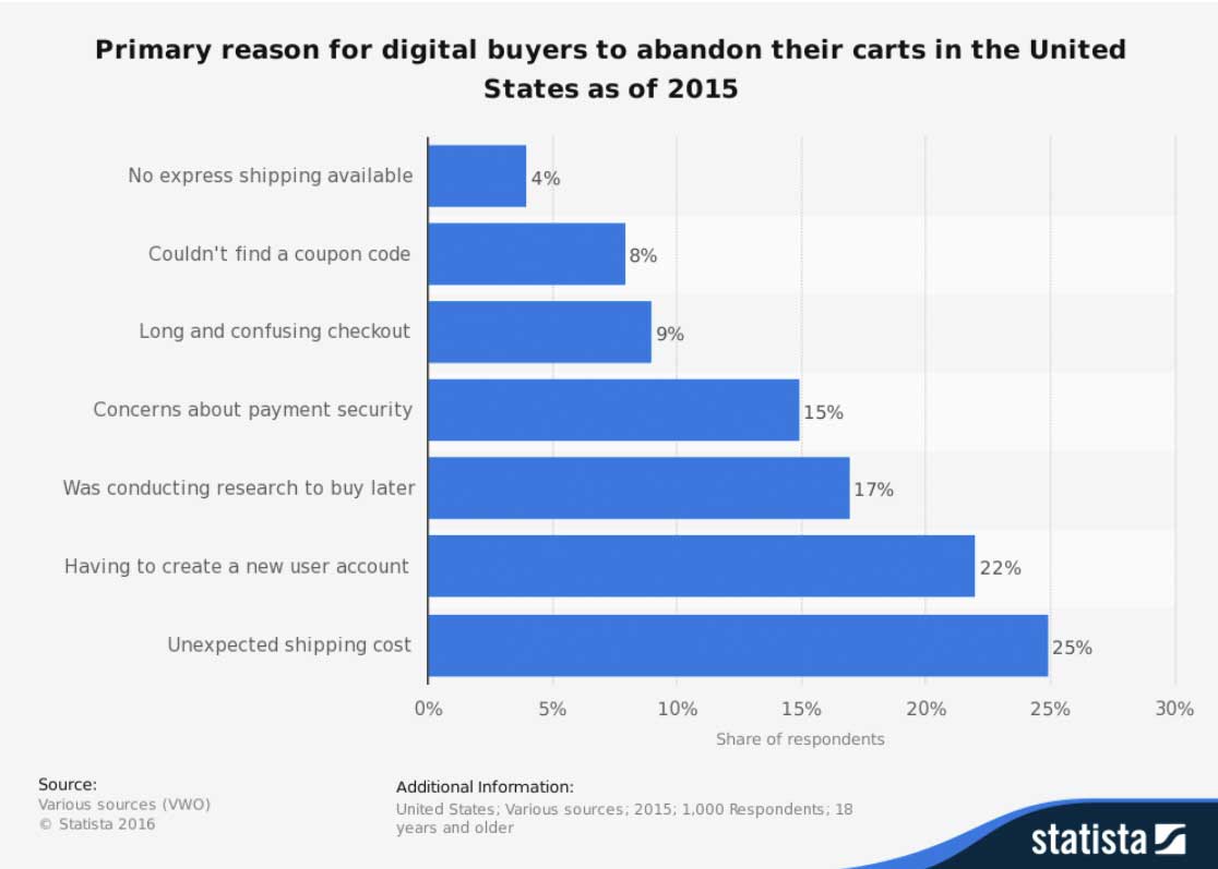
Guess what? What is the most common reason for shopping cart abandonment in America?

Hidden shipping costs.

Statista’s study reveals that online buyers don’t care about hidden shipping costs or last-minute shipping costs.

show honestly all terms of delivery

Recognizing that transparency is key to e-commerce website conversion and customer trust, it’s important that they provide more information about shipping and returns policies.

10. Complementary products

E-commerce isn’t new to cross-selling and complementary products.

Displaying complementary products within the shopping cart is an innovative feature that you should explore.

We recommend you closely monitor any conversion-related change that may occur afterward. While complementary products don’t necessarily increase e-commerce sales, they do increase your order value (AOV).

offer related products in the product card

Contact us online to increase the conversion rate on your website. Our CRO specialists will help you to optimize shopping cart or whole website plus redesign.

Open->
to new

Start working with #UAATEAM

  • United States+1
  • Afghanistan (‫افغانستان‬‎)+93
  • Albania (Shqipëri)+355
  • Algeria (‫الجزائر‬‎)+213
  • American Samoa+1
  • Andorra+376
  • Angola+244
  • Anguilla+1
  • Antigua and Barbuda+1
  • Argentina+54
  • Armenia (Հայաստան)+374
  • Aruba+297
  • Australia+61
  • Austria (Österreich)+43
  • Azerbaijan (Azərbaycan)+994
  • Bahamas+1
  • Bahrain (‫البحرين‬‎)+973
  • Bangladesh (বাংলাদেশ)+880
  • Barbados+1
  • Belarus (Беларусь)+375
  • Belgium (België)+32
  • Belize+501
  • Benin (Bénin)+229
  • Bermuda+1
  • Bhutan (འབྲུག)+975
  • Bolivia+591
  • Bosnia and Herzegovina (Босна и Херцеговина)+387
  • Botswana+267
  • Brazil (Brasil)+55
  • British Indian Ocean Territory+246
  • British Virgin Islands+1
  • Brunei+673
  • Bulgaria (България)+359
  • Burkina Faso+226
  • Burundi (Uburundi)+257
  • Cambodia (កម្ពុជា)+855
  • Cameroon (Cameroun)+237
  • Canada+1
  • Cape Verde (Kabu Verdi)+238
  • Caribbean Netherlands+599
  • Cayman Islands+1
  • Central African Republic (République centrafricaine)+236
  • Chad (Tchad)+235
  • Chile+56
  • China (中国)+86
  • Christmas Island+61
  • Cocos (Keeling) Islands+61
  • Colombia+57
  • Comoros (‫جزر القمر‬‎)+269
  • Congo (DRC) (Jamhuri ya Kidemokrasia ya Kongo)+243
  • Congo (Republic) (Congo-Brazzaville)+242
  • Cook Islands+682
  • Costa Rica+506
  • Côte d’Ivoire+225
  • Croatia (Hrvatska)+385
  • Cuba+53
  • Curaçao+599
  • Cyprus (Κύπρος)+357
  • Czech Republic (Česká republika)+420
  • Denmark (Danmark)+45
  • Djibouti+253
  • Dominica+1
  • Dominican Republic (República Dominicana)+1
  • Ecuador+593
  • Egypt (‫مصر‬‎)+20
  • El Salvador+503
  • Equatorial Guinea (Guinea Ecuatorial)+240
  • Eritrea+291
  • Estonia (Eesti)+372
  • Ethiopia+251
  • Falkland Islands (Islas Malvinas)+500
  • Faroe Islands (Føroyar)+298
  • Fiji+679
  • Finland (Suomi)+358
  • France+33
  • French Guiana (Guyane française)+594
  • French Polynesia (Polynésie française)+689
  • Gabon+241
  • Gambia+220
  • Georgia (საქართველო)+995
  • Germany (Deutschland)+49
  • Ghana (Gaana)+233
  • Gibraltar+350
  • Greece (Ελλάδα)+30
  • Greenland (Kalaallit Nunaat)+299
  • Grenada+1
  • Guadeloupe+590
  • Guam+1
  • Guatemala+502
  • Guernsey+44
  • Guinea (Guinée)+224
  • Guinea-Bissau (Guiné Bissau)+245
  • Guyana+592
  • Haiti+509
  • Honduras+504
  • Hong Kong (香港)+852
  • Hungary (Magyarország)+36
  • Iceland (Ísland)+354
  • India (भारत)+91
  • Indonesia+62
  • Iran (‫ایران‬‎)+98
  • Iraq (‫العراق‬‎)+964
  • Ireland+353
  • Isle of Man+44
  • Israel (‫ישראל‬‎)+972
  • Italy (Italia)+39
  • Jamaica+1
  • Japan (日本)+81
  • Jersey+44
  • Jordan (‫الأردن‬‎)+962
  • Kazakhstan (Казахстан)+7
  • Kenya+254
  • Kiribati+686
  • Kosovo+383
  • Kuwait (‫الكويت‬‎)+965
  • Kyrgyzstan (Кыргызстан)+996
  • Laos (ລາວ)+856
  • Latvia (Latvija)+371
  • Lebanon (‫لبنان‬‎)+961
  • Lesotho+266
  • Liberia+231
  • Libya (‫ليبيا‬‎)+218
  • Liechtenstein+423
  • Lithuania (Lietuva)+370
  • Luxembourg+352
  • Macau (澳門)+853
  • Macedonia (FYROM) (Македонија)+389
  • Madagascar (Madagasikara)+261
  • Malawi+265
  • Malaysia+60
  • Maldives+960
  • Mali+223
  • Malta+356
  • Marshall Islands+692
  • Martinique+596
  • Mauritania (‫موريتانيا‬‎)+222
  • Mauritius (Moris)+230
  • Mayotte+262
  • Mexico (México)+52
  • Micronesia+691
  • Moldova (Republica Moldova)+373
  • Monaco+377
  • Mongolia (Монгол)+976
  • Montenegro (Crna Gora)+382
  • Montserrat+1
  • Morocco (‫المغرب‬‎)+212
  • Mozambique (Moçambique)+258
  • Myanmar (Burma) (မြန်မာ)+95
  • Namibia (Namibië)+264
  • Nauru+674
  • Nepal (नेपाल)+977
  • Netherlands (Nederland)+31
  • New Caledonia (Nouvelle-Calédonie)+687
  • New Zealand+64
  • Nicaragua+505
  • Niger (Nijar)+227
  • Nigeria+234
  • Niue+683
  • Norfolk Island+672
  • North Korea (조선 민주주의 인민 공화국)+850
  • Northern Mariana Islands+1
  • Norway (Norge)+47
  • Oman (‫عُمان‬‎)+968
  • Pakistan (‫پاکستان‬‎)+92
  • Palau+680
  • Palestine (‫فلسطين‬‎)+970
  • Panama (Panamá)+507
  • Papua New Guinea+675
  • Paraguay+595
  • Peru (Perú)+51
  • Philippines+63
  • Poland (Polska)+48
  • Portugal+351
  • Puerto Rico+1
  • Qatar (‫قطر‬‎)+974
  • Réunion (La Réunion)+262
  • Romania (România)+40
  • Russia (Россия)+7
  • Rwanda+250
  • Saint Barthélemy+590
  • Saint Helena+290
  • Saint Kitts and Nevis+1
  • Saint Lucia+1
  • Saint Martin (Saint-Martin (partie française))+590
  • Saint Pierre and Miquelon (Saint-Pierre-et-Miquelon)+508
  • Saint Vincent and the Grenadines+1
  • Samoa+685
  • San Marino+378
  • São Tomé and Príncipe (São Tomé e Príncipe)+239
  • Saudi Arabia (‫المملكة العربية السعودية‬‎)+966
  • Senegal (Sénégal)+221
  • Serbia (Србија)+381
  • Seychelles+248
  • Sierra Leone+232
  • Singapore+65
  • Sint Maarten+1
  • Slovakia (Slovensko)+421
  • Slovenia (Slovenija)+386
  • Solomon Islands+677
  • Somalia (Soomaaliya)+252
  • South Africa+27
  • South Korea (대한민국)+82
  • South Sudan (‫جنوب السودان‬‎)+211
  • Spain (España)+34
  • Sri Lanka (ශ්‍රී ලංකාව)+94
  • Sudan (‫السودان‬‎)+249
  • Suriname+597
  • Svalbard and Jan Mayen+47
  • Swaziland+268
  • Sweden (Sverige)+46
  • Switzerland (Schweiz)+41
  • Syria (‫سوريا‬‎)+963
  • Taiwan (台灣)+886
  • Tajikistan+992
  • Tanzania+255
  • Thailand (ไทย)+66
  • Timor-Leste+670
  • Togo+228
  • Tokelau+690
  • Tonga+676
  • Trinidad and Tobago+1
  • Tunisia (‫تونس‬‎)+216
  • Turkey (Türkiye)+90
  • Turkmenistan+993
  • Turks and Caicos Islands+1
  • Tuvalu+688
  • U.S. Virgin Islands+1
  • Uganda+256
  • Ukraine (Україна)+380
  • United Arab Emirates (‫الإمارات العربية المتحدة‬‎)+971
  • United Kingdom+44
  • United States+1
  • Uruguay+598
  • Uzbekistan (Oʻzbekiston)+998
  • Vanuatu+678
  • Vatican City (Città del Vaticano)+39
  • Venezuela+58
  • Vietnam (Việt Nam)+84
  • Wallis and Futuna (Wallis-et-Futuna)+681
  • Western Sahara (‫الصحراء الغربية‬‎)+212
  • Yemen (‫اليمن‬‎)+967
  • Zambia+260
  • Zimbabwe+263
  • Åland Islands+358
Select a Service:
Please fill in all required form fields