10 Best Practices for Shopping Cart Page Optimization
It’s not known how many people abandon their shopping carts. Some studies claim that 80% of people abandon their shopping carts, while others say it’s closer to 65%.
Because of industry differences, it is impossible to determine the exact abandonment rates.
The Baymard Institute compiled an astonishing analysis of 37 studies that examined shopping cart abandonment rates.
The average abandonment rate for carts was 70% as of 2017.
This may not be surprising to e-marketers who have been in the business for a while, but 7/10 people will abandon their cart after adding their products.
Implementing best practices to reduce the abandonment rate should be a top priority for any website that wants to increase conversions.
Before we start our top selections for the best shopping Cart practices, we want to remind you that conversion rate is also dependent on other interesting variables.
10 best practices for your shopping cart pages
Let’s get started with the basics.
Your shopping cart should contain:
- Clear.
- Simple.
- Fast.
This easy 3-step formula (CSF), forms the cornerstone of any cart page.
Let’s take a closer glance at these three elements.
Clear
Clear refers to a cart page that is clean and uncluttered. It should be able to display all of the relevant information on one page.
Simple
The cart page will be simple. This means it will have all the information you need in one place. It is also important to avoid confusing color codes and structure.
Fast
Your cart page will be less popular if they take longer to view. You should make your cart page easy and clear by incorporating the two most important elements (simple+clear). People will be able to view their orders in a short time before making a purchase.
With these three crucial elements in mind, it’s time to look at our 10 best practices.
1. The Product Summary is Complete
Just seconds before your customers make checkout, they will land on your cart page. It has one purpose: to lead your customers to actually pay.
Most e-commerce buyers use the cart to review their orders.
You have to make sure they are aware of all details about the product.
Remember to include:
- Image (see point 3).
- Name exactly (especially important if you’re selling similar products).
- Specifications (e.g., power, capacity, and memory, features.
- Quantity (some people may wish to buy more than one).
- For clothes, fashion and so on, size is very important.
- Color is a major factor in product returns.
All these elements should be clearly explained to customers in order to allow them to review their order quickly before purchasing: This will decrease the likelihood of customers abandoning their cart due to unclear information.
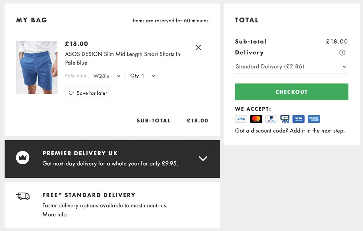

ASOS, an online fashion retailer based in the UK, allows you to easily review your order. You can see which product you’re looking at as well as its color and quantity.
A special bonus point for the button “Save for Later” (see point 8).
2. A simple, easy-to-use color code
Many studies have been conducted on the psychology behind color use.
To be fair there isn’t a single solution or color that will suit all websites and solve all abandonment rates problems. Each industry uses its own color code for the checkout button.
It is clear that users love UX harmony and clear design.
Be sure to match the overall color scheme when creating your cart page. Also, it should be reassuring.
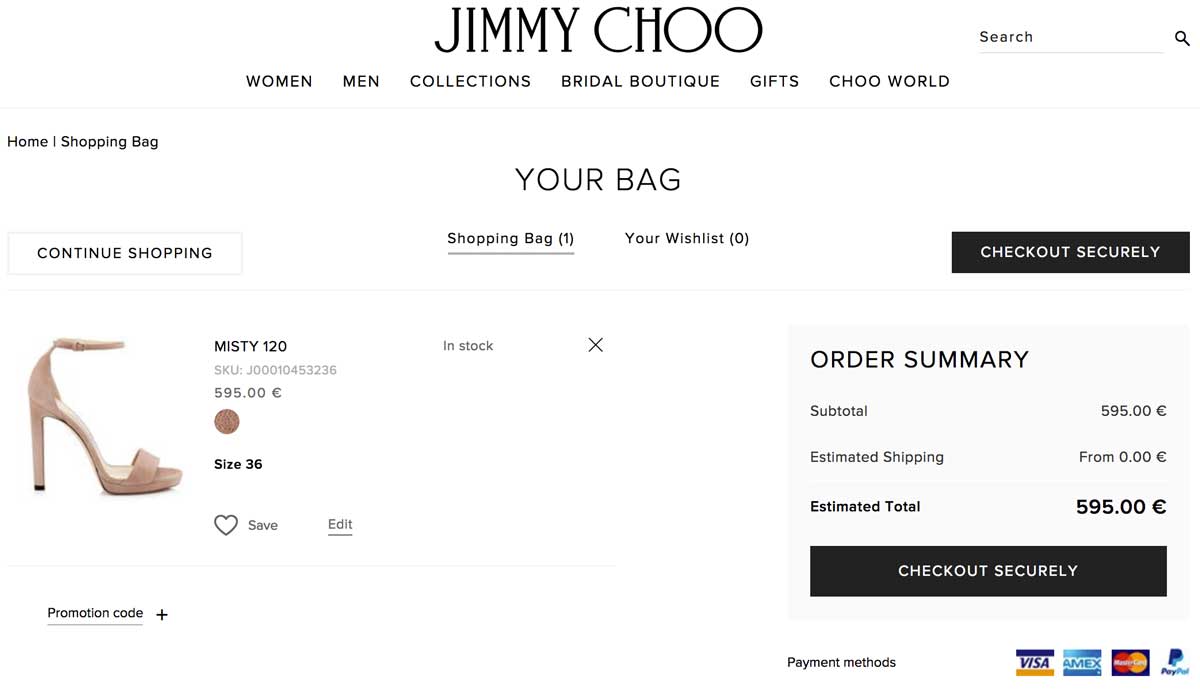

Jimmy Choo, the famous shoemaker, uses an elegant but efficient black-and-white color code to clearly show the information on his cart page.
You will notice that the checkout button is clearly visible as the only button in black on the page. This makes it easy to click.
3. Thumbnail images that are precise and bright
Nothing is more irritating than a small, ridiculous thumbnail that can’t help you identify the product.
Lets customers see their product properly in a convenient resolution.
Mobile users will also appreciate a larger image.
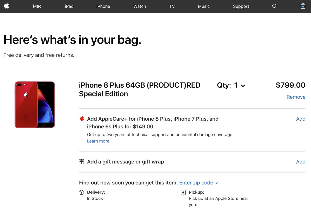

Apple makes it very simple to recognize the product that you choose on their shopping cart page. It’s easy to know that it’s the right one.
Apple’s image was bright and clear. We are absolutely certain that our bag has the right color.
4. Clever information hierarchy & noncompeting CTAs
Information hierarchy is the system used to rank and display information according to its importance.
When designing cart pages, pay close attention to the logic of buttons, columns, titles, and headings as these will significantly influence users’ perception.
Simply stated, the rule is to keep things simple and clear so as not to create confusion.
There are many options for colors. We recommend using at most 3-4 colors.
Yes, colors can be used to draw attention:
- Highlight important information
- You can distinguish the CTA by using a different color
- You can structure your page using lines or columns
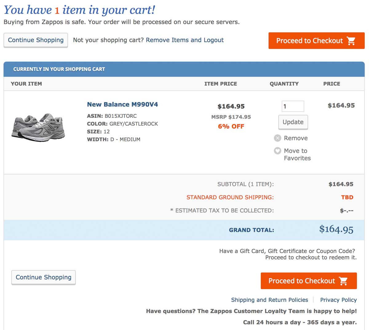

Zappos, an American shoe marketplace, excels at providing a simple and easy shopping experience.
Its shopping cart page is no less and expertly guides customers through their buying journey. We love the clean layout accented by a simple 3-step code (orange=very significant; blue=important; gray=secondary).


5. You can offer payment options your users love
Different payment options are a must in today’s competitive eCommerce marketplace.
This will help you increase conversions and reassure customers who are familiar with a specific payment solution.
Control estimates that 50% would cancel their order if they didn’t have their preferred payment method.
When you are operating an international e-commerce shop, keep in mind that payment methods can differ between countries. For example, what is used in the US may not be the same in Europe and Asia.
Last but not least, you should redirect customers based on their IP location to give them a personalized experience based on their preferred payment method and currency.
Statista has a study that shows the top online payment methods.
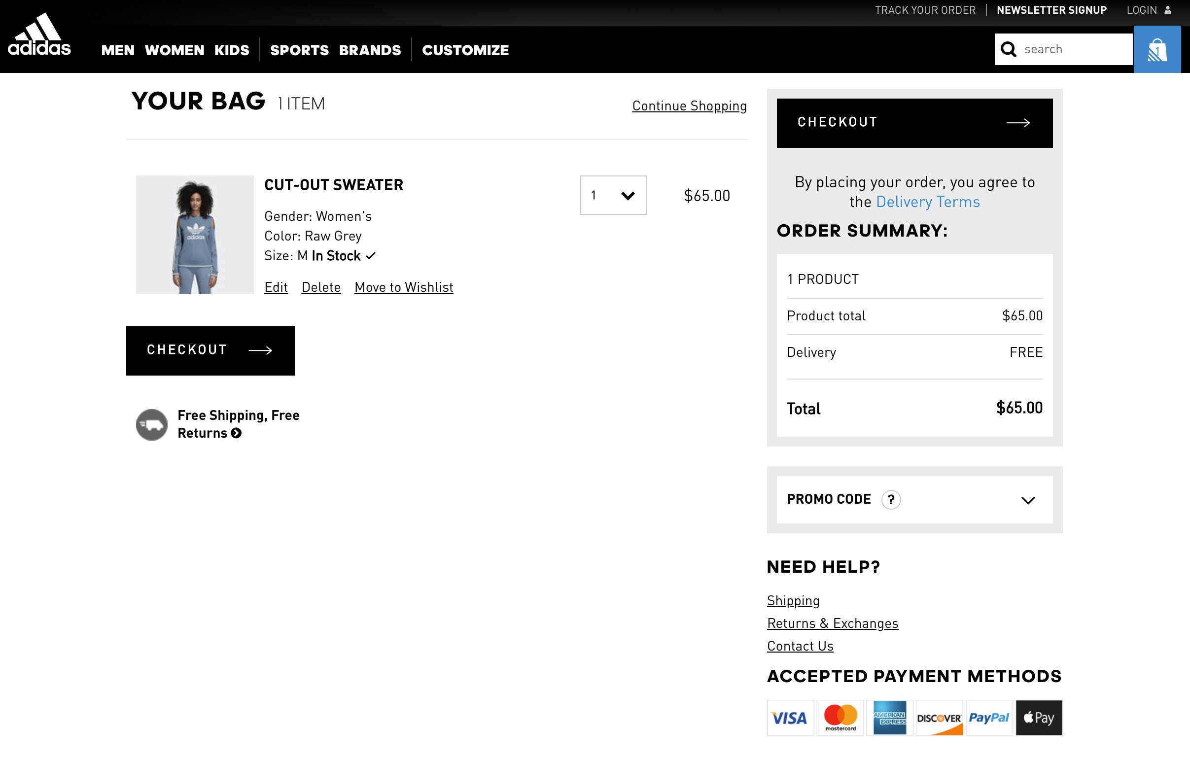

Adidas is a worldwide sportswear company that offers six payment methods, including VISA, Apple Pay, and Paypal. It’s a must-have for global or large stores.
6. Trust seals, reassuring elements
Econsultancy conducted a recent survey that found trust seals are the best way to win customers’ loyalty towards a website.
Are actually more important than peer recommendation or trusted design.
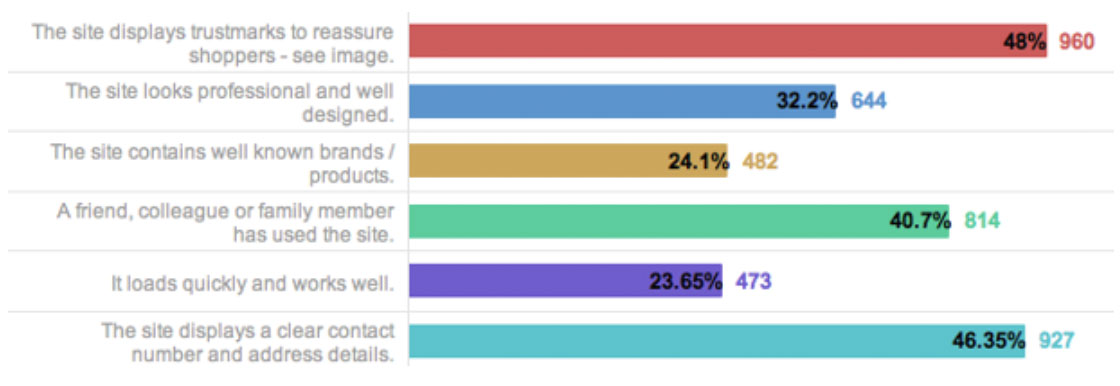

Do not move if you do not know which seal to choose and want to find the best trust seals.
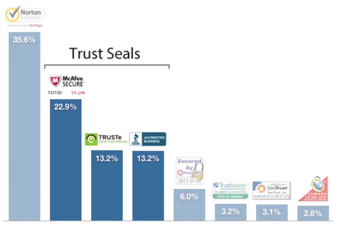
Baymard did an in-depth analysis of the original 2018 study and updated it for 2021:

7. Chat, phone, or email support
Econsultancy’s study looking at the most important factors that influence customers’ trust found that “displaying a clear address and contact number” was close behind.
Visitors want to feel human behind your website. This is called customer service.
Even though it isn’t a new option for e-marketers, providing a live chat/phone assistance service directly on the cart page will increase conversions, gain customers’ trust, and leverage your brand image.
Brand recognition is what we all want, aren’t we?
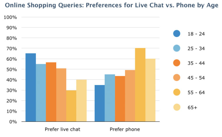
Remember that millennials prefer live chat when it comes to choosing between phone assistance and live chat. Software Advice’s survey clearly shows this.

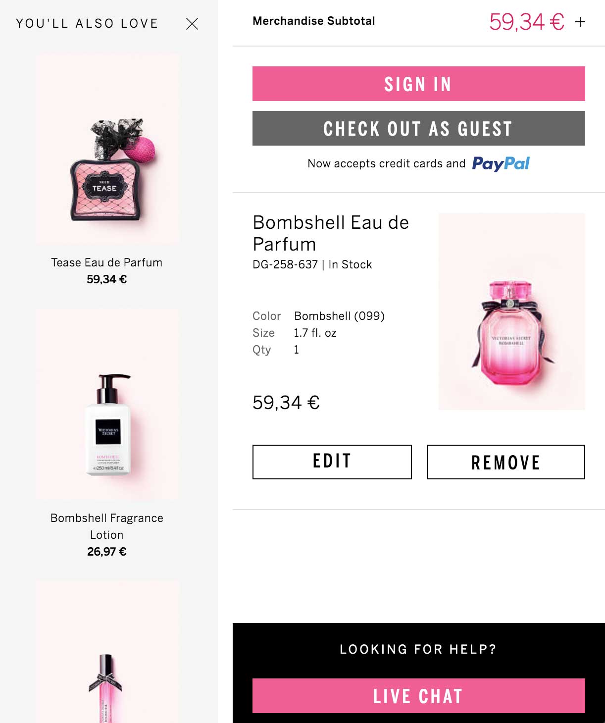

Victoria’s Secret focuses on the flashy colors of its products to raise their call-to-action visibility.
The live chat option is cleverly offered within the cart page. This allows you to bypass any potential purchase barriers and it also provides a quick way to answer any last-minute questions.
8. Continue Shopping
We’ll get to that one quickly, but a continue-shopping option is a clever way to give your visitors an easy way to abandon their cart without leaving your website.
Online shoppers can also use carts to store future purchases, which they intend to buy later.
9. Shipping and Returns: Exact and detailed information
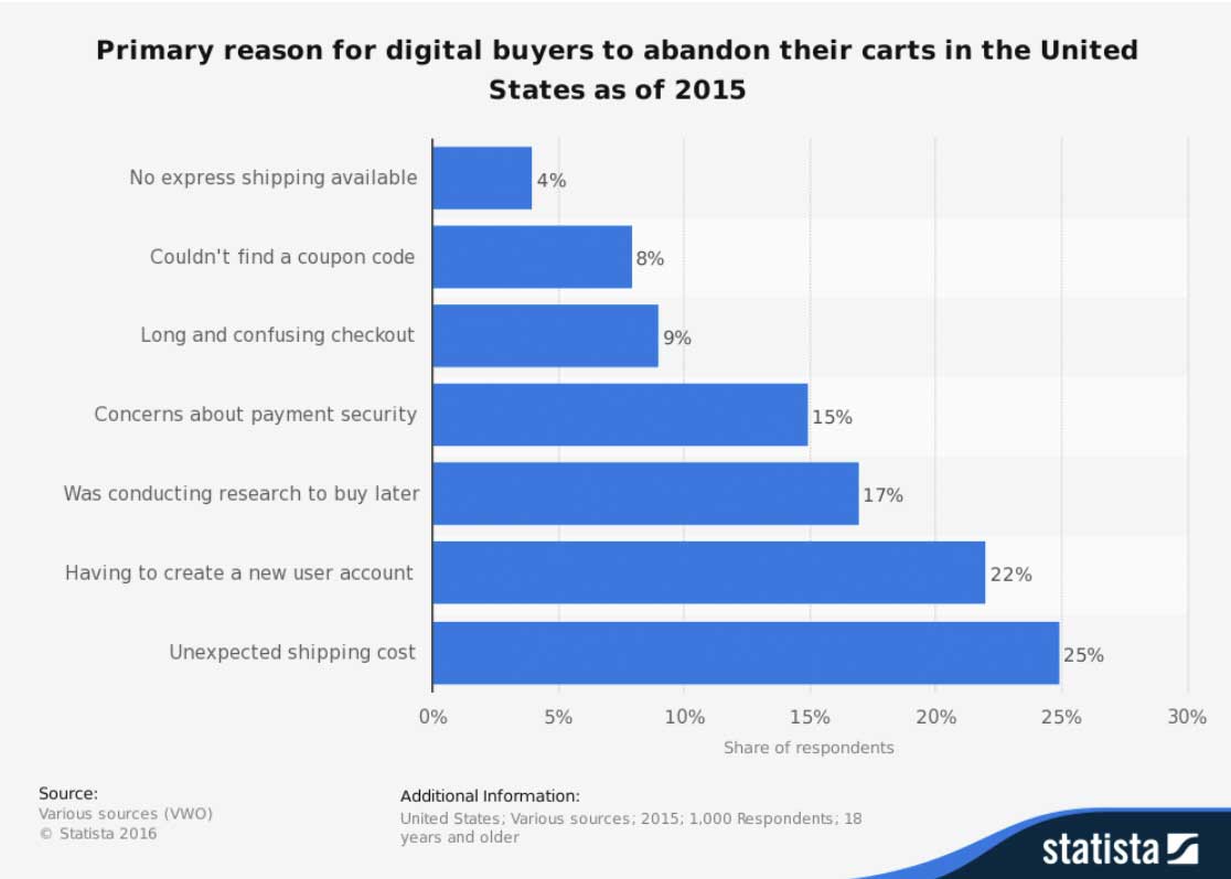
Guess what? What is the most common reason for shopping cart abandonment in America?
Hidden shipping costs.
Statista’s study reveals that online buyers don’t care about hidden shipping costs or last-minute shipping costs.

Recognizing that transparency is key to e-commerce website conversion and customer trust, it’s important that they provide more information about shipping and returns policies.
10. Complementary products
E-commerce isn’t new to cross-selling and complementary products.
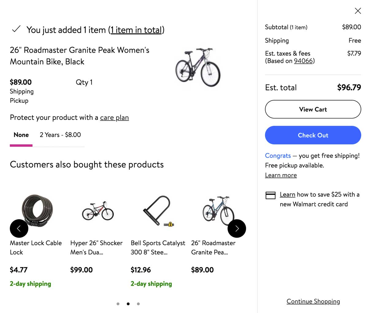
Displaying complementary products within the shopping cart is an innovative feature that you should explore.
We recommend you closely monitor any conversion-related change that may occur afterward. While complementary products don’t necessarily increase e-commerce sales, they do increase your order value (AOV).

Contact us online to increase the conversion rate on your website. Our CRO specialists will help you to optimize shopping cart or whole website plus redesign.
