case study
CRO for cosmetics store
Bioformulaselect
BIOFORMMULASELECT


Location
USA

Start date
January 2022

Category
Beauty

View
Website 
Task
- To increase the conversion rate on a page;
- Increase the number of sales;
- Update page design;
Project features
- Website on Shopify;
- Need to redesign whole page;
Tools and services
Project description
Bioformulaselect is an online store that sells acne and blackhead/whitehead masks. As you understand, the site should show the client many things: the process of use, the structure of the tool, efficiency, etc. The current conversion rate was average and our client wanted to increase it. That's why we started work on conversion optimization for individual pages that led to the main traffic.

Solution
Bioformulaselect it’s a project which sells masks against acne and blackheads/whiteheads. As you understand, the website should show the customer many things: process, structure, effectiveness, etc. The current conversion rate was on average level and our client would like to increase it. So we started our work on conversion rate optimization.
First of all we reviewed the page which should be optimized and find there are a lot of points which would be good to change. For example:
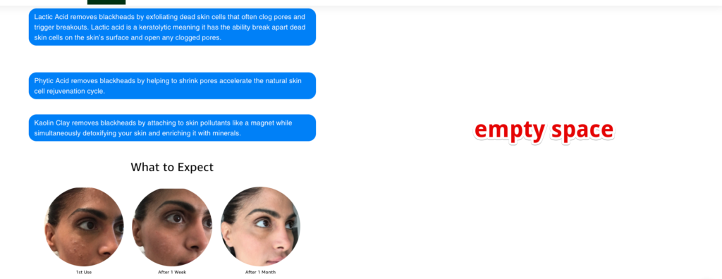
- The website looks good on mobile and not so good on desktops. So there are a lot of empty spaces when you open the website on desktop:
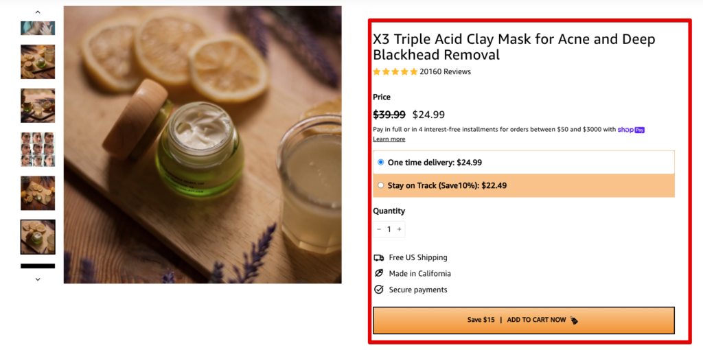
- Too many texts on purchase area:
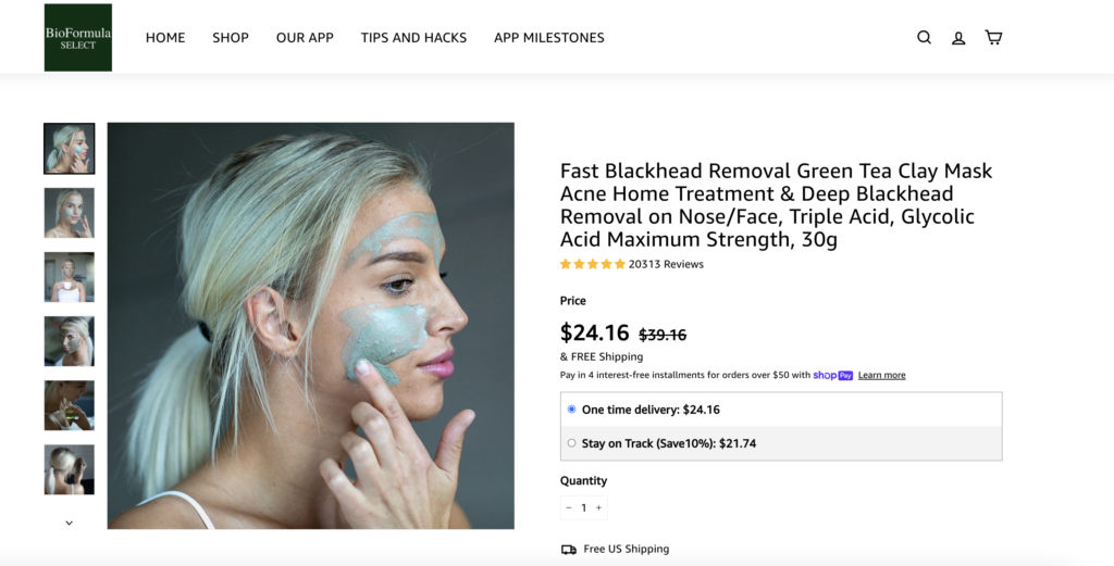
- Main image we can test and see what works better. But we agreed with the client that the main image it’s a very important thing which can affect everything. So old version looks like this:
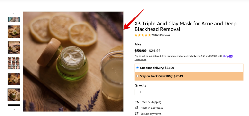
We suggested starting with page redesign, not testing. Our suggestion was based on calculations of a time which we need to spend on testing different elements and it was not reasonable from the economic side, because we need redesign the page anyway after tests or before. So we created a new design for the Shopify website and implemented it as a new page.
You can find the new page version by the link.
Then we installed Google Optimize on Shopify website for our client and started tests. We created an A/B test with redirections for 2 separate URLs and divided traffic 50/50 between old and new pages.
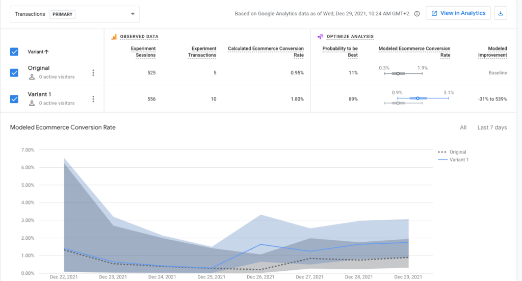
The project started to receive x2 conversions with new designed page.
+100%
Conversion rate increase
+100%
Sales increase
+$0
Additional advertising budget
Results
Thanks to testing several theories for desktop and mobile, we were able to significantly increase conversion results on the site without increasing the advertising budget.
View other cases


ARE YOU READY TO IMPROVE YOUR PROJECT WITH #UAATEAM?
We will be happy to discuss your project, along with your main goals and objectives. You can schedule a meeting with one of our managers.


