eCommerce Shopping Cart Optimization
Customers anticipate a flawless online buying experience as the demand for eCommerce websites grows. You must execute eCommerce shopping cart optimization in order to do so.
A smooth checkout process is required to deliver this experience to an ever-increasing number of digital shoppers.
Fortunately, thanks to recent technological advancements, building the ideal checkout procedure is now much more feasible than previously.
First, though.
Why is it vital to optimize your shopping cart?
When a customer thinks they’ve filled their cart with everything they want and are ready to place their order, the shopping cart checkout process begins.
This is vital to examine since it enables us to recognize that the customer feels a sense of urgency. They’ve already spent time browsing items and descriptions, selecting sizes, colors, and other options, and they want the process to be over as soon as possible. They may easily bounce if they find it difficult.
Those who are unfamiliar with the shopping cart concept should look to eCommerce platforms for examples of the greatest shopping cart checkouts.
Listen to this podcast to discover more about expanding your Shopify brand and providing superior omnichannel experiences if you’re on Shopify or plan to utilize it to improve your cart checkout process.
So, here’s how you go about doing it.
In eight simple steps, learn how to optimize your eCommerce shopping cart.
- Include a summary of the order.
- For real-time chats, enable live chat.
- Make the checkout process mobile-friendly.
- Only ask pertinent questions.
- Avoid employing too many fields by using a comprehensible table-based layout.
- Make payment simple.
- Develop customer confidence.
- Let’s delve a little deeper into the details.
Step 1. Include an overview of the order
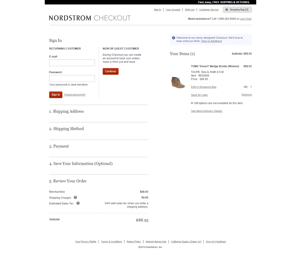
The most visible and vital component of the checkout page is allowing your customers to double-check their orders.
Providing comprehensive transparency aids in the development of trust. Customers do not want any surprises when they open their mailed packages.
Just before checking out, give them an order review summary that includes:
- Each item’s name and a picture/photo of it
- Size, color, and pricing are all characteristics of that product.
- Shipping fees, discounts, coupons, gift cards, and taxes are all cost-related variables.
- The entire amount to be paid (in their local currency if you can)
- The Baymard Institute provides a nice illustration of the order review mechanism with Staples (from a study evaluating eCommerce websites to find out the best checkout steps).

Step 2. Include a live chat feature for real-time communication.
According to several studies, adding a live chat function to your website enhances conversion rates and eCommerce purchases.
That’s because live chat gives customers a fast method to get product information (along with other things like shipping options and costs) before they buy. This would not only keep them informed about their product, but it would also foster customer-eCommerce brand trust.
If you sell a laptop, for example, a consumer may be curious about its features, benefits, projected delivery time, or even whether you have it in stock or in a different color.
Instead of making customers contact or email for these facts, live chat allows you to deliver them immediately, ensuring that they do not abandon their shopping basket due to a lack of information.

Step 3. Make the checkout process mobile-friendly.
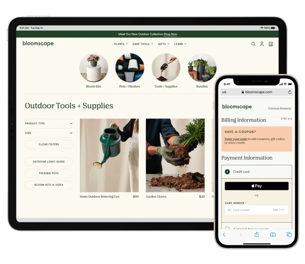
How does your cart checkout procedure fare on mobile, even if your eCommerce website is responsive? Do you have a mobile-friendly checkout page?
If it isn’t, it should be. Far more people use mobile devices than they were previously. You must make your checkout page mobile-friendly or you risk losing clients.
Checkout is mobile friendly
Customers may discover the following when sites are not mobile-friendly:
- The text is quite small and difficult to read.
- The product graphics are tiny and difficult to read.
- When you add an item to your shopping basket, it’s impossible to view the total pricing and other details.
- Because of the aforementioned difficulties, the rate of cart abandonment rises. If you want to increase sales and conversion rates, mobile eCommerce shopping cart optimization for checkout pages is a requirement.

Step 4. Only ask pertinent questions
Users quit during checkout because they don’t want to provide any additional information about themselves with the website, which they believe could threaten their privacy. Or they simply don’t have the time to wade through several pages and clicks in order to complete their purchase.
As a result, it’s best to keep inquiries focused and the number of steps required to finish the checkout process as low as possible. Always attempt to keep similar product or price-related questions on separate secure pages.
One of the better examples is the Bellroy eCommerce business checkout page. Their strategy is straightforward. There’s no need to click “next” many times because everything is on one page. To finish the checkout procedure, they require payment information, only the necessary contact information, and a delivery address. This makes the entire cart checkout procedure quick and painless.
Step 5. Use a table-based arrangement that is easy to understand.
When an eCommerce shopping cart checkout is formatted to make it easy to read, it looks beautiful. The checkout page’s content should be straightforward and straightforward. Use a comprehensible table-based style so that your clients can easily examine product characteristics such as size, color, price, description, and reviews.
Step 6. Limit the number of fields you use.
Demanding too much information from customers can hurt the shopping experience. When shopping online, users enjoy a clean and easy experience, and they anticipate the same from the checkout process.
The major problem is to provide clients with all necessary information when they check out without overwhelming them. If the checkout page has too many fields, it will take a long time to fill them all out, and customers may wonder why you need to know so much.
When a customer becomes frustrated, they are only a click away from terminating the entire process.
So, simply ask for the information that is really necessary:
Name, address, email address, and phone number
Guest or returning user
COD, debit cards, and credit cards are all accepted modes of payment.
Step 7. Make payment simple.
Customers will come to your cart checkout page as their last trip on your website. It’s a significant one. People value their money and want to know that everything will be simple and secure.
Customers will trust you more if you create a simple, user-friendly payment method.
When creating payment pages, there are a few things to bear in mind.
To begin, allow clients to pay using a variety of methods, including their digital wallets. Some websites still only accept one payment method, which leads to cart abandonment.
In addition, many websites need customers to register before making a purchase. Customers will depart as a result of this unneeded barrier to purchase. The integration of a guest login to your cart checkout procedure is critical. If you want customers to join up, give them the opportunity and let them decide; as an incentive, you can offer them free delivery or discounts on their next purchase.
Step 8. Establish customer trust
Earning the trust of users requires time and effort. However, shoppers must feel protected in order to enhance conversion rates and strengthen your eCommerce brand.
Customers should feel safe inputting their credit card information on your website first and foremost.
There are several ways to demonstrate the trustworthiness of your website and persuade customers to shop there.
- Security logos and trustmarks are used. Customers may enter their payment information and shop on your website with confidence because of trustmarks. The logos are shown above, for example, represent a site’s technical security and are an excellent way to gain client confidence and trustworthiness.
- Proof from others. Google’s Trusted Stores initiative provides average user ratings, recommending products to customers based on previous purchases. Customers will feel more at ease utilizing your eCommerce site as a result of this.
- Contact Information Customers should feel confident that if there is a problem with their order, they can easily contact the company via the website’s contact options.

This is how you make the ideal shopping cart checkout procedure.
The good news are:
A seamless online shopping cart checkout procedure can help your online business make more money and reduce cart abandonment. If you follow these steps, you’ll be well on your way to delighting customers.
Is your online store’s shopping cart a bit clumsy? Is there anything you think should be done better? What actions have you taken to ensure that your checkout procedure is as efficient as possible?


