+44 7727 978782
ua
Submit Request

Improve your conversion rate with optimized mobile version

Improve your conversion rate with mobile optimization

When conversion rates are low, it’s tempting to throw money at the problem in search of a quick solution. Resist this temptation, as the key to a higher conversion rate is not always to invest more money in advertising campaigns or a flashy new marketing initiative.

No, the solution is considerably simpler. Mobile optimization!

Beginning with the mobile experience of your website makes sense. More than 50% of Americans spend about 5-6 hours per day on their smartphones. They will likely access your website through their mobile devices. That is, your website must be prepared.

Below are our top four mobile conversion rate optimization recommendations. Follow them, and you’ll end up with a site that is clean, compelling, and focused on the customer – and ready to convert.

What does mobile optimization mean?

Mobile optimization is the process of customizing your website for users who access it via a mobile device, such as a smartphone or tablet, rather than a desktop computer.

It involves ensuring that the layout, structure, and content of your website are optimized for mobile devices. So why is this significant?

Consider the consequences of a website that is not mobile-optimized. The content appears misshapen or improperly sized. Elements on the page appear to have a life of their own; you must zoom in and out frantically to read the text on the screen.

The user experience (UX) is poor. Furthermore, it is detrimental to business. 57% of mobile users will not recommend a company with inadequate mobile optimization.

Inadequate mobile optimization, or its absence, results in a frustrated user. And frustrated users seldom convert to paying customers!

How to maximize conversion rate with a mobile optimization: 4 best tips

Prepared to maximize your conversion rates and make your website mobile-friendly simultaneously? Here are our four top tips for mobile optimization:

  • Provide a streamlined checkout process
  • Add product recommendations to the page
  • Offer more payment options.
  • Enhance your calls to action – and make them remarkable
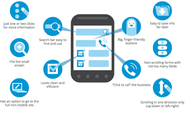
improve your conversion rate with mobile version

Offer a clean and easy checkout process

The first way to increase conversion rates on your mobile site? Optimizing your checkout flow to provide a frictionless checkout experience.

How you accomplish this depends on how you constructed your website. However, a few general tips include:

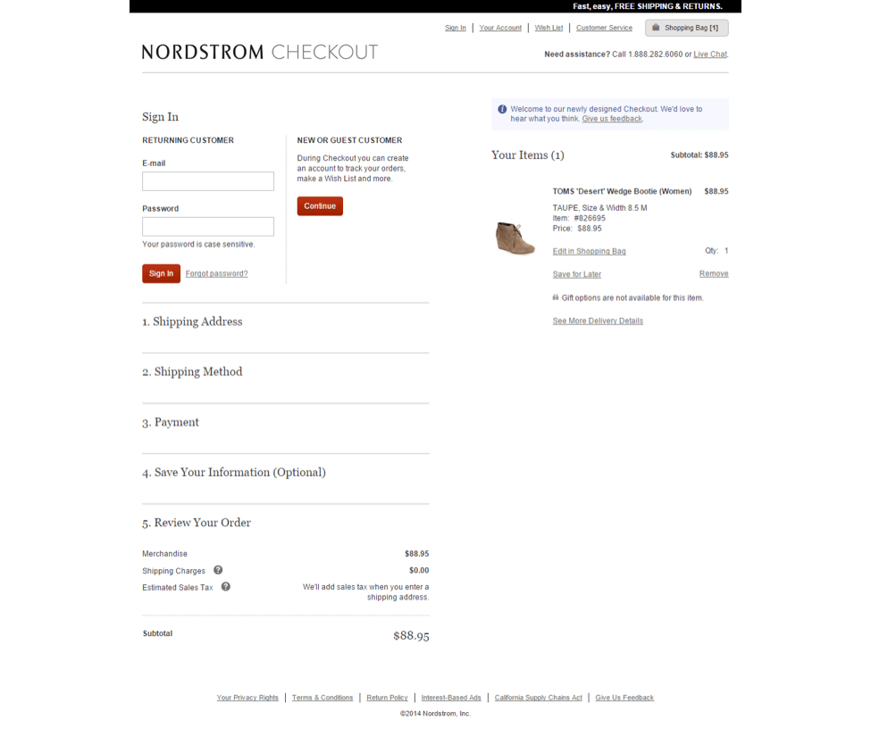
  • Enabling guest checkout so that users are not deterred from purchasing by having to create an account.
  • Offering a variety of shipping options
  • Reducing the number of form fields (i.e., the depth of customer information required)
  • Displaying identification badges to increase consumer confidence.

Add Product Recommendations to the Page

Including product recommendations directly on the product page is a low-effort and high-impact action for mobile optimization.

On-page product recommendations could be products the customer has recently viewed or products that are comparable to the ones they are currently viewing. These will appear in the frame as the customer browses your store on their mobile device, allowing them to quickly and easily navigate to products of interest.

On-page product suggestions are excellent for UX. However, they are also beneficial to your conversion rates, as they remove one more obstacle to a customer making a purchase.

Provide additional payment options

Providing a variety of payment options is no longer a “nice-to-have” in the present day.

It is indispensable. It’s one of the most important decisions you’ll make for your website, along with selecting a web host and constructing your site on the most suitable platform.

Today’s consumers are more discerning than ever before. Many are skeptical of the online payment process, while others want it to be as streamlined, seamless, and quick as possible.

What’s your role? To ensure that your customers can use a variety of payment methods, including:

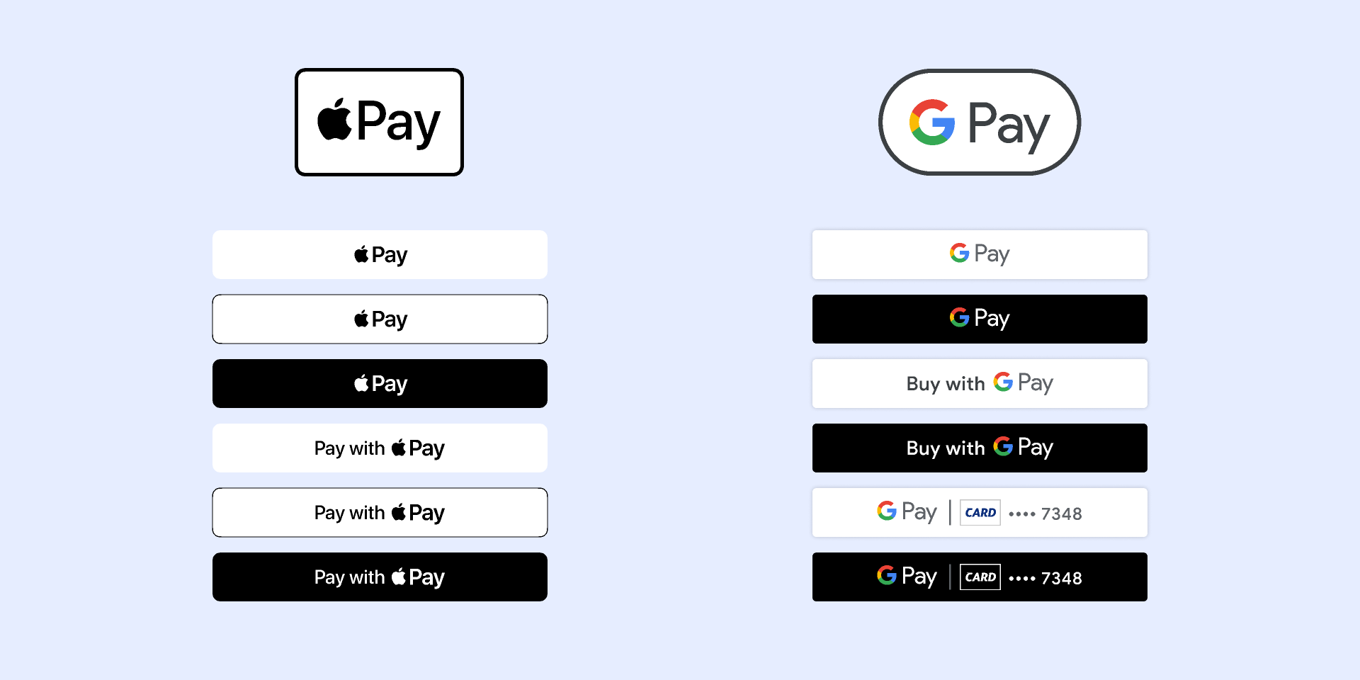
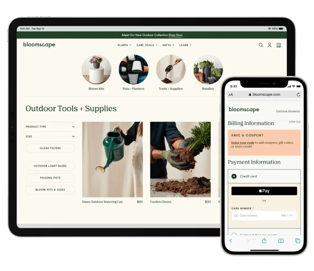
  • Mobile wallets: Google pay, Apple pay, etc.
  • Debit and credit cards.
  • PayPal wallet or app.

Millennials are particularly fond of the ease and convenience that mobile wallet payments provide. According to Statista, Generation Y accounts for 46% of digital or mobile wallet payments in the United States.

Also, you can target Generation Z by providing a “Buy Now, Pay Later” (BNPL) service. 55.1 percent of Gen Z consumers aged 14 and older in the United States will use a BNPL service at least once this year.

Enhance Your Calls-To-Action – And Their Visibility

To maximize conversions, compelling calls to action are required.

Therefore, take the time to evaluate the content, placement, and design of your website’s current calls to action. Are they:

  • Start with commanding verbs that generate interest and enthusiasm.
  • Develop a sense of urgency?
  • Demonstrate to the customer the advantages of taking action.

Remember that you are optimizing these CTAs for mobile devices. Consider your users and how they interact with your website. They are already on their phones, so how can you leverage this to improve your calls to action?

One tip is to use CTAs based on phone calls. Instead of asking them to fill out a lengthy contact form or send an email – both of which are more difficult to complete on a mobile device or while on the go – invite them to call with their questions.

Moreover, CTAs are not just about the text – what they say – but also about their appearance. Ensure that they stand out from the rest of the page’s content (you want people to realize they’re viewing a CTA, after all!). Utilize the effective simplicity of white space. And, if there is a button, ensure that it is large, bold, and screams “Click me!”

Summary

Mobile optimization will not only enhance the appearance, feel, and functionality of your website. It will boost your conversion rates and help you expand your online business. Your google ads campaigns or search engine optimization give you more results with a good optimized website.

Therefore, best of luck, and have a great time applying these tips. Mobile optimization is a complex and time-consuming process. But the result will be worth it – believe us!


eCommerce Shopping Cart Optimization

eCommerce Shopping Cart Optimization

Customers anticipate a flawless online buying experience as the demand for eCommerce websites grows. You must execute eCommerce shopping cart optimization in order to do so.

A smooth checkout process is required to deliver this experience to an ever-increasing number of digital shoppers.

Fortunately, thanks to recent technological advancements, building the ideal checkout procedure is now much more feasible than previously.

First, though.

Why is it vital to optimize your shopping cart?

When a customer thinks they’ve filled their cart with everything they want and are ready to place their order, the shopping cart checkout process begins.

This is vital to examine since it enables us to recognize that the customer feels a sense of urgency. They’ve already spent time browsing items and descriptions, selecting sizes, colors, and other options, and they want the process to be over as soon as possible. They may easily bounce if they find it difficult.

Those who are unfamiliar with the shopping cart concept should look to eCommerce platforms for examples of the greatest shopping cart checkouts.

Listen to this podcast to discover more about expanding your Shopify brand and providing superior omnichannel experiences if you’re on Shopify or plan to utilize it to improve your cart checkout process.

So, here’s how you go about doing it.

In eight simple steps, learn how to optimize your eCommerce shopping cart.

  • Include a summary of the order.
  • For real-time chats, enable live chat.
  • Make the checkout process mobile-friendly.
  • Only ask pertinent questions.
  • Avoid employing too many fields by using a comprehensible table-based layout.
  • Make payment simple.
  • Develop customer confidence.
  • Let’s delve a little deeper into the details.

Step 1. Include an overview of the order
The most visible and vital component of the checkout page is allowing your customers to double-check their orders.

Providing comprehensive transparency aids in the development of trust. Customers do not want any surprises when they open their mailed packages.

Just before checking out, give them an order review summary that includes:

  • Each item’s name and a picture/photo of it
  • Size, color, and pricing are all characteristics of that product.
  • Shipping fees, discounts, coupons, gift cards, and taxes are all cost-related variables.
  • The entire amount to be paid (in their local currency if you can)
  • The Baymard Institute provides a nice illustration of the order review mechanism with Staples (from a study evaluating eCommerce websites to find out the best checkout steps).

shopping cart optimization

Step 2. Include a live chat feature for real-time communication.
According to several studies, adding a live chat function to your website enhances conversion rates and eCommerce purchases.

That’s because live chat gives customers a fast method to get product information (along with other things like shipping options and costs) before they buy. This would not only keep them informed about their product, but it would also foster customer-eCommerce brand trust.

If you sell a laptop, for example, a consumer may be curious about its features, benefits, projected delivery time, or even whether you have it in stock or in a different color.

Instead of making customers contact or email for these facts, live chat allows you to deliver them immediately, ensuring that they do not abandon their shopping basket due to a lack of information.

website live chat

Step 3. Make the checkout process mobile-friendly.
How does your cart checkout procedure fare on mobile, even if your eCommerce website is responsive? Do you have a mobile-friendly checkout page?

If it isn’t, it should be. Far more people use mobile devices than they were previously. You must make your checkout page mobile-friendly or you risk losing clients.

Checkout is mobile friendly
Customers may discover the following when sites are not mobile-friendly:

  • The text is quite small and difficult to read.
  • The product graphics are tiny and difficult to read.
  • When you add an item to your shopping basket, it’s impossible to view the total pricing and other details.
  • Because of the aforementioned difficulties, the rate of cart abandonment rises. If you want to increase sales and conversion rates, mobile eCommerce shopping cart optimization for checkout pages is a requirement.

mobile-friendly checkout

Step 4. Only ask pertinent questions
Users quit during checkout because they don’t want to provide any additional information about themselves with the website, which they believe could threaten their privacy. Or they simply don’t have the time to wade through several pages and clicks in order to complete their purchase.

As a result, it’s best to keep inquiries focused and the number of steps required to finish the checkout process as low as possible. Always attempt to keep similar product or price-related questions on separate secure pages.

One of the better examples is the Bellroy eCommerce business checkout page. Their strategy is straightforward. There’s no need to click “next” many times because everything is on one page. To finish the checkout procedure, they require payment information, only the necessary contact information, and a delivery address. This makes the entire cart checkout procedure quick and painless.

Step 5. Use a table-based arrangement that is easy to understand.
When an eCommerce shopping cart checkout is formatted to make it easy to read, it looks beautiful. The checkout page’s content should be straightforward and straightforward. Use a comprehensible table-based style so that your clients can easily examine product characteristics such as size, color, price, description, and reviews.

Step 6. Limit the number of fields you use.
Demanding too much information from customers can hurt the shopping experience. When shopping online, users enjoy a clean and easy experience, and they anticipate the same from the checkout process.

The major problem is to provide clients with all necessary information when they check out without overwhelming them. If the checkout page has too many fields, it will take a long time to fill them all out, and customers may wonder why you need to know so much.

When a customer becomes frustrated, they are only a click away from terminating the entire process.

So, simply ask for the information that is really necessary:

Name, address, email address, and phone number
Guest or returning user
COD, debit cards, and credit cards are all accepted modes of payment.

Step 7. Make payment simple.

Customers will come to your cart checkout page as their last trip on your website. It’s a significant one. People value their money and want to know that everything will be simple and secure.

Customers will trust you more if you create a simple, user-friendly payment method.

When creating payment pages, there are a few things to bear in mind.

To begin, allow clients to pay using a variety of methods, including their digital wallets. Some websites still only accept one payment method, which leads to cart abandonment.

In addition, many websites need customers to register before making a purchase. Customers will depart as a result of this unneeded barrier to purchase. The integration of a guest login to your cart checkout procedure is critical. If you want customers to join up, give them the opportunity and let them decide; as an incentive, you can offer them free delivery or discounts on their next purchase.

Step 8. Establish customer trust

Earning the trust of users requires time and effort. However, shoppers must feel protected in order to enhance conversion rates and strengthen your eCommerce brand.

Customers should feel safe inputting their credit card information on your website first and foremost.

There are several ways to demonstrate the trustworthiness of your website and persuade customers to shop there.

  • Security logos and trustmarks are used. Customers may enter their payment information and shop on your website with confidence because of trustmarks. The logos are shown above, for example, represent a site’s technical security and are an excellent way to gain client confidence and trustworthiness.
  • Proof from others. Google’s Trusted Stores initiative provides average user ratings, recommending products to customers based on previous purchases. Customers will feel more at ease utilizing your eCommerce site as a result of this.
  • Contact Information Customers should feel confident that if there is a problem with their order, they can easily contact the company via the website’s contact options.

This is how you make the ideal shopping cart checkout procedure.

The good news are:

A seamless online shopping cart checkout procedure can help your online business make more money and reduce cart abandonment. If you follow these steps, you’ll be well on your way to delighting customers.

Is your online store’s shopping cart a bit clumsy? Is there anything you think should be done better? What actions have you taken to ensure that your checkout procedure is as efficient as possible?

Conversion funnels optimisation tips

Conversion funnels optimization tips

A clear understanding of your conversion funnels can be likened to having directions (or setting Google Maps up) to the place you want. Because you and your team can communicate in the same language, a good conversion funnel will help optimize your marketing efforts. Obsolete data will eliminate the anecdote-driven analysis that plagues many businesses.

This post will show you how to create your own conversion funnel. It’ll also demonstrate how to visualize it and analyze it. Let’s get started and map your funnel.

What is a Conversion Funnel?

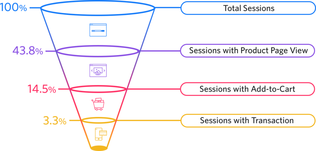
conversion rate funnels

A conversion funnel simply describes the sequence of steps that a user must follow to convert. There may be multiple steps involved in the conversion process. You can buy something, open an account, or take any other action you wish.

Every product or website must have a unique funnel. This is how they view customer satisfaction and marketing. Users may not always follow your perfectly designed funnel and enter your funnel in unexpected ways.

Let’s try our best to create your funnel. There are many frameworks available online, but I prefer the Buyer’s Journey framework by Hubspot, which includes three stages: Awareness, Consideration, and Decision.

The stage of awareness is when a prospect (or potential customer) is researching the best solution to their problem. Consideration is when they commit to solving their problem. The decision is when they are weighing all options and are ready to buy. Prospects may move back and forth between these stages as they gain more information.

Visualizing and Analyzing your Conversion Funnel

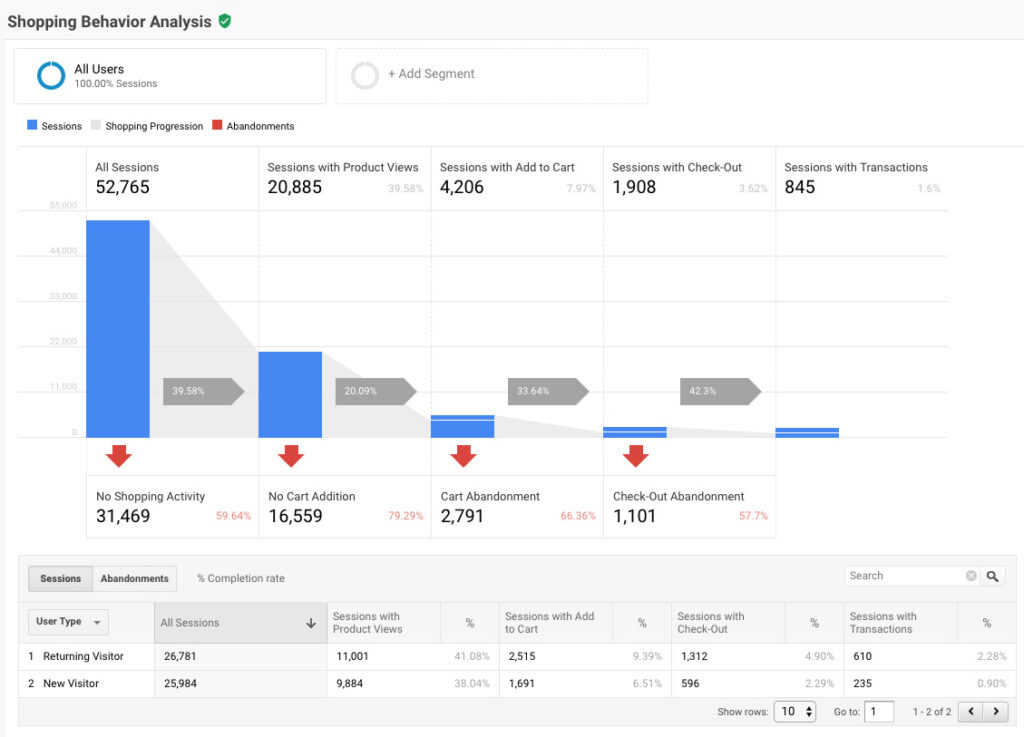
You can visualize your funnel in analytics data to see where users are dropping off, and then choose a strategy (our next section).

This section’s goal is to produce a report similar to this one.

You can see the conversion funnel and the dropoffs. We could also segment the funnel by different dimensions, e.g. country, city, browser, device, marketing campaign, etc.

To track the correct data, you will need to collaborate with your engineering team. However, it will likely include a combination of analytics events as well as user attributes. You will find below links that provide more information about which popular tools can visualize this report. I’ll also show you how it is done within Google Analytics and Amplitude.

How to Analyze your Conversion Funnel with Google Analytics

Google Analytics is capable of many things, but funnels are one of its major weaknesses, especially the free version. There are two types of funnels in GA.

You create the goal completion manually by creating the funnel attached. Although it does the job, the data can be confusing, especially if users have the ability to enter your funnel at any stage.

The ecommerce checkout behavior is the second and most preferred option. It is intended for ecommerce shops, but it could be used for any type of sales funnel.

This will allow you to create a funnel by using advanced segments. These funnels must be created in advance and can’t be modified once they are established. This is a small price to pay for the flexibility that Amplitude offers when creating funnels.

We can now look at 3 strategies to optimize your conversion funnel once we have the data.

3 Strategies for Conversion Funnel Optimization

Now you have created your conversion funnel. You visualized it with your favorite analytics tool. Now you can optimize your conversion funnel to increase conversion rates. Although it may seem like there are endless possibilities, you can organize them into three main strategies.

1. Locate Outlier Segments

First, you need to identify customer segments that convert at higher rates than the average. It is possible that users who are referred to you via email marketing convert at a higher rate than those who are referred through social media ads. This is where it’s crucial to have the right data as it will allow you to break down your funnel into possible segments.

After you have identified a segment, it is important to ensure that there is a strong correlation between your results and the conversion rates. This can be confirmed by running additional A/B tests and gathering data. Communication such as cart abandonment email is another area that can be used.

This strategy is great because it allows you to tap into what is already working well and then double down.

2. Fix the Biggest Holes

The second strategy is to address the most serious problems or drop-offs. It is possible that half of your users abandon their carts after adding an item to them. This could be because of technical issues, or a lack of trust in your landing page or website.

I would pay particular attention to the dropoff rates at bottom of the funnel. If a user is already in the checkout process and has committed to buying something, high dropoff rates would alarm them.

A common problem I’ve seen in some companies is their refusal to disclose pricing, terms, or caveats. They hope the momentum will help the user move forward. You’re not giving the user the right information if they are shocked at the end of your funnel.

This strategy can make a big difference in your conversion rate, especially if you have not audited the site’s feel and performance to “regular” users.

3. Eliminate Steps

The final strategy is to eliminate all steps from your funnel. The general rule of thumb is that fewer steps will increase your overall conversion rate. Although this is not always true, it’s a good rule of thumb to reduce or eliminate steps.

Amazon’s “1-Click checkout” option for some products is one of my favorites. Some users, like myself, know that they want the product or service. I prefer to avoid extra steps because Amazon knows my defaults for shipping and payment.

Analyzing your conversion funnel does not have to be complicated.
There are a few strategies, but it is important to ensure that your testing is done correctly. This includes designing the right A/B tests and properly reading the data.

Click to access the login or register cheese

Open->
to new

Start working with #UAATEAM

  • United States+1
  • Afghanistan (‫افغانستان‬‎)+93
  • Albania (Shqipëri)+355
  • Algeria (‫الجزائر‬‎)+213
  • American Samoa+1
  • Andorra+376
  • Angola+244
  • Anguilla+1
  • Antigua and Barbuda+1
  • Argentina+54
  • Armenia (Հայաստան)+374
  • Aruba+297
  • Australia+61
  • Austria (Österreich)+43
  • Azerbaijan (Azərbaycan)+994
  • Bahamas+1
  • Bahrain (‫البحرين‬‎)+973
  • Bangladesh (বাংলাদেশ)+880
  • Barbados+1
  • Belarus (Беларусь)+375
  • Belgium (België)+32
  • Belize+501
  • Benin (Bénin)+229
  • Bermuda+1
  • Bhutan (འབྲུག)+975
  • Bolivia+591
  • Bosnia and Herzegovina (Босна и Херцеговина)+387
  • Botswana+267
  • Brazil (Brasil)+55
  • British Indian Ocean Territory+246
  • British Virgin Islands+1
  • Brunei+673
  • Bulgaria (България)+359
  • Burkina Faso+226
  • Burundi (Uburundi)+257
  • Cambodia (កម្ពុជា)+855
  • Cameroon (Cameroun)+237
  • Canada+1
  • Cape Verde (Kabu Verdi)+238
  • Caribbean Netherlands+599
  • Cayman Islands+1
  • Central African Republic (République centrafricaine)+236
  • Chad (Tchad)+235
  • Chile+56
  • China (中国)+86
  • Christmas Island+61
  • Cocos (Keeling) Islands+61
  • Colombia+57
  • Comoros (‫جزر القمر‬‎)+269
  • Congo (DRC) (Jamhuri ya Kidemokrasia ya Kongo)+243
  • Congo (Republic) (Congo-Brazzaville)+242
  • Cook Islands+682
  • Costa Rica+506
  • Côte d’Ivoire+225
  • Croatia (Hrvatska)+385
  • Cuba+53
  • Curaçao+599
  • Cyprus (Κύπρος)+357
  • Czech Republic (Česká republika)+420
  • Denmark (Danmark)+45
  • Djibouti+253
  • Dominica+1
  • Dominican Republic (República Dominicana)+1
  • Ecuador+593
  • Egypt (‫مصر‬‎)+20
  • El Salvador+503
  • Equatorial Guinea (Guinea Ecuatorial)+240
  • Eritrea+291
  • Estonia (Eesti)+372
  • Ethiopia+251
  • Falkland Islands (Islas Malvinas)+500
  • Faroe Islands (Føroyar)+298
  • Fiji+679
  • Finland (Suomi)+358
  • France+33
  • French Guiana (Guyane française)+594
  • French Polynesia (Polynésie française)+689
  • Gabon+241
  • Gambia+220
  • Georgia (საქართველო)+995
  • Germany (Deutschland)+49
  • Ghana (Gaana)+233
  • Gibraltar+350
  • Greece (Ελλάδα)+30
  • Greenland (Kalaallit Nunaat)+299
  • Grenada+1
  • Guadeloupe+590
  • Guam+1
  • Guatemala+502
  • Guernsey+44
  • Guinea (Guinée)+224
  • Guinea-Bissau (Guiné Bissau)+245
  • Guyana+592
  • Haiti+509
  • Honduras+504
  • Hong Kong (香港)+852
  • Hungary (Magyarország)+36
  • Iceland (Ísland)+354
  • India (भारत)+91
  • Indonesia+62
  • Iran (‫ایران‬‎)+98
  • Iraq (‫العراق‬‎)+964
  • Ireland+353
  • Isle of Man+44
  • Israel (‫ישראל‬‎)+972
  • Italy (Italia)+39
  • Jamaica+1
  • Japan (日本)+81
  • Jersey+44
  • Jordan (‫الأردن‬‎)+962
  • Kazakhstan (Казахстан)+7
  • Kenya+254
  • Kiribati+686
  • Kosovo+383
  • Kuwait (‫الكويت‬‎)+965
  • Kyrgyzstan (Кыргызстан)+996
  • Laos (ລາວ)+856
  • Latvia (Latvija)+371
  • Lebanon (‫لبنان‬‎)+961
  • Lesotho+266
  • Liberia+231
  • Libya (‫ليبيا‬‎)+218
  • Liechtenstein+423
  • Lithuania (Lietuva)+370
  • Luxembourg+352
  • Macau (澳門)+853
  • Macedonia (FYROM) (Македонија)+389
  • Madagascar (Madagasikara)+261
  • Malawi+265
  • Malaysia+60
  • Maldives+960
  • Mali+223
  • Malta+356
  • Marshall Islands+692
  • Martinique+596
  • Mauritania (‫موريتانيا‬‎)+222
  • Mauritius (Moris)+230
  • Mayotte+262
  • Mexico (México)+52
  • Micronesia+691
  • Moldova (Republica Moldova)+373
  • Monaco+377
  • Mongolia (Монгол)+976
  • Montenegro (Crna Gora)+382
  • Montserrat+1
  • Morocco (‫المغرب‬‎)+212
  • Mozambique (Moçambique)+258
  • Myanmar (Burma) (မြန်မာ)+95
  • Namibia (Namibië)+264
  • Nauru+674
  • Nepal (नेपाल)+977
  • Netherlands (Nederland)+31
  • New Caledonia (Nouvelle-Calédonie)+687
  • New Zealand+64
  • Nicaragua+505
  • Niger (Nijar)+227
  • Nigeria+234
  • Niue+683
  • Norfolk Island+672
  • North Korea (조선 민주주의 인민 공화국)+850
  • Northern Mariana Islands+1
  • Norway (Norge)+47
  • Oman (‫عُمان‬‎)+968
  • Pakistan (‫پاکستان‬‎)+92
  • Palau+680
  • Palestine (‫فلسطين‬‎)+970
  • Panama (Panamá)+507
  • Papua New Guinea+675
  • Paraguay+595
  • Peru (Perú)+51
  • Philippines+63
  • Poland (Polska)+48
  • Portugal+351
  • Puerto Rico+1
  • Qatar (‫قطر‬‎)+974
  • Réunion (La Réunion)+262
  • Romania (România)+40
  • Russia (Россия)+7
  • Rwanda+250
  • Saint Barthélemy+590
  • Saint Helena+290
  • Saint Kitts and Nevis+1
  • Saint Lucia+1
  • Saint Martin (Saint-Martin (partie française))+590
  • Saint Pierre and Miquelon (Saint-Pierre-et-Miquelon)+508
  • Saint Vincent and the Grenadines+1
  • Samoa+685
  • San Marino+378
  • São Tomé and Príncipe (São Tomé e Príncipe)+239
  • Saudi Arabia (‫المملكة العربية السعودية‬‎)+966
  • Senegal (Sénégal)+221
  • Serbia (Србија)+381
  • Seychelles+248
  • Sierra Leone+232
  • Singapore+65
  • Sint Maarten+1
  • Slovakia (Slovensko)+421
  • Slovenia (Slovenija)+386
  • Solomon Islands+677
  • Somalia (Soomaaliya)+252
  • South Africa+27
  • South Korea (대한민국)+82
  • South Sudan (‫جنوب السودان‬‎)+211
  • Spain (España)+34
  • Sri Lanka (ශ්‍රී ලංකාව)+94
  • Sudan (‫السودان‬‎)+249
  • Suriname+597
  • Svalbard and Jan Mayen+47
  • Swaziland+268
  • Sweden (Sverige)+46
  • Switzerland (Schweiz)+41
  • Syria (‫سوريا‬‎)+963
  • Taiwan (台灣)+886
  • Tajikistan+992
  • Tanzania+255
  • Thailand (ไทย)+66
  • Timor-Leste+670
  • Togo+228
  • Tokelau+690
  • Tonga+676
  • Trinidad and Tobago+1
  • Tunisia (‫تونس‬‎)+216
  • Turkey (Türkiye)+90
  • Turkmenistan+993
  • Turks and Caicos Islands+1
  • Tuvalu+688
  • U.S. Virgin Islands+1
  • Uganda+256
  • Ukraine (Україна)+380
  • United Arab Emirates (‫الإمارات العربية المتحدة‬‎)+971
  • United Kingdom+44
  • United States+1
  • Uruguay+598
  • Uzbekistan (Oʻzbekiston)+998
  • Vanuatu+678
  • Vatican City (Città del Vaticano)+39
  • Venezuela+58
  • Vietnam (Việt Nam)+84
  • Wallis and Futuna (Wallis-et-Futuna)+681
  • Western Sahara (‫الصحراء الغربية‬‎)+212
  • Yemen (‫اليمن‬‎)+967
  • Zambia+260
  • Zimbabwe+263
  • Åland Islands+358
Select a Service:
Please fill in all required form fields